The dash relief
WebGL, 3D, Hover
Free
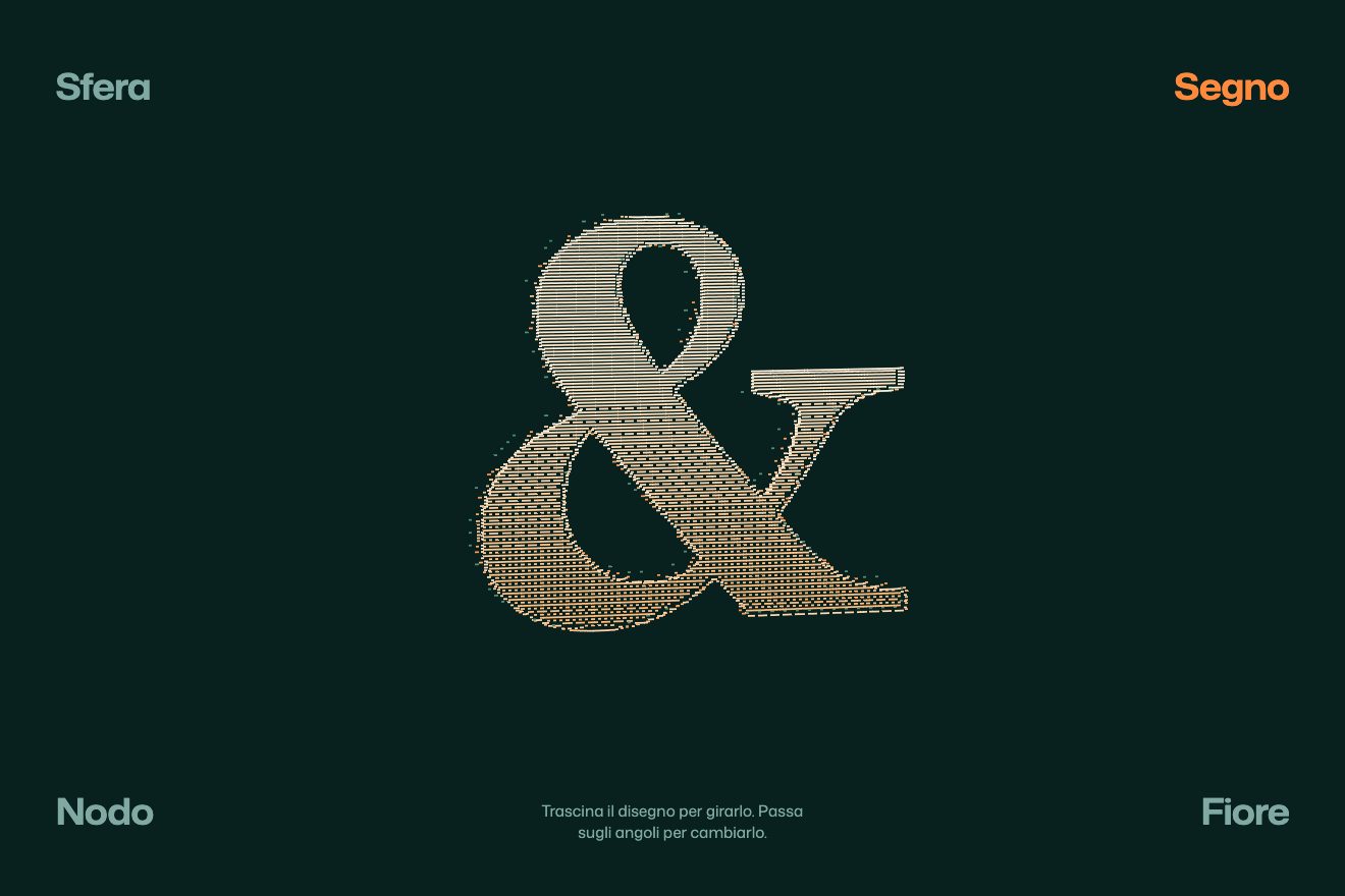
A minimal-style hover animation: a big word that is really a stack of copies in true 3D. At rest it is flat; with the pointer near, the stack tilts towards it and the copies open in depth, each lighter and narrower than the one in front, down to the last one in the accent, like the edge of a ream of paper.
A folder that runs on its own: index.html, style.css, script.js and the libraries from a CDN. The React and Vue tabs hold the same demo as a ready component, which switches its animations off when it leaves the page.
<!doctype html>
<html lang="en">
<head>
<meta charset="utf-8">
<meta name="viewport" content="width=device-width, initial-scale=1">
<title>Ream</title>
<link rel="stylesheet" href="https://cdn.jsdelivr.net/npm/@fontsource-variable/archivo@5.3.0/wdth.css">
<link rel="stylesheet" href="style.css">
</head>
<body>
<main class="stage" data-stage>
<!-- the word people read; the stack below is only its picture -->
<h1 class="sr" data-read>Ream</h1>
<!-- the stack: the script fills it with copies of the word, one behind the other in real 3D. At rest they line up
into one flat word; near the pointer the stack tilts and the copies fan out in depth like a ream of paper -->
<div class="scena" data-scena aria-hidden="true">
<div class="pila" data-pila></div>
</div>
<p class="nota" data-nota>Paper mill & press</p>
<p class="aiuto" data-aiuto>Hover the word</p>
</main>
<script src="https://cdn.jsdelivr.net/npm/gsap@3.15.0/dist/gsap.min.js"></script>
<script src="script.js"></script>
</body>
</html>Change values, colours and text with the controls and watch the animation respond live. Or write in the code yourself. Then download the folder with your changes.
17 values to change
With the Animorio connector, Claude Code takes it from here, guide included, and fits it into your project. Paste this request:
Take “The layered word” from Animorio and fit it into my siteThe word is written ten times in ten divs, inside a container with transform-style: preserve-3d and a perspective seven times the size of the type. In the DOM the farthest copy comes first and the front one last: at rest they all sit at depth zero, so the one you see is the front one, painted on top of the others. The first copy is in the flow and gives the size; the others sit on top of it with position absolute.
Each copy has its own number, how open it is, which follows a target from 0 to 1 on a spring. Opening means translateZ of minus its position times a step that is a share of the type size: the farthest copy goes back the most. As it opens, the weight and the width (Archivo’s wght and wdth axes) move towards those of the back copy and the opacity drops, so the word shows its thickness. The back copy is in the accent colour.
The targets of the copies don’t all change at once: a GSAP tween with a stagger takes them to 1 from the front copy towards the back when the pointer arrives, and to 0 from the back towards the front when it leaves. The springs do the rest: each copy arrives a touch too far and settles, and the delay between them shows as a wave.
The whole stack turns with rotateX and rotateY towards the pointer, in proportion to where it is from the middle of the word, on two springs with a small bounce. The springs run on GSAP’s ticker with four small steps per frame, so they stay steady even when a frame is long, and the timing tool can slow them down. When nobody moves the pointer, a pretend pointer takes a ten-second loop around the word on a timeline that repeats the same.
| Name | File | Default | What it changes |
|---|---|---|---|
WORD | script.js | 'Ream' | The word: short words read best (up to about 8 letters). |
LAYERS | script.js | 10 | How many copies make the stack, from 4 to 16. |
DEPTH | script.js | 0.09 | How far apart the copies open, as a share of the type size. |
TILT | script.js | 24 | How far the stack tilts towards the pointer, in degrees. |
SPRING | script.js | 1 | How lively the springs are: 0.5 slow and soft, 2 quick and bouncy. |
STAGGER | script.js | 0.045 | Seconds between one copy and the next as they open and close. |
FRONT_WEIGHT | script.js | 820 | The weight of the front copy, from 100 to 900. |
BACK_WEIGHT | script.js | 260 | The weight of the farthest copy when the stack is open. |
BACK_WIDTH | script.js | 74 | The width (wdth axis) of the farthest copy when open: the front one stays at 100. |
REACH | script.js | 0.9 | How near the pointer must come for the stack to open, in widths of the word around it. |
For the heading of a paper mill, a printer, a publisher or a design studio, a product name at the top of a landing page, the cover of a portfolio: one word that, when touched, shows it has a thickness.
The same animation with the sizes adapted: the word fits the width of the screen; a finger over the word opens and tilts it, and if the phone already gives its angles without asking, tilting it is enough. At rest the pretend pointer circles the word.
No 3D and no tilt: the word stays flat, and with the pointer near only its weight changes, softly.
GSAP 3.15.0, Archivo (font variabile, assi wght e wdth) 5.3.0.
Compressed with gzip, the three demo files weigh 5.4 KB; the libraries: GSAP 28 KB.
Tested on 21 October 2026
Use it in your own projects and in your clients’ projects. Do not resell it or redistribute it as is. GSAP stays under its own Standard license. Full license.
With your account’s email and password.
or with your email
You’re signed in as .
With your account, you can download the zip of every animation and every pack, for free.