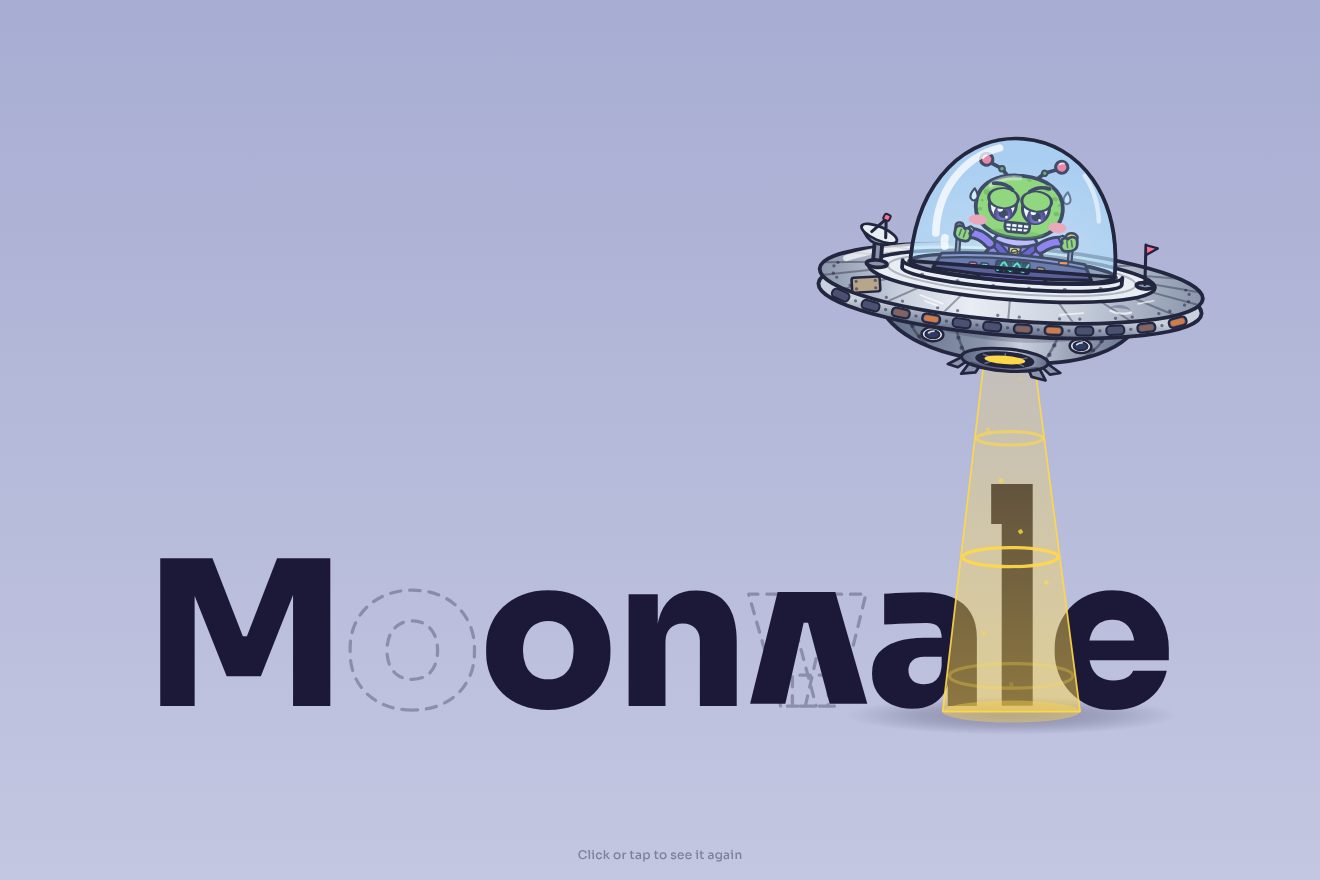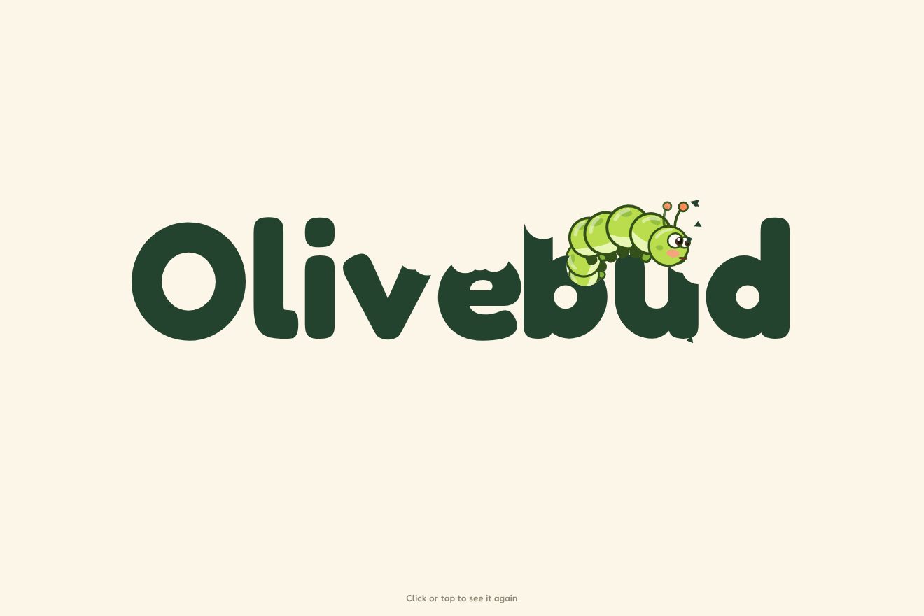
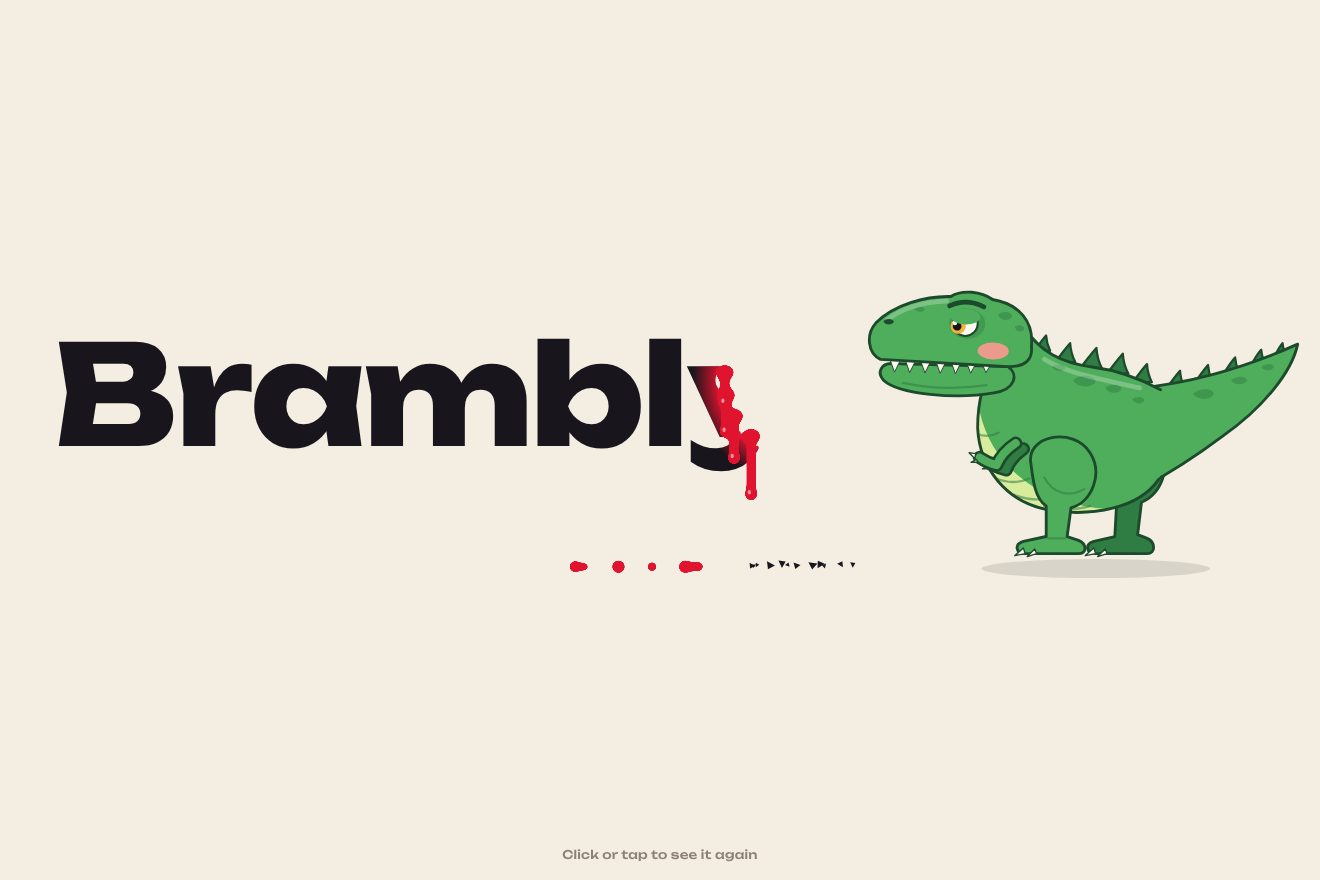
The dinosaur-bitten logo
Intro, SVG, Text
NewFree
A minimal-style logo intro made only of type: a thin line draws itself across the page, the horizon, and out of it grow the letters of the name, far apart, wide and light. Then they pull together: the outer ones leave first, each narrowing on the width axis and gaining weight as it travels, arriving a hair past its place and settling with a small nod, while the horizon shrinks under the name and turns vermilion.
A folder that runs on its own: index.html, style.css, script.js and the libraries from a CDN. The React and Vue tabs hold the same demo as a ready component, which switches its animations off when it leaves the page.
<!doctype html>
<html lang="en">
<head>
  <meta charset="utf-8">
  <meta name="viewport" content="width=device-width, initial-scale=1">
  <title>The logo that tightens from the horizon</title>
  <link rel="stylesheet" href="https://cdn.jsdelivr.net/npm/@fontsource-variable/archivo@5.3.0/wdth.css">
  <link rel="stylesheet" href="style.css">
</head>
<body>
  <main class="scena" data-stage>
    <p class="marca" data-entra><span>Halden</span> <span>Studio for quiet interiors</span></p>

    <h1 class="sr">Halden</h1>

    <!-- the horizon: one hairline across the page; the letters grow out of it far apart, very wide and light, then pull
         together, narrower and heavier, until they are the logo; the line shrinks under the name -->
    <div class="logo" data-logo aria-hidden="true">
      <div class="parola" data-word></div>
      <span class="orizzonte" data-line></span>
    </div>

    <p class="motto" data-tagline>Rooms with room to breathe.</p>

    <button class="pillola" type="button" data-replay>
      <span class="pillola__scritta" data-testo="Replay">Replay</span>
    </button>
  </main>

  <script src="https://cdn.jsdelivr.net/npm/gsap@3.15.0/dist/gsap.min.js"></script>
  <script src="script.js"></script>
</body>
</html>Change values, colours and text with the controls and watch the animation respond live. Or write in the code yourself. Then download the folder with your changes.
22 values to change
With the Animorio connector, Claude Code takes it from here, guide included, and fits it into your project. Paste this request:
Take “The logo that tightens from the horizon” from Animorio and fit it into my siteThe final places are measured once with the final axes (wdth 92, wght 640), in a hidden row: for each letter, the distance of its centre from the centre of the name. The starting places are equal steps across most of the page width. An empty box on the baseline tells where the letters stand, and the horizon and the shadows go there.
Each letter has a number, s, from 0 to 1: its position, width and weight all depend on it, so the letter narrows exactly while it gets closer and never bumps into its neighbours. GSAP animates only the numbers; a single draw pass every frame writes them on the outer letter (the movement) and the inner one (the axes and the squash).
s reaches 1.006 with power3.inOut and goes back to 1 with sine.inOut: over a few hundred pixels of travel that is a pixel or two too far, the settle. At the same moment the letter squashes by a pixel and springs back with elastic.out, and its shadow on the line darkens.
The line has two numbers: how much of it is drawn and how tight it is. Its scale is the first times a mix between the whole page and the width of the name, weighted by the second; so it is recomputed right even if the window changes size halfway. At the end it turns vermilion, the only colour.
| Name | File | Default | What it changes |
|---|---|---|---|
WORD | script.js | 'Halden' | The name: short, four to eight letters. |
SPREAD | script.js | 0.86 | How much of the page width the letters cover before they pull together. |
GROW_GAP | script.js | 0.09 | Seconds between one letter growing out of the line and the next. |
TIGHTEN | script.js | 1.25 | How many seconds the letters take to pull together. |
WIDE | script.js | 125 | The width (wdth axis) while they are far apart. |
NARROW | script.js | 92 | The width of the finished logo. |
LIGHT | script.js | 180 | The weight while they are far apart. |
HEAVY | script.js | 640 | The weight of the finished logo. |
BREATHE | script.js | 12 | How much wider the letters near the pointer get, at the end. |
HOLD | script.js | 3.2 | How many seconds the finished logo stays before the intro plays again. |
SPEED | script.js | 1 | 2 is twice as fast, 0.5 half as fast. |
For the opening or the loader of the site of an interior design studio, an architect, a furniture or fashion brand, anyone with a one-word wordmark who wants a calm, precise entrance.
The same animation: the name is smaller and the letters start spread over almost the whole screen width; at the end they widen under a sliding finger.
Nothing grows or travels: the logo appears already tight, with the vermilion horizon underneath, in a fade; then the motto and the Replay button.
GSAP 3.15.0, Archivo (font variabile) 5.3.0.
Compressed with gzip, the three demo files weigh 5.4 KB; the libraries: GSAP 28 KB.
Tested on 24 October 2026
Use it in your own projects and in your clients’ projects. Do not resell it or redistribute it as is. GSAP stays under its own Standard license. Full license.
With your account’s email and password.
or with your email
You’re signed in as .
With your account, you can download the zip of every animation and every pack, for free.