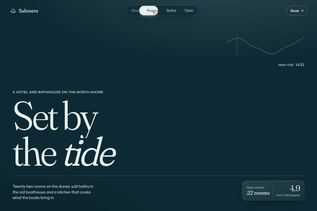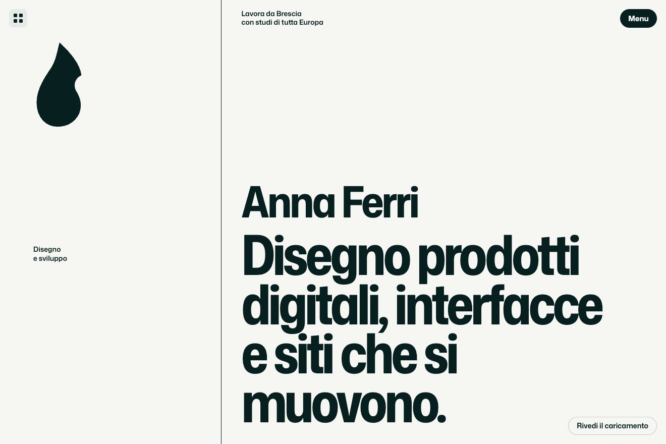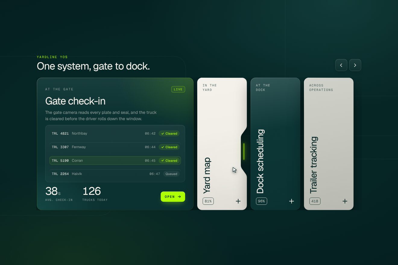
Notched feature cards
Hover, SVG, Transitions
The backup panel of a made-up app, Keelvault, on a warm white card. A single icon inside a ring tells the whole story, and its four strokes never disappear: they bend from one drawing into the next. A clock while it waits, two arrows spinning while it backs up (the ring fills, the three folders fill one after another, files and speed count up), two bars when paused, a triangle with an exclamation mark when the connection drops and a tick when it is done, with a light sweeping across the card. The colour follows the state.
A folder that runs on its own: index.html, style.css, script.js and the libraries from a CDN. The React and Vue tabs hold the same demo as a ready component, which switches its animations off when it leaves the page.
<!doctype html>
<!--
  "Backup status icon" from Animorio · https://animorio.com
  License: free on your own sites and your clients’ sites, paid work included.
  Not for resale, redistribution, templates or code collections · https://animorio.com/en/license/
-->
<html lang="en">
<head>
  <meta charset="utf-8">
  <meta name="viewport" content="width=device-width, initial-scale=1">
  <title>The backup status with the icon that changes shape at every step</title>
  <link rel="stylesheet" href="https://cdn.jsdelivr.net/npm/@fontsource-variable/mona-sans@5.3.0/wdth.css">
  <link rel="stylesheet" href="style.css">
</head>
<body>
  <main class="stage" data-stage>
    <!-- the backup widget of a made-up app, Keelvault. One icon tells the state: its four strokes bend from a clock
         (waiting) into two chasing arrows (backing up), two bars (paused), a triangle (connection lost) and a tick
         (backed up), while the ring around it fills with the progress -->
    <section class="card" data-card aria-label="Keelvault backup">
      <span class="card__sheen" data-sheen aria-hidden="true"></span>

      <header class="card__head">
        <span class="brand">
          <svg class="brand__mark" viewBox="0 0 20 20" aria-hidden="true">
            <path d="M3.5 7.5L10 3l6.5 4.5v6.8L10 17l-6.5-2.7z" />
            <path d="M3.5 7.5L10 10l6.5-2.5M10 10v7" />
          </svg>
          <span class="brand__name">Keelvault</span>
        </span>
        <span class="device">
          <svg viewBox="0 0 16 16" aria-hidden="true"><rect x="2.5" y="3.5" width="11" height="7.5" rx="1.2" /><path d="M1 13h14" /></svg>
          Studio laptop
        </span>
      </header>

      <div class="hero">
        <button class="dial" data-dial type="button" aria-label="Backup status">
          <svg class="dial__svg" viewBox="0 0 120 120" aria-hidden="true">
            <defs>
              <radialGradient id="dialFace" cx="50%" cy="38%" r="62%">
                <stop offset="0" stop-color="#ffffff" />
                <stop offset="1" stop-color="#eef0f4" />
              </radialGradient>
            </defs>
            <circle class="dial__face" cx="60" cy="60" r="44" fill="url(#dialFace)" />
            <circle class="dial__track" cx="60" cy="60" r="53" />
            <circle class="dial__ring" data-ring cx="60" cy="60" r="53" pathLength="1" />
            <circle class="dial__tip" data-tip cx="60" cy="7" r="3.2" />
            <g class="dial__icon" data-icon>
              <path class="stroke" data-a d="M60 38 a22 22 0 1 1 0 44 a22 22 0 1 1 0 -44" />
              <path class="stroke" data-b d="M60 60 L60 45" />
              <path class="stroke" data-c d="M60 60 L69 65" />
              <path class="stroke" data-d d="M60 60 L60 60.01" />
            </g>
          </svg>
        </button>

        <div class="status">
          <p class="status__title" data-title aria-live="polite"><span class="roll" data-roll>Next backup in 0:05</span></p>
          <p class="status__line" data-line>Last one: yesterday, 23:40</p>
        </div>
      </div>

      <ul class="folders" data-folders>
        <li class="folder">
          <span class="folder__name">Photos</span>
          <span class="folder__bar"><span data-bar></span></span>
          <span class="folder__size" data-size>9.4 GB</span>
        </li>
        <li class="folder">
          <span class="folder__name">Documents</span>
          <span class="folder__bar"><span data-bar></span></span>
          <span class="folder__size" data-size>2.1 GB</span>
        </li>
        <li class="folder">
          <span class="folder__name">Projects</span>
          <span class="folder__bar"><span data-bar></span></span>
          <span class="folder__size" data-size>7.1 GB</span>
        </li>
      </ul>

      <footer class="card__foot">
        <span class="speed" data-speed>Wi-Fi · Studio</span>
        <button class="pill" data-pill type="button"><span class="pill__fill" aria-hidden="true"></span><span class="pill__text" data-pill-text>Back up now</span></button>
      </footer>
    </section>

    <svg class="pointer" data-pointer viewBox="0 0 20 20" aria-hidden="true">
      <path d="M4.5 2.8l10.6 8.1-4.6.6 2.6 5.1-2.1 1-2.6-5.1-3.4 3.2z" />
    </svg>
  </main>

  <script src="https://cdn.jsdelivr.net/npm/gsap@3.15.0/dist/gsap.min.js"></script>
  <script src="https://cdn.jsdelivr.net/npm/gsap@3.15.0/dist/MorphSVGPlugin.min.js"></script>
  <script src="script.js"></script>
</body>
</html>Change values, colours and text with the controls and watch the animation respond live. Or write in the code yourself. Then download the folder with your changes.
30 values to change
With the Animorio connector, Claude Code, ChatGPT, Cursor or VS Code take it from here, guide included, and fit it into your project. Paste this request:
Take “Backup status icon” from Animorio and fit it into my siteEvery icon is made of the same four paths: the clock is circle, long hand, short hand and pin; the arrows are two arcs and two heads; pause is the circle and two bars; the error is triangle, stem and dot; the tick is circle and tick. Changing state means taking each path to its new shape with morphSVG in MORPH seconds on expo.inOut, and fading out the ones not needed.
While backing up the icon group turns with rotation +=360 and svgOrigin at the centre, repeating forever. When the state changes the turn stops at the next full turn with back.out, so the arrows land straight before becoming something else.
Progress is a number from 0 to 1 driven by a tween: on every update the ring takes stroke-dashoffset 1 minus the number (with pathLength 1), the dot runs along the circle, the three folders fill in a row by their weight in GB and files and speed are rewritten.
The colour is a CSS variable, --accent, that GSAP takes from one colour to the next on html: icon, ring, bars, dial shadow and button all read it, so they change together without touching them one by one.
The old title rises and leaves, the new one comes in from below with back.out inside a line that clips what sticks out; the button does the same with its label, shorter, and squashes on click with a spring.
| Name | File | Default | What it changes |
|---|---|---|---|
DURATION | script.js | 7 | Seconds for a whole backup, from 0 to 100%. |
MORPH | script.js | 0.6 | Seconds for the icon to bend into its next shape. |
SPIN | script.js | 1.4 | Seconds for one turn of the arrows while backing up. |
FAIL_AT | script.js | 0.62 | Where the connection drops on the first run (0 for never). |
COUNTDOWN | script.js | 5 | Seconds of countdown before the backup starts by itself. |
HOLD | script.js | 2.6 | Seconds the finished state stays before starting again. |
LOOP | script.js | true | Left alone, start the backup again. |
For a backup, sync or cloud storage app, or the panel of a long export or upload: wherever a task goes through several states and one icon that tells them all without moving is better.
The same animation with adapted sizes: the card takes almost the whole width, the dial shrinks with the screen height, below 460 pixels of height the third folder is left out and on narrow screens the speed. Tap the dial or the button.
No spinning arrows, no shake and no springs: the icon changes shape at once with a fade, the words fade, the ring and folders fill as always, because they are the data.
GSAP 3.15.0, MorphSVGPlugin 3.15.0, Mona Sans (font variabile) 5.3.0.
Compressed with gzip, the three demo files weigh 7.7 KB; the libraries: GSAP + MorphSVG 37 KB.
Tested on 8 November 2026
Use it in your own projects and in your clients’ projects. Do not resell it or redistribute it as is. GSAP stays under its own Standard license. Full license.
Support Animorio
Animorio stays free thanks to the people who support it. If you like, buy us a coffee: it helps us make the next animations.
You asked for
We made it for you: it’s in the library, with the preview, the Playground and the code to copy.
An animation you can’t find, or a site to take apart in the journal: tell us which. We pick the next ones from here.
With your account’s email and password.
or with your email
You’re signed in as .
With your account, you can download the zip of every animation and every pack, for free.