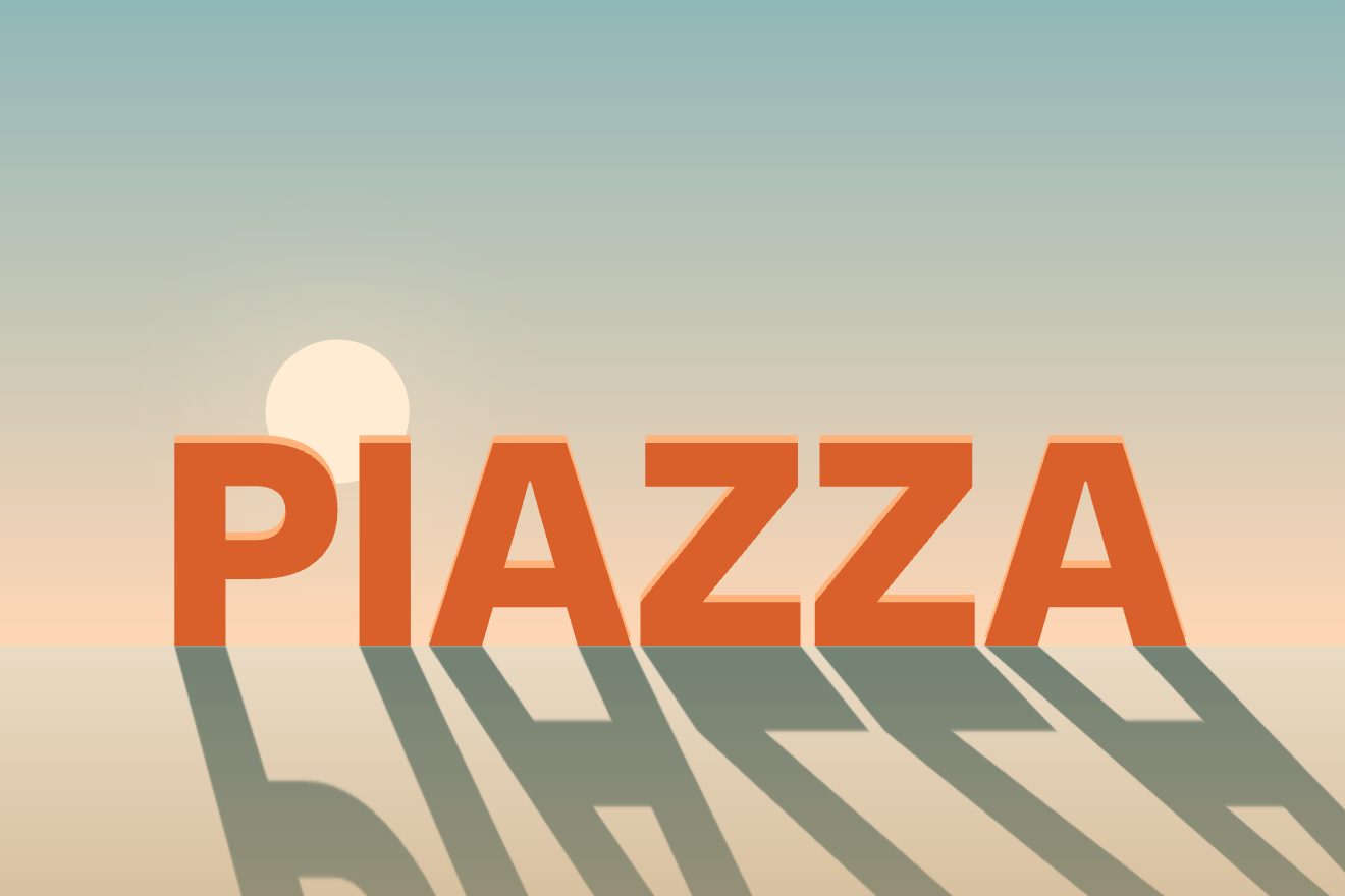
Standing letters with a long shadow
Text, Scroll, 3D
NewFree
An animated background to put behind a heading or a section: a black page covered in small letters, like a printer's halftone made of type. Bands of weight run slowly over the lines and the letters go from hairline to full black and back; where the pointer goes they swell, and the heaviest turn lemon yellow. Minimal style.
A folder that runs on its own: index.html, style.css, script.js and the libraries from a CDN. The React and Vue tabs hold the same demo as a ready component, which switches its animations off when it leaves the page.
<!doctype html>
<html lang="en">
<head>
  <meta charset="utf-8">
  <meta name="viewport" content="width=device-width, initial-scale=1">
  <title>Heft</title>
  <link rel="stylesheet" href="https://cdn.jsdelivr.net/npm/@fontsource-variable/roboto-flex@5.3.0/full.css">
  <link rel="stylesheet" href="style.css">
</head>
<body>
  <!-- the background: a grid of small letters on a canvas behind the page, like a halftone made of type; bands of
       weight run across them, so letters go from hairline to black and back, and they swell where the pointer goes -->
  <main class="pagina" data-pagina>
    <canvas class="fondo" aria-hidden="true" data-fondo></canvas>

    <header class="testa">
      <p class="marchio">Heft</p>
      <p class="testa__nota">A quarterly about type</p>
    </header>

    <section class="eroe">
      <div class="blocco" data-blocco>
        <p class="occhiello" data-entra>The autumn issue is out</p>
        <h1 class="titolo">
          <span class="riga"><span class="riga__dentro" data-riga>Words carry</span></span>
          <span class="riga"><span class="riga__dentro" data-riga>weight<span class="accento">.</span></span></span>
        </h1>
        <div class="azione" data-entra>
          <a class="pillola" href="#">
            <span class="pillola__scritta" data-testo="Read the new issue">Read the new issue</span>
            <svg class="pillola__freccia" viewBox="0 0 16 16" aria-hidden="true"><path d="M2.5 8h10.5M9 3.8 13.2 8 9 12.2" /></svg>
          </a>
        </div>
      </div>
    </section>
  </main>

  <script src="https://cdn.jsdelivr.net/npm/gsap@3.15.0/dist/gsap.min.js"></script>
  <script src="script.js"></script>
</body>
</html>Change values, colours and text with the controls and watch the animation respond live. Or write in the code yourself. Then download the folder with your changes.
23 values to change
With the Animorio connector, Claude Code takes it from here, guide included, and fits it into your project. Paste this request:
Take “The background of letters gaining weight” from Animorio and fit it into my siteDrawing thousands of letters with fillText and a different weight each would be slow. At the start each letter of TESTO is drawn once, on a hidden canvas, in nineteen weights from 100 to 1000 (canvas accepts the numeric weight of a variable font) and in two tints, the grey and the accent. Then each letter of the grid is just a drawImage from that sheet: thousands per frame stay light.
The letters sit on lines like a text: the step is AVANZA times the size horizontally and INTERLINEA times vertically, and each line starts three letters further on than the one before, so the columns do not line up. For each letter the distance from the heading and the header is measured once (a superellipse with a feather).
The weight is a wave: the sine of the distance along a diagonal, divided by BANDE, bent by two slower sines and pushed by the phase of a GSAP timeline GIRO seconds long, which comes back the same after a round. An exponent above 1 leaves more thin letters than heavy ones: the bands stay narrow and the page breathes.
The pointer adds GONFIA · e^(−d²/2·LARGO²) to the weight, on a spring (MOLLA). Where the swelling goes over 86% and the letter is among the heaviest, the stamp in the accent colour is used. Without the real pointer a fake walk tied to the round swells the letters instead.
A front starts from the middle and reaches the corners: before it the letters are not there, on the front a Gaussian ring takes them to full weight, behind it they settle on the weight of the bands. The heading lines rise with back.out while font-stretch goes from 140% to 88% and the weight from 100 to 760.
| Name | File | Default | What it changes |
|---|---|---|---|
TESTO | script.js | heft | The letters of the grid, repeated in a row. |
CORPO | script.js | 13 | The size of the letters, in px (a little less on a phone). |
AVANZA | script.js | 0.82 | The step from one letter to the next, as a fraction of the size. |
INTERLINEA | script.js | 1.32 | The step from one line to the next, as a fraction of the size. |
BANDE | script.js | 300 | The distance between bands of weight, in px. |
GIRO | script.js | 18 | How many seconds the bands take to come round to the same place. |
GONFIA | script.js | 1.1 | How much the letters near the pointer swell (0 not at all). |
LARGO | script.js | 120 | How wide the area the pointer swells is, in px. |
MOLLA | script.js | [70, 11] | The pointer's spring: how stiff and how damped. |
As the background of the first screen of a magazine, a writing blog, a type foundry, a graphic design studio, a print shop or a book fair; in general behind a short heading when you want a black that speaks of words. The letters are set in TESTO (the brand's name works well) and the two colours in the CSS.
The same animations with the sizes adapted: the letters are a little smaller and the lines closer, the heading smaller with its calm area. The finger swells the letters while it touches and drags; when it lifts the fake pointer comes back.
The letters are still, with the bands of weight in place: no flowing, no swelling, no opening wave. The heading, the small line and the pill fade in.
GSAP 3.15.0, Roboto Flex (font variabile) 5.3.0.
Compressed with gzip, the three demo files weigh 6.5 KB; the libraries: GSAP 28 KB.
Tested on 19 October 2026
Use it in your own projects and in your clients’ projects. Do not resell it or redistribute it as is. GSAP stays under its own Standard license. Full license.
With your account’s email and password.
or with your email
You’re signed in as .
With your account, you can download the zip of every animation and every pack, for free.