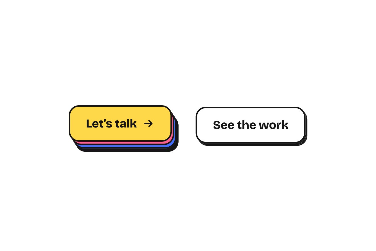
The layered button
Buttons, Hover, Physics
The tip at the end of a delivery order, on black: four pills, 10, 15, 20% and Custom, with a light indicator that slides from one to the next on a spring and stretches towards where it runs. Tip and total roll digit by digit, the thank-you line changes words and tone with the percentage, from a quiet grey to a warm orange; Custom widens, becomes a field with a caret and a numeric keypad rises from the bottom of the card.
A folder that runs on its own: index.html, style.css, script.js and the libraries from a CDN. The React and Vue tabs hold the same demo as a ready component, which switches its animations off when it leaves the page.
<!doctype html>
<!--
  "Tip selector" from Animorio · https://animorio.com
  License: free on your own sites and your clients’ sites, paid work included.
  Not for resale, redistribution, templates or code collections · https://animorio.com/en/license/
-->
<html lang="en">
<head>
  <meta charset="utf-8">
  <meta name="viewport" content="width=device-width, initial-scale=1">
  <title>The tip selector with the pills and the keypad that rises</title>
  <link rel="stylesheet" href="https://cdn.jsdelivr.net/npm/@fontsource-variable/mona-sans@5.3.0/wdth.css">
  <link rel="stylesheet" href="style.css">
</head>
<body>
  <main class="stage" data-stage>
    <!-- the tip at the end of a delivery order: four pills with a light indicator that slides on a spring,
         tip and total that roll digit by digit, a thank-you line that changes tone, and Custom that opens a field
         inside its pill while a numeric keypad rises from the bottom of the card -->
    <div class="scale" data-frame>
      <section class="card" data-card aria-label="Tip your courier">
        <span class="card__light" aria-hidden="true"></span>

        <header class="head">
          <span class="avatar" aria-hidden="true"><span class="avatar__in">IM</span></span>
          <div class="head__text">
            <p class="head__title">Tip Ines</p>
            <p class="head__meta">Delivered 12:48 · Kumo Noodle Bar</p>
          </div>
          <span class="head__order" data-order>$28.40</span>
        </header>

        <div class="seg" data-seg role="radiogroup" aria-label="Tip amount">
          <span class="seg__ind" data-ind aria-hidden="true"></span>
          <button class="pill" type="button" role="radio" aria-checked="false" data-pct="10">
            <span class="pill__face"><span class="pill__main">10%</span><span class="pill__sub" data-sub></span></span>
          </button>
          <button class="pill" type="button" role="radio" aria-checked="false" data-pct="15">
            <span class="pill__face"><span class="pill__main">15%</span><span class="pill__sub" data-sub></span></span>
          </button>
          <button class="pill" type="button" role="radio" aria-checked="false" data-pct="20">
            <span class="pill__face"><span class="pill__main">20%</span><span class="pill__sub" data-sub></span></span>
          </button>
          <button class="pill pill--custom" type="button" role="radio" aria-checked="false" aria-expanded="false" data-custom>
            <span class="pill__face pill__face--rest" data-rest><span class="pill__main">Custom</span><span class="pill__sub">Any amount</span></span>
            <span class="pill__face pill__face--field" data-fieldface aria-hidden="true">
              <span class="pill__main pill__main--field"><span class="roll" data-cval></span><span class="caret" data-caret></span></span>
              <span class="pill__sub">Custom</span>
            </span>
          </button>
        </div>

        <div class="rows">
          <div class="row">
            <span class="row__label">Tip</span>
            <span class="row__value roll" data-tip aria-live="polite"></span>
          </div>
          <div class="row row--total">
            <span class="row__label">Total</span>
            <span class="total roll" data-total></span>
          </div>
        </div>

        <p class="thanks" data-thanks aria-live="polite"></p>

        <div class="pad" data-pad>
          <div class="pad__in" data-padin>
            <button class="key" type="button" data-k="1">1</button>
            <button class="key" type="button" data-k="2">2</button>
            <button class="key" type="button" data-k="3">3</button>
            <button class="key" type="button" data-k="4">4</button>
            <button class="key" type="button" data-k="5">5</button>
            <button class="key" type="button" data-k="6">6</button>
            <button class="key" type="button" data-k="7">7</button>
            <button class="key" type="button" data-k="8">8</button>
            <button class="key" type="button" data-k="9">9</button>
            <button class="key key--back" type="button" data-k="back" aria-label="Delete">
              <svg viewBox="0 0 24 24" aria-hidden="true"><path d="M9 6h10.5a1.5 1.5 0 0 1 1.5 1.5v9a1.5 1.5 0 0 1-1.5 1.5H9l-5.5-6Z"></path><path d="M12.5 9.6l4.8 4.8M17.3 9.6l-4.8 4.8"></path></svg>
            </button>
            <button class="key" type="button" data-k="0">0</button>
            <button class="key key--done" type="button" data-k="done" aria-label="Done">
              <svg viewBox="0 0 24 24" aria-hidden="true"><path d="M6 12.4l4 4L18.2 8"></path></svg>
            </button>
          </div>
        </div>
      </section>
    </div>

    <svg class="ghost" data-ghost viewBox="0 0 24 24" aria-hidden="true"><path d="M5 3.2 19.2 11l-6.3 1.6-3.3 5.9Z"></path></svg>
  </main>

  <script src="https://cdn.jsdelivr.net/npm/gsap@3.15.0/dist/gsap.min.js"></script>
  <script src="script.js"></script>
</body>
</html>Change values, colours and text with the controls and watch the animation respond live. Or write in the code yourself. Then download the folder with your changes.
40 values to change
With the Animorio connector, Claude Code, ChatGPT, Cursor or VS Code take it from here, guide included, and fit it into your project. Paste this request:
Take “Tip selector” from Animorio and fit it into my siteThe indicator’s position and width chase those of the chosen pill with a damped spring (STIFFNESS and DAMPING), integrated in four steps per frame on GSAP’s ticker. The target is measured again every frame, so the indicator follows the Custom pill while it widens.
Speed stretches the indicator on the side it runs towards (STRETCH) and squashes it a few hundredths in height: when it stops it is as wide as the pill again.
Every character sits in a window one line high: when it changes, the old one leaves and the new one comes in with back.out, up or down depending on the number, the digits on the right a moment before those on the left.
The real percentage gives a sentence and a tone: colour, weight and the wdth axis of the variable font animate as CSS variables, the words leave and come back blurred one at a time and the light on the card’s edge grows stronger.
Custom takes more room with an animated flex-grow and its two faces swap; the keypad is a box zero high that opens to its measured height while the keys rise row by row. The amount is typed as at a till, in cents, up to 99.99.
| Name | File | Default | What it changes |
|---|---|---|---|
SUBTOTAL | script.js | 28.40 | The order before the tip, in dollars. |
CHOICES | script.js | 10,15,20 | The three percentages of the pills. |
START | script.js | 15 | The pill chosen at the start. |
NAME | script.js | Ines | The name of the courier to thank. |
STIFFNESS | script.js | 520 | How stiff the indicator’s spring is. |
DAMPING | script.js | 33 | How much the spring brakes: lower, it wobbles more. |
STRETCH | script.js | 0.035 | How much the indicator stretches while it runs. |
CUSTOM_GROW | script.js | 1.7 | How much the open Custom pill widens. |
ACCENT | script.js | #ff9b55 | The warm colour of generous tips, the check key and the caret. |
At the end of an order in a delivery app, at the till of a café or a restaurant, in the payment of a taxi or a home service: anywhere a tip is left among three handy choices and a free amount.
The card takes the screen width minus the margins, pills and keys get shorter with the window’s height and the open keypad stays inside the box. A tap does everything a click does.
Nothing moves: the indicator jumps straight onto the chosen pill, the digits change in place, the sentence and the keypad fade in and the caret stays still. The autopilot does not start.
GSAP 3.15.0, Mona Sans (font variabile) 5.3.0.
Compressed with gzip, the three demo files weigh 9.4 KB; the libraries: GSAP 28 KB.
Tested on 11 November 2026
Use it in your own projects and in your clients’ projects. Do not resell it or redistribute it as is. GSAP stays under its own Standard license. Full license.
Support Animorio
Animorio stays free thanks to the people who support it. If you like, buy us a coffee: it helps us make the next animations.
You asked for
We made it for you: it’s in the library, with the preview, the Playground and the code to copy.
An animation you can’t find, or a site to take apart in the journal: tell us which. We pick the next ones from here.
With your account’s email and password.
or with your email
You’re signed in as .
With your account, you can download the zip of every animation and every pack, for free.