Guide
Button hover and micro-interactions: timing, springs and states
A well animated button has four moments: when the pointer arrives, when the finger presses, while the action runs and when it settles back. How long each should last, why springs feel better than curves, how to write hover only for people with a mouse, and how to keep anyone from waiting.
 Weighted press button
Buttons are the most touched part of any website, which is exactly why a bad animation on them stands out. A slow hover makes the page feel sticky, a press you cannot see gets clicked twice, a harsh return looks like a rubber band snapping. Button micro-interactions are not decoration: they are how an interface says “I heard you”. This guide takes them apart one at a time, with the timings we use in the Animorio library and the code to build them.
The four states of a button
Before animating anything, list the states, because each one has a different job.
Rest. The button has to look clickable without moving: shape, colour and contrast do all the work. A button that pulses or moves on its own catches the eye once and then becomes tiring.
Approach. When the pointer comes over it, the button confirms it understood: it brightens, grows a touch, the arrow shifts a few pixels. This is the most delicate state, because people who pass over a button often do not mean to click it.
Press. The moment the finger or key goes down, the button dips. This response has to be immediate; it is the one that says “the click landed”.
Outcome. After the click the button tells you what happened: working, done, failed. It is the most neglected state and the most useful one.
Timing: short on the way in, soft on the way back
The durations that work are shorter than most people expect. These are our starting values, and we only change them after trying them by hand.
- Approach: 150 to 250 milliseconds.
- Press: 60 to 100 milliseconds, close to instant.
- Release after a press: 300 to 500 milliseconds, with a small bounce.
- Pointer leaving: a little slower than arriving, 250 to 400 milliseconds.
The asymmetry is deliberate. Someone arriving on a button wants a quick answer; when they leave, a softer return keeps the button from snapping under the eye. In CSS you get it by giving different transitions to the normal and hover states: the transition declared on the state you are moving to is the one that applies.
.button {
  transition: transform 0.35s cubic-bezier(0.34, 1.56, 0.64, 1),
              background-color 0.3s ease;
}
@media (hover: hover) and (pointer: fine) {
  .button:hover {
    transform: translateY(-2px);
    background-color: var(--accent-light);
    transition-duration: 0.18s;
  }
}
.button:active {
  transform: translateY(1px) scale(0.98);
  transition-duration: 0.06s;
}
The curve cubic-bezier(0.34, 1.56, 0.64, 1) overshoots the end slightly and comes back, which is the simplest way to get a bounce in plain CSS.
Hover only for people with a mouse
Phones have no hovering pointer. For compatibility, mobile browsers apply :hover on the first tap and keep it until you tap somewhere else, so the button stays “lit” after a click and links sometimes need a second tap. The fix is to wrap every hover rule in a media query that asks for a device able to hover precisely.
@media (hover: hover) and (pointer: fine) {
  .card:hover .card__arrow { transform: translateX(4px); }
}
On phones, feedback moves to the press. :active works on touch as long as the page has a touchstart listener or the CSS sets touch-action: manipulation, which also removes the double-tap delay.
Springs: why they feel real
An animation curve has a fixed duration: the movement always ends after the same time, whatever happens. A spring has stiffness and damping instead, and the duration takes care of itself. The difference shows when an animation is interrupted. If the pointer goes in and out quickly, a curve restarts or jumps, while a spring carries on from wherever it is, with whatever speed it has. That is why phone interfaces use springs almost everywhere.
GSAP has no true spring, but quickTo gets very close: it creates a function you call on every movement, and it chases the new value without starting from zero.
const button = document.querySelector('.magnetic');
const x = gsap.quickTo(button, 'x', { duration: 0.5, ease: 'elastic.out(1, 0.4)' });
const y = gsap.quickTo(button, 'y', { duration: 0.5, ease: 'elastic.out(1, 0.4)' });

button.addEventListener('pointermove', (e) => {
  const r = button.getBoundingClientRect();
  x((e.clientX - r.left - r.width / 2) * 0.3);
  y((e.clientY - r.top - r.height / 2) * 0.3);
});
button.addEventListener('pointerleave', () => { x(0); y(0); });
This is the core of the magnetic button: the button leans a third of the way toward the pointer, the label inside a little further, and when the pointer leaves it springs back with a short wobble. The 0.3 factor matters. Push it higher and the button chases the pointer and becomes hard to hit.
Animate the contents, not just the box
The best buttons do not move everything at once. They move one part and let the rest follow with a slight delay: a label that travels a bit further than its background, an icon that turns while the button widens, letters that change weight one by one. In the button with weight under the finger the letters near the pointer gain weight as if under a lens, each on its own spring, and the pill widens as much as the heavier letters need. It takes a variable font and one CSS property per letter.
const letters = [...document.querySelectorAll('.button span')];
const weights = letters.map((l) => gsap.quickTo(l, '--weight', { duration: 0.4, ease: 'power3.out' }));

button.addEventListener('pointermove', (e) => {
  letters.forEach((l, i) => {
    const r = l.getBoundingClientRect();
    const d = Math.abs(e.clientX - (r.left + r.width / 2));
    weights[i](Math.max(350, 800 - d * 6));
  });
});
In the CSS each letter reads the variable: font-variation-settings: 'wght' var(--weight). This only works with a real variable font that has a weight axis. With a regular font the browser jumps between weights with nothing in between.
The outcome state: showing that something happened
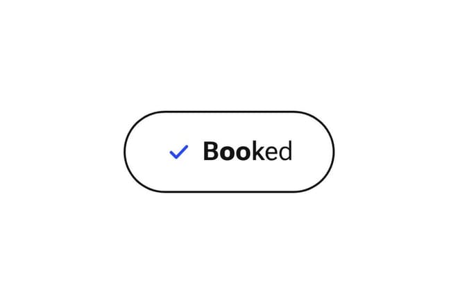
After the click the button has one more job: saying how it went, without making people look elsewhere. Three pieces in the library show three different cases.
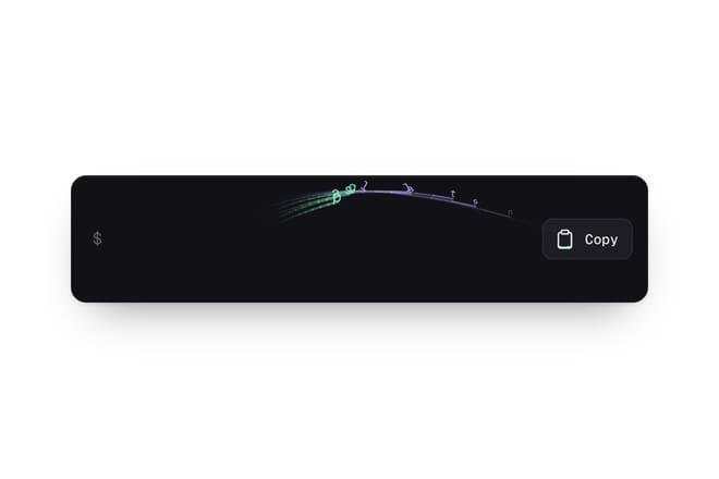
The copy button confirms an action you cannot see. Copying text changes nothing on the page, so the button has to show it happened: the characters fly into the clipboard icon, which fills up and turns into a tick. A couple of seconds later it goes back to normal, ready for another copy.
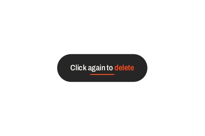
The button that asks twice guards an action that cannot be undone. The first click deletes nothing: the label becomes “Click again to delete” and the pill stretches, and the time left to answer is the space that remains, shrinking over three seconds. It is faster than a confirmation dialog and clearer than a written warning.
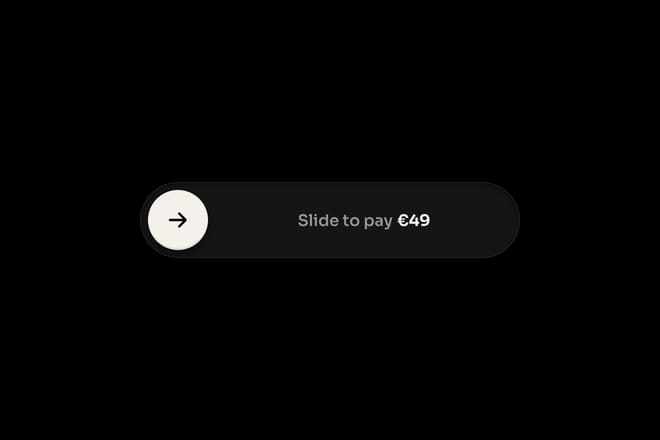
The slide-to-confirm button asks for a long gesture for an important action such as confirming a payment. Let go too early and it runs back, so a mistake costs little and is understood at once.
All three follow the same rule: the outcome is also written as text, not only shown as a shape. An icon that becomes a tick should come with a label or an aria-label that changes too, so people who cannot see the animation still know what happened.
Pressing with the keyboard
Keyboard users trigger buttons with Enter or the space bar and deserve the same feedback as people who click. :active fires with the space bar but not with Enter in every browser, so for JavaScript-driven animations listen to pointerdown and keydown together. And never remove the focus outline. Style it to suit the site, with :focus-visible so it only appears for keyboard users.
.button:focus-visible {
  outline: 2px solid var(--accent);
  outline-offset: 4px;
}
Common mistakes
Moving the button out from under the pointer. A hover that lifts a button by ten pixels slides it away from the pointer, so the hover ends, the button drops back, the hover starts again: an endless flicker. Keep hover movement under 3 or 4 pixels, or apply it to a child while the clickable area stays put.
Animating width, padding or margin. Every frame recalculates the layout of the whole row. To widen a button, scale a separate background layer with transform, or only animate width where nothing around it reflows.
Bounces everywhere. A bounce gives character to the main call to action; ten bouncing buttons make people seasick. Secondary buttons and inline links want plain transitions.
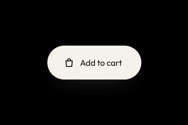
No feedback while waiting. If the action needs the server, the button should change state on the click, not when the response arrives. The add to cart button starts straight away with the bag flying off, and the number updates once the server has confirmed.
Try it with your hand
You cannot judge micro-interactions by watching a video. You judge them by using them, a hundred times in a row, with a mouse and with a finger. Every button in the library has a Playground with knobs for timing, distance and bounce: try it by hand, tune it until you stop noticing it, and only then copy the code. A good button is the one you only notice when it is missing.
Try them in the library
The pieces this guide mentions, with the live demo, the knobs and the code.