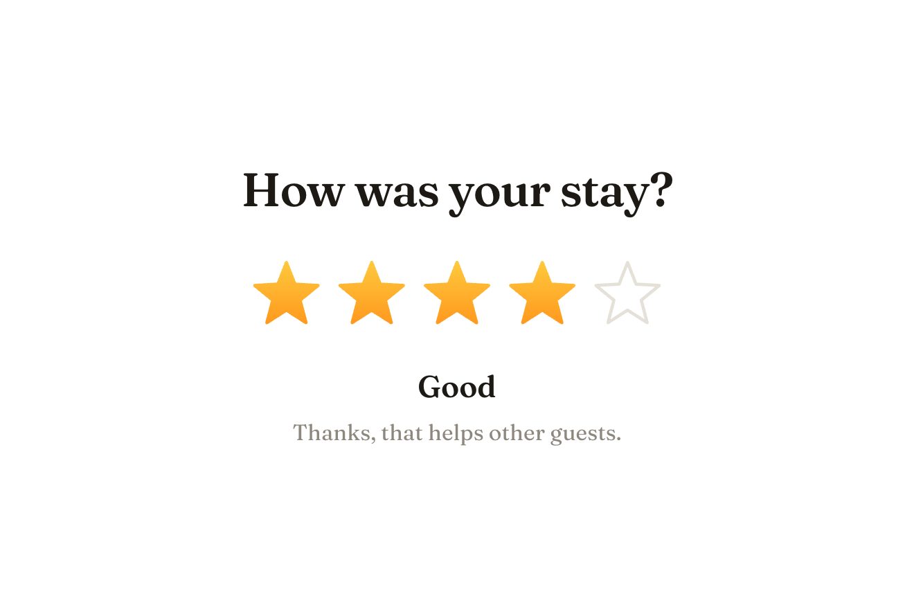
The star rating
Ratings, SVG, Hover
The button at the end of a lesson in an online course: a light pill with the course ring, the lesson’s title and the percentage done. Pressed, a blue tint leaves the ring and floods the pill, the ring advances by one lesson while the percentage counts, a green tick draws itself in the centre and the label says which lesson comes next.
A folder that runs on its own: index.html, style.css, script.js and the libraries from a CDN. The React and Vue tabs hold the same demo as a ready component, which switches its animations off when it leaves the page.
<!doctype html>
<!--
  "Complete lesson button" from Animorio · https://animorio.com
  License: free on your own sites and your clients’ sites, paid work included.
  Not for resale, redistribution, templates or code collections · https://animorio.com/en/license/
-->
<html lang="en">
<head>
  <meta charset="utf-8">
  <meta name="viewport" content="width=device-width, initial-scale=1">
  <title>Complete lesson button with the course ring that advances</title>
  <link rel="stylesheet" href="https://cdn.jsdelivr.net/npm/@fontsource-variable/mona-sans@5.3.0/wdth.css">
  <link rel="stylesheet" href="style.css">
</head>
<body>
  <main class="stage">
    <!-- the button at the end of a lesson in an online course: pressed, a tint leaves the ring and floods the pill,
         the course ring advances by one lesson while the percentage counts, a tick draws itself and the label
         says which lesson comes next -->
    <button class="crs" type="button" data-crs>
      <span class="crs__body" aria-hidden="true"><span class="crs__wash" data-wash></span><span class="crs__light"></span></span>
      <span class="crs__edge" aria-hidden="true"></span>

      <span class="seat" data-seat aria-hidden="true">
        <svg viewBox="0 0 24 24">
          <circle class="seat__track" cx="12" cy="12" r="10.2"></circle>
          <circle class="seat__ring" data-ring cx="12" cy="12" r="10.2" pathLength="1" transform="rotate(-90 12 12)"></circle>
          <path class="seat__play" data-play d="M10 8.300 15.600 12 10 15.700Z"></path>
          <path class="seat__tick" data-tick pathLength="1" d="M8.2 12.4 10.9 15 15.9 9.4"></path>
        </svg>
      </span>

      <span class="label">
        <span class="label__main"><span data-word>Complete lesson</span></span>
        <span class="label__sub"><span data-sub>Colour and contrast</span></span>
      </span>
      <span class="tag" aria-hidden="true"><span data-pct>58%</span></span>
    </button>
    <p class="sr" data-live aria-live="polite"></p>

    <svg class="ghost" data-ghost viewBox="0 0 24 24" aria-hidden="true"><path d="M5 3.2 19.2 11l-6.3 1.6-3.3 5.9Z"></path></svg>
  </main>

  <script src="https://cdn.jsdelivr.net/npm/gsap@3.15.0/dist/gsap.min.js"></script>
  <script src="script.js"></script>
</body>
</html>Change values, colours and text with the controls and watch the animation respond live. Or write in the code yourself. Then download the folder with your changes.
16 values to change
With the Animorio connector, Claude Code, ChatGPT, Cursor or VS Code take it from here, guide included, and fit it into your project. Paste this request:
Take “Complete lesson button” from Animorio and fit it into my siteThe course progress is one number between 0 and 1 (lessons done over LESSONS). The same function shortens the ring’s stroke-dashoffset and rewrites the percentage: on press, the number goes to the next lesson with power3.out, no spring.
Inside the pill there is a coloured layer clipped with clip-path: circle() centred on the ring: the radius goes from 0 to 360 pixels, so the colour seems to come out of the ring.
The triangle scales to zero, the tick draws itself with stroke-dashoffset, seat and pill make a small elastic bounce and a class takes ring and tint to green; the two lines roll to the new text.
| Name | File | Default | What it changes |
|---|---|---|---|
LESSONS | script.js | 12 | How many lessons the course has. |
DONE_SO_FAR | script.js | 7 | How many are already done before this one. |
LESSON | script.js | Colour and contrast | The lesson being completed (invented). |
NEXT | script.js | Type on a grid | The lesson that comes next (invented). |
ACCENT | script.js | #2f6bff | The colour of the course ring. |
OK | script.js | #12a868 | The colour once the lesson is completed. |
HOLD | script.js | 2.6 | On its own: how many seconds the summary stays before going back. |
LOOP | script.js | true | Left alone, a pointer tries it by itself. |
For an online school, a course platform, an app for learning a language or an instrument: the button at the end of the lesson, which shows the course advancing. It also suits the steps of a sign-up, a guide’s chapters, the stages of a training plan.
The same button: the pill takes at most the screen width minus the margins; it is pressed with a finger and there is no light under the pointer.
No spreading tint or bounces: the colour fades in, the ring and the percentage go to the new value at once, labels and tick change in place.
GSAP 3.15.0, Mona Sans (font variabile) 5.3.0.
Compressed with gzip, the three demo files weigh 5.2 KB; the libraries: GSAP 28 KB.
Tested on 15 November 2026
Use it in your own projects and in your clients’ projects. Do not resell it or redistribute it as is. GSAP stays under its own Standard license. Full license.
Support Animorio
Animorio stays free thanks to the people who support it. If you like, buy us a coffee: it helps us make the next animations.
You asked for
We made it for you: it’s in the library, with the preview, the Playground and the code to copy.
An animation you can’t find, or a site to take apart in the journal: tell us which. We pick the next ones from here.
With your account’s email and password.
or with your email
You’re signed in as .
With your account, you can download the zip of every animation and every pack, for free.