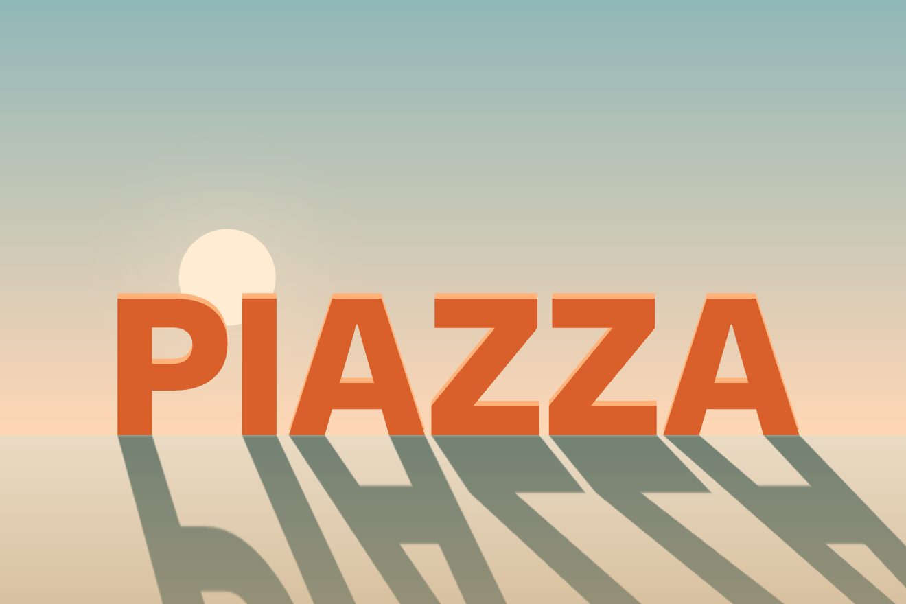
Long shadow letters
Text, Scroll, 3D
A minimal text animation built on the rule every typesetter knows: small type wants air, big type wants its letters close. A word arrives as a small label, light and widely spaced, with a thin rule under it that measures it; then it grows into the headline and, as it grows, its spacing closes and its weight rises, letter by letter from the middle, one pixel too far and back. The rule follows the width and takes the accent at the end; under the pointer the letters open up a little.
A folder that runs on its own: index.html, style.css, script.js and the libraries from a CDN. The React and Vue tabs hold the same demo as a ready component, which switches its animations off when it leaves the page.
<!doctype html>
<!--
  "Tightening headline" from Animorio · https://animorio.com
  License: free on your own sites and your clients’ sites, paid work included.
  Not for resale, redistribution, templates or code collections · https://animorio.com/en/license/
-->
<html lang="en">
<head>
  <meta charset="utf-8">
  <meta name="viewport" content="width=device-width, initial-scale=1">
  <title>The headline that tightens as it grows</title>
  <link rel="stylesheet" href="https://cdn.jsdelivr.net/npm/@fontsource-variable/mona-sans@5.3.0/wdth.css">
  <link rel="stylesheet" href="style.css">
</head>
<body>
  <main class="scena" data-stage>
    <!-- the word: it starts as a small, widely spaced label and grows into the headline, closing its spacing as it grows -->
    <div class="palco">
      <h1 class="parola" data-word aria-label="Closer"></h1>
      <!-- the thin rule that measures the word, with a tick at each end -->
      <div class="misura" data-rule>
        <span class="linea" data-line></span>
        <span class="tacca" data-tick-a></span>
        <span class="tacca" data-tick-b></span>
      </div>
    </div>
    <p class="nota" data-note>Hover the letters, click to start again</p>
  </main>

  <script src="https://cdn.jsdelivr.net/npm/gsap@3.15.0/dist/gsap.min.js"></script>
  <script src="script.js"></script>
</body>
</html>Change values, colours and text with the controls and watch the animation respond live. Or write in the code yourself. Then download the folder with your changes.
16 values to change
With the Animorio connector, Claude Code, ChatGPT, Cursor or VS Code take it from here, guide included, and fit it into your project. Paste this request:
Take “Tightening headline” from Animorio and fit it into my siteThe word is always set at headline size (a clamp with vw and vh) and GSAP scales it down for the label. So the spacing, written in em as a margin after each letter, stays relative to the headline: 0.34 em in the label, -0.035 in the headline.
Size, spacing, the colour of the rule and the weight of each letter are numbers in an object. GSAP animates only those; one draw per frame, in the ticker, writes them: scale on the word, margin-right and font-variation-settings on the letters.
The size reaches 1 plus 1.2 pixels over the type size, one pixel too many, and goes back to 1 with sine.inOut; the spacing drops 0.009 em below the mark and comes back up. Each letter’s weight starts with a delay that grows from the middle, overshoots by 26 and returns.
Every frame the width of the rule is the word’s offsetWidth times its scale: so it follows the growth, the spacing and even the letters opening under the pointer. Its colour goes from grey to orange by mixing the two colours by hand.
Every gap between two letters has its own spring (stiffness 260, damping 20) chasing how close the pointer is, with a Gaussian bell almost a letter wide. The invisible pointer is a number GSAP passes over the word while it rests.
| Name | File | Default | What it changes |
|---|---|---|---|
WORD | script.js | Closer | The word. |
START_SIZE | script.js | 0.16 | How small the label starts, compared with the headline. |
START_SPACING | script.js | 0.34 | The spacing of the label, in em. |
END_SPACING | script.js | -0.035 | The spacing of the headline, in em: below zero is tighter than the type. |
START_WEIGHT | script.js | 340 | The weight of the label. |
WEIGHT | script.js | 720 | The weight of the headline. |
OPEN | script.js | 0.06 | How much the letters near the pointer open up, in em. |
SPEED | script.js | 1 | 2 = twice as fast, 0.5 = half as fast. |
REST | script.js | 3.4 | How many seconds the headline stays before turning back into the label. |
LOOP | script.js | true | Turn back into the label and start again. |
For the opening of a type foundry, a design studio or a portfolio, for a page headline that should say care for detail without filling the page.
The same animation with adapted sizes: the word is as big as the box allows, in width and height, and the letters open up under the finger.
The headline appears already big and tight, with the orange rule, in a fade; the letters do not open under the pointer.
GSAP 3.15.0, Mona Sans (font variabile) 5.3.0.
Compressed with gzip, the three demo files weigh 5.2 KB; the libraries: GSAP 28 KB.
Tested on 30 October 2026
Use it in your own projects and in your clients’ projects. Do not resell it or redistribute it as is. GSAP stays under its own Standard license. Full license.
Support Animorio
Animorio stays free thanks to the people who support it. If you like, buy us a coffee: it helps us make the next animations.
You asked for
We made it for you: it’s in the library, with the preview, the Playground and the code to copy.
An animation you can’t find, or a site to take apart in the journal: tell us which. We pick the next ones from here.
With your account’s email and password.
or with your email
You’re signed in as .
With your account, you can download the zip of every animation and every pack, for free.