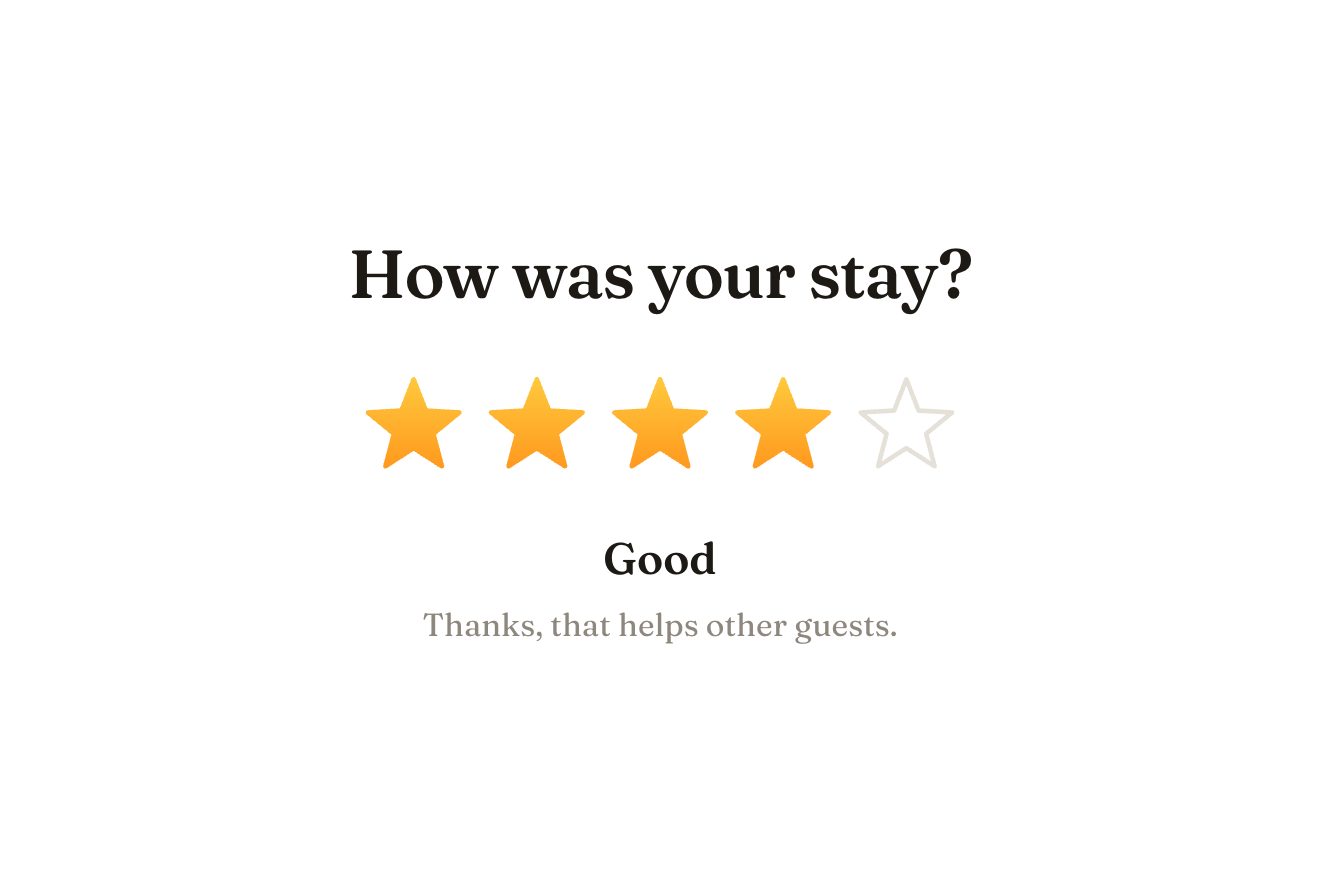
The star rating
Ratings, SVG, Hover
A group of checkboxes for an app’s settings, with the ‘All notifications’ checkbox on top: each box fills from its middle on a spring while its tick draws itself and a ring leaves it; the select all box shows a dash while only some are on, and the same stroke bends into a tick when the last one joins. Pressed, it switches them all on or off one after the other, and the number beside it rolls.
A folder that runs on its own: index.html, style.css, script.js and the libraries from a CDN. The React and Vue tabs hold the same demo as a ready component, which switches its animations off when it leaves the page.
<!doctype html>
<!--
  "Notification checkboxes" from Animorio · https://animorio.com
  License: free on your own sites and your clients’ sites, paid work included.
  Not for resale, redistribution, templates or code collections · https://animorio.com/en/license/
-->
<html lang="en">
<head>
  <meta charset="utf-8">
  <meta name="viewport" content="width=device-width, initial-scale=1">
  <title>Notification checkboxes with a select all box that goes from dash to tick</title>
  <link rel="stylesheet" href="https://cdn.jsdelivr.net/npm/@fontsource-variable/mona-sans@5.3.0/wdth.css">
  <link rel="stylesheet" href="style.css">
</head>
<body>
  <main class="stage">
    <!-- a group of checkboxes with a parent on top: each box fills from its middle on a spring while its tick draws
         itself and a ring leaves the box; the parent shows a dash while only some are on, and the same stroke bends
         into a tick when the last one joins; pressed, the parent switches them all one after the other -->
    <fieldset class="group" data-group>
      <legend class="sr">Notifications</legend>

      <label class="row row--all" data-row>
        <input class="row__input" type="checkbox" data-all>
        <span class="box" data-box aria-hidden="true">
          <span class="box__ring"></span>
          <span class="box__fill"></span>
          <svg viewBox="0 0 22 22"><path pathLength="1"></path></svg>
        </span>
        <span class="row__text"><span class="row__name">All notifications</span></span>
        <span class="count" aria-hidden="true"><span class="count__n" data-count>1</span> selected</span>
        <span class="row__sheen" aria-hidden="true"></span>
      </label>

      <div class="rows">
        <label class="row" data-row>
          <input class="row__input" type="checkbox" data-item checked>
          <span class="box" data-box aria-hidden="true">
            <span class="box__ring"></span>
            <span class="box__fill"></span>
            <svg viewBox="0 0 22 22"><path pathLength="1"></path></svg>
          </span>
          <span class="row__text"><span class="row__name">Mentions</span><span class="row__note">When someone tags you</span></span>
        </label>
        <label class="row" data-row>
          <input class="row__input" type="checkbox" data-item>
          <span class="box" data-box aria-hidden="true">
            <span class="box__ring"></span>
            <span class="box__fill"></span>
            <svg viewBox="0 0 22 22"><path pathLength="1"></path></svg>
          </span>
          <span class="row__text"><span class="row__name">Comments</span><span class="row__note">Replies on your files</span></span>
        </label>
        <label class="row" data-row>
          <input class="row__input" type="checkbox" data-item>
          <span class="box" data-box aria-hidden="true">
            <span class="box__ring"></span>
            <span class="box__fill"></span>
            <svg viewBox="0 0 22 22"><path pathLength="1"></path></svg>
          </span>
          <span class="row__text"><span class="row__name">Weekly digest</span><span class="row__note">Every Monday morning</span></span>
        </label>
        <label class="row" data-row>
          <input class="row__input" type="checkbox" data-item>
          <span class="box" data-box aria-hidden="true">
            <span class="box__ring"></span>
            <span class="box__fill"></span>
            <svg viewBox="0 0 22 22"><path pathLength="1"></path></svg>
          </span>
          <span class="row__text"><span class="row__name">Product news</span><span class="row__note">Releases and tips</span></span>
        </label>
      </div>
    </fieldset>
    <p class="sr" data-live aria-live="polite"></p>

    <svg class="ghost" data-ghost viewBox="0 0 24 24" aria-hidden="true"><path d="M5 3.2 19.2 11l-6.3 1.6-3.3 5.9Z"></path></svg>
  </main>

  <script src="https://cdn.jsdelivr.net/npm/gsap@3.15.0/dist/gsap.min.js"></script>
  <script src="script.js"></script>
</body>
</html>Change values, colours and text with the controls and watch the animation respond live. Or write in the code yourself. Then download the folder with your changes.
26 values to change
With the Animorio connector, Claude Code, ChatGPT, Cursor or VS Code take it from here, guide included, and fit it into your project. Paste this request:
Take “Notification checkboxes” from Animorio and fit it into my siteEach row is a label with its own checkbox input, invisible but real: keyboard, screen readers and forms work on their own. The drawn box is a span next to it, with a fill, a ring and an SVG stroke. The select all box uses the indeterminate property while only some are on.
Tick and dash are the same stroke: three points, written into the d attribute every frame. To go from dash to tick GSAP takes each coordinate from one shape to the other with back.out, so the stroke bends and slightly overshoots.
On press the box drops to 0.86 and comes back with back.out; the fill grows from 0.2 to 1 with the same bounce (BOUNCE), the tick draws itself in DRAW seconds with stroke-dashoffset and pathLength 1, and a ring of the same colour widens to RING and fades.
The select all box changes the real state of every input at once, but each one’s animation starts CASCADE seconds after the one before: the data is right immediately, the movement cascades down.
The old number leaves upwards when the count rises and downwards when it falls, the new one comes in from the other side with back.out. When all are on a light crosses the row and the pill takes the colour with color-mix.
| Name | File | Default | What it changes |
|---|---|---|---|
ACCENT | script.js | #f2542d | The colour of the checked boxes. |
DRAW | script.js | 0.32 | How many seconds the tick takes to draw. |
BOUNCE | script.js | 2.4 | How far the box overshoots when it fills: 0 = no bounce. |
CASCADE | script.js | 0.07 | How many seconds between one box and the next when all are selected. |
RING | script.js | 1.9 | How far the ring leaving the box widens: 1 = hidden. |
LOOP | script.js | true | Left alone, the boxes try themselves out. |
For the settings of an app or a dashboard, notification preferences, the consents of a sign up form, the filters of a list: wherever several items can be chosen and one box takes them all.
The same component: the panel takes the screen width minus the margins, the rows stay at least 44 pixels tall and the height also follows the window’s. The whole row can be tapped, not just the box.
No springs and no movement: fill and tick fade in, the dash becomes a tick without bending, all the boxes change together and the number updates in place.
GSAP 3.15.0, Mona Sans (font variabile) 5.3.0.
Compressed with gzip, the three demo files weigh 5.8 KB; the libraries: GSAP 28 KB.
Tested on 13 November 2026
Use it in your own projects and in your clients’ projects. Do not resell it or redistribute it as is. GSAP stays under its own Standard license. Full license.
Support Animorio
Animorio stays free thanks to the people who support it. If you like, buy us a coffee: it helps us make the next animations.
You asked for
We made it for you: it’s in the library, with the preview, the Playground and the code to copy.
An animation you can’t find, or a site to take apart in the journal: tell us which. We pick the next ones from here.
With your account’s email and password.
or with your email
You’re signed in as .
With your account, you can download the zip of every animation and every pack, for free.