The star rating
Ratings, SVG, Hover
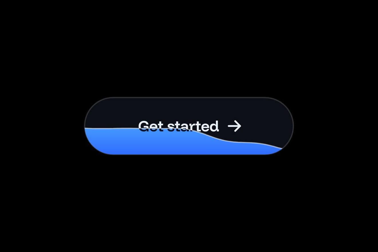
The button to open a tab at the counter of a made-up cocktail bar, the Lantern Room: you leave your card and order all evening without paying every round. On the tap, the little card drawn in the dark pill slips into the slot and a light runs along the slot while the bar holds the card. Then the pill floods with whisky amber starting from the slot, a cocktail coupe with its peel rises out of the slot, the label becomes Tab open · $0.00 and the paper check with the name, the time and the total comes up from behind the pill on its brass clip, settling a little crooked. Another tap closes the tab and the card comes back out.
A folder that runs on its own: index.html, style.css, script.js and the libraries from a CDN. The React and Vue tabs hold the same demo as a ready component, which switches its animations off when it leaves the page.
<!doctype html>
<!--
  "Open a bar tab button" from Animorio · https://animorio.com
  License: free on your own sites and your clients’ sites, paid work included.
  Not for resale, redistribution, templates or code collections · https://animorio.com/en/license/
-->
<html lang="en">
<head>
  <meta charset="utf-8">
  <meta name="viewport" content="width=device-width, initial-scale=1">
  <title>The Open a tab button of the cocktail bar with the card that slips in and the coupe that rises</title>
  <link rel="stylesheet" href="https://cdn.jsdelivr.net/npm/@fontsource-variable/mona-sans@5.3.0/wdth.css">
  <link rel="stylesheet" href="style.css">
</head>
<body>
  <main class="stage">
    <!-- one gesture: open a tab at the bar. Pressed, the card slips into the slot and a light runs along it while
         the bar holds the card; the pill floods with whisky amber, a coupe rises out of the slot and the paper
         check with your name comes up from behind the pill on its brass clip. Pressed again, it all goes back -->
    <div class="frame" data-wrap>
      <div class="rise" data-rise aria-hidden="true">
        <div class="check" data-check>
          <div class="check__tilt" data-tilt>
            <svg class="check__clip" viewBox="0 0 34 16"><path class="clip__back" d="M5 14.5V5.2C5 3.4 6.4 2 8.2 2h17.6C27.6 2 29 3.4 29 5.2v9.3"></path><path class="clip__face" d="M3 15V7.6C3 6.2 4.2 5 5.6 5h22.8C29.8 5 31 6.2 31 7.6V15Z"></path><path class="clip__hinge" d="M8 9.6h18"></path></svg>
            <div class="check__paper">
              <span class="check__house">Lantern Room</span>
              <span class="check__name">Tab<span class="check__sep">·</span>Mara</span>
              <span class="check__row"><span>Opened</span><span>21:42</span></span>
              <span class="check__row"><span>Seat</span><span>Bar, left end</span></span>
              <span class="check__perf"></span>
              <span class="check__row check__row--total"><span>Running total</span><span data-total>$0.00</span></span>
            </div>
          </div>
        </div>
      </div>

      <div class="row">
        <button class="t" type="button" data-btn data-autoclic aria-pressed="false" aria-describedby="t-note">
          <span class="t__shell" data-shell aria-hidden="true">
            <span class="t__skin"></span>
            <span class="t__fill" data-fill></span>
            <span class="t__glow" data-glow></span>
            <span class="t__sheen" data-sheen></span>
          </span>
          <span class="t__icon" data-icon aria-hidden="true">
            <svg viewBox="0 0 26 26">
              <defs><clipPath id="t-above"><rect x="-4" y="-12" width="34" height="29.6"></rect></clipPath></defs>
              <g clip-path="url(#t-above)">
                <g class="i__card" data-card>
                  <rect class="card__body" x="4.6" y="4.4" width="16.8" height="11.4" rx="2.2"></rect>
                  <rect class="card__chip" x="7.2" y="7.6" width="3.8" height="2.9" rx="0.7"></rect>
                  <path class="card__line" d="M13.4 12.6h5.4"></path>
                </g>
                <g class="i__glass" data-glass>
                  <path class="glass__wine" d="M8.1 8.3h9.8c-0.5 2.1-2.4 3.3-4.9 3.3s-4.4-1.2-4.9-3.3Z"></path>
                  <path class="glass__bowl" d="M6.6 6.6h12.8c0 3.7-2.9 6.2-6.4 6.2S6.6 10.3 6.6 6.6Z"></path>
                  <path class="glass__stem" d="M13 12.8v6.4"></path>
                  <path class="glass__peel" d="M17.6 5.2c0.9-1.5 2.4-2.1 3.6-1.7"></path>
                </g>
              </g>
              <path class="i__slot" d="M3.4 18.2h19.2"></path>
              <path class="i__run" data-run d="M3.4 18.2h19.2" pathLength="100"></path>
            </svg>
          </span>
          <span class="t__labels" data-labels>
            <span class="t__label" data-l="idle">Open a tab</span>
            <span class="t__label" data-l="wait">Holding your card</span>
            <span class="t__label" data-l="done">Tab open<span class="t__sep">·</span><span class="t__amt">$0.00</span></span>
          </span>
        </button>
      </div>

      <p class="note" id="t-note" aria-live="polite">
        <span class="note__line" data-n="idle">Lantern Room · card held, charged at close</span>
        <span class="note__line" data-n="done">Order under Mara · tap to close the tab</span>
      </p>
    </div>
  </main>

  <script src="https://cdn.jsdelivr.net/npm/gsap@3.15.0/dist/gsap.min.js"></script>
  <script src="script.js"></script>
</body>
</html>Change values, colours and text with the controls and watch the animation respond live. Or write in the code yourself. Then download the folder with your changes.
31 values to change
With the Animorio connector, Claude Code, ChatGPT, Cursor or VS Code take it from here, guide included, and fit it into your project. Paste this request:
Take “Open a bar tab button” from Animorio and fit it into my siteThe card and the coupe are two groups of the same SVG, under a clipPath that ends exactly on the slot line: moving them 14 units down makes them vanish inside, and the coupe, whose stem already starts below the slot, really seems to come out of it.
Over the slot sits a second stroke with pathLength 100 and a single dash: GSAP takes its strokeDashoffset from 22 to -100 on repeat, so a short light crosses the slot while the bar holds the card. Turning off the autoRound plugin keeps the dash smooth.
The amber layer has a circle clip-path centred on the slot; the final radius comes from the width the pill will have with the new label, measured before the swap, out to the farthest corner.
The check sits in a container behind the pill cut by a clip-path exactly halfway down the pill: raised with a back.out it seems to come out from under it. A separate child rotates with keyframes that swing and stop crooked, and on hover a quickTo leans it towards the pointer.
The fill sits in an absolute shell that GSAP widens by a few pixels with an elastic.out on hover, while the label goes from wdth 100 to 108 and its box stretches by measuring the real width once the font has arrived.
| Name | File | Default | What it changes |
|---|---|---|---|
GUEST | script.js | "Mara" | The name the tab is opened under, on the check and in the line below. |
HOLD_CARD | script.js | 1.5 | The seconds the bar holds the card while the light runs in the slot. |
BOUNCE | script.js | 1.4 | How much the pill, the coupe and the check bounce. |
TILT | script.js | 3 | The degrees the check stays crooked on its clip. |
SWELL | script.js | 6 | The pixels the pill's fill swells by on hover. |
MIN_SHOW | script.js | 2.6 | The minimum seconds the autopilot leaves the open tab in view. |
--ambra | style.css | #a8621f | The whisky amber that fills the pill once the tab is open. |
--ottone | style.css | #d7a55a | The brass of the card chip and of the check clip. |
In the site or app of a cocktail bar, a pub, a wine bar or a hotel terrace, to open a tab from the phone at the table or the counter: whoever orders sees at once which name the tab is under and how much has been spent.
The pill drops to 56 pixels and the label tightens by a point; the check rises into the space above, also sized in vh. The finger taps like the mouse; without hover the fill does not swell and the check stays as crooked as it lands.
No card dipping or coupe rising: the card fades away, the label changes with a fade, the amber fades in all at once, the coupe and the check appear still in place; on closing everything fades out and the card comes back.
GSAP 3.15.0, Mona Sans (font variabile) 5.3.0.
Compressed with gzip, the three demo files weigh 7.7 KB; the libraries: GSAP 28 KB.
Tested on 16 November 2026
Use it in your own projects and in your clients’ projects. Do not resell it or redistribute it as is. GSAP stays under its own Standard license. Full license.
Support Animorio
Animorio stays free thanks to the people who support it. If you like, buy us a coffee: it helps us make the next animations.
You asked for
We made it for you: it’s in the library, with the preview, the Playground and the code to copy.
An animation you can’t find, or a site to take apart in the journal: tell us which. We pick the next ones from here.
With your account’s email and password.
or with your email
You’re signed in as .
With your account, you can download the zip of every animation and every pack, for free.