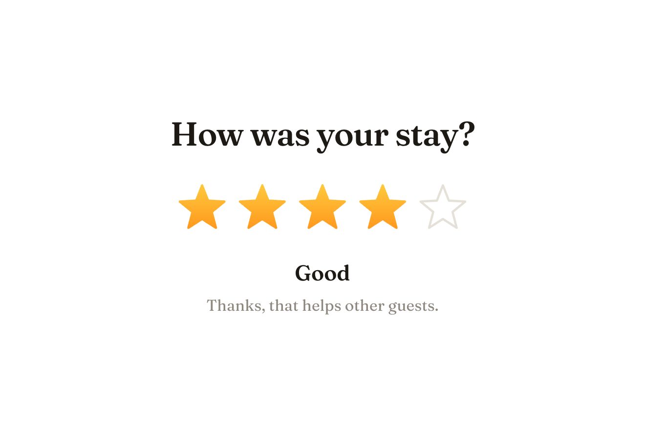
The star rating
Ratings, SVG, Hover
A coffee bar's order-ahead button on white: an espresso-lacquer pill with a porcelain cup in the round window and a thread of steam rising slowly. On hover the steam stands up and slips out of the pill; on click the order goes («Sending order»), the wisps rise tall and sway, then gather one after the other into the check, while the cup sinks, caramel fills the disc and the label becomes «Ready at» with the time and «Bar 2».
A folder that runs on its own: index.html, style.css, script.js and the libraries from a CDN. The React and Vue tabs hold the same demo as a ready component, which switches its animations off when it leaves the page.
<!doctype html>
<!--
  "Order ahead button" from Animorio · https://animorio.com
  License: free on your own sites and your clients’ sites, paid work included.
  Not for resale, redistribution, templates or code collections · https://animorio.com/en/license/
-->
<html lang="en">
<head>
  <meta charset="utf-8">
  <meta name="viewport" content="width=device-width, initial-scale=1">
  <title>The Order ahead button with the cup steam that becomes the check</title>
  <link rel="stylesheet" href="https://cdn.jsdelivr.net/npm/@fontsource-variable/mona-sans@5.3.0/wdth.css">
  <link rel="stylesheet" href="style.css">
</head>
<body>
  <main class="stage" data-stage>
    <!-- a coffee bar's order-ahead button: the cup in the round end steams,
         the order goes to the bar, and the steam gathers itself into the check -->
    <button class="btn" type="button" data-btn data-autoclic>
      <span class="btn__light" aria-hidden="true"></span>

      <svg class="cup" data-cup-svg viewBox="0 0 64 96" aria-hidden="true">
        <defs>
          <clipPath id="disco"><circle cx="32" cy="74" r="22"/></clipPath>
          <radialGradient id="fondo-disco" cx="0.38" cy="0.3" r="0.8">
            <stop offset="0" stop-color="#3a2b21"/>
            <stop offset="1" stop-color="#1f1610"/>
          </radialGradient>
          <radialGradient id="caramello" cx="0.4" cy="0.32" r="0.85">
            <stop offset="0" stop-color="#e0a463"/>
            <stop offset="0.6" stop-color="#c7843f"/>
            <stop offset="1" stop-color="#a6672d"/>
          </radialGradient>
          <linearGradient id="vapore" gradientUnits="userSpaceOnUse" x1="0" y1="68" x2="0" y2="4">
            <stop offset="0" style="stop-color: var(--vapore)" stop-opacity="0.95"/>
            <stop offset="0.35" style="stop-color: var(--vapore)" stop-opacity="0.7"/>
            <stop offset="1" style="stop-color: var(--vapore)" stop-opacity="0"/>
          </linearGradient>
          <linearGradient id="porcellana" x1="0" y1="0" x2="1" y2="0">
            <stop offset="0" stop-color="#fbf5ec"/>
            <stop offset="0.55" stop-color="#efe3d2"/>
            <stop offset="1" stop-color="#cdbba5"/>
          </linearGradient>
        </defs>

        <!-- the round window: dark, then the caramel that fills it from below when the order is in -->
        <circle class="cup__disc" cx="32" cy="74" r="22" fill="url(#fondo-disco)"/>
        <g clip-path="url(#disco)">
          <circle data-fill cx="32" cy="74" r="22" fill="url(#caramello)"/>
          <g data-cup>
            <ellipse class="cup__shadow" cx="32" cy="83.6" rx="12" ry="1.6"/>
            <path class="cup__saucer" d="M19.6 83 H44.4"/>
            <path class="cup__handle" d="M40.2 69.6 h1.4 a3.1 3.1 0 0 1 0 6.2 h-2.2"/>
            <path class="cup__body" d="M23.4 67 H40.6 V72.4 C40.6 77.4 37 81 32 81 C27 81 23.4 77.4 23.4 72.4 Z" fill="url(#porcellana)"/>
            <ellipse class="cup__coffee" cx="32" cy="67.1" rx="8.4" ry="1.3"/>
            <path class="cup__glint" d="M25.6 69.4 V73.2"/>
          </g>
          <path class="cup__rimlight" d="M14.6 66 A22 22 0 0 1 30 52.1"/>
        </g>
        <circle class="cup__ring" data-ring cx="32" cy="74" r="23.4"/>

        <!-- the steam: each wisp is redrawn every frame; at the end the wisps are pulled into the check -->
        <g data-wisps fill="none" stroke="url(#vapore)" stroke-linecap="round" stroke-linejoin="round"></g>
        <path class="cup__check" data-check d=""/>
      </svg>

      <span class="btn__words">
        <span class="btn__label" data-idle><span class="btn__what">Order ahead</span></span>
        <span class="btn__label" data-busy aria-hidden="true">Sending order</span>
        <span class="btn__label" data-done aria-hidden="true">Ready at <span data-time>8:42</span></span>
      </span>
      <span class="btn__side">
        <span class="btn__price" data-price>€3.80</span>
        <span class="btn__paid" data-paid aria-hidden="true">Bar 2</span>
      </span>
    </button>
    <p class="sr" data-live aria-live="polite"></p>

    <svg class="ghost" data-ghost viewBox="0 0 24 24" aria-hidden="true"><path d="M5 3.2 19.2 11l-6.3 1.6-3.3 5.9Z"></path></svg>
  </main>

  <script src="https://cdn.jsdelivr.net/npm/gsap@3.15.0/dist/gsap.min.js"></script>
  <script src="script.js"></script>
</body>
</html>Change values, colours and text with the controls and watch the animation respond live. Or write in the code yourself. Then download the folder with your changes.
20 values to change
With the Animorio connector, Claude Code, ChatGPT, Cursor or VS Code take it from here, guide included, and fit it into your project. Paste this request:
Take “Order ahead button” from Animorio and fit it into my siteEach wisp is a 26 point path rewritten every frame: x is the sum of two sines (a wave and a longer curl) running in time, with the amplitude growing as it rises and a drift to the right; each wisp has its own phase, pace and wavelength, so they never move together. The fade is a userSpaceOnUse linearGradient on the vertical axis: the steam vanishes as it rises, on the brown pill and on the white.
The check is sampled by arc length, so every point of the wisp has its own place on the broken line. A value m per wisp, 0 to 1 with power2.inOut, blends the live steam into the check, with a sin(π m) swing that carries it past and lets it settle. When m passes 0.78 the wisps fade and the identical check path lights up in their place: the swap cannot be seen.
Inside the round window (a clipPath) the caramel disc grows from the bottom with back.out while the cup sinks with power3.in; the ring around it opens on a spring, then widens and fades. Going back unwinds the check with stroke-dashoffset and returns the cup with elastic.out.
The three labels share one 22 pixel row: they leave upwards widening on the wdth axis and the new one comes in from below, narrow, with back.out. The warm light is a radial-gradient following the pointer through the --mx and --my variables; --luce turns it on for hover and during the order.
Rest, hover (and focus), pressed, in progress with aria-busy, done with an aria-live announcement, and back by itself or with a click. A drawn pointer comes in, rests on the button, orders and waits for the whole round; at the first real touch it stops and starts again after six quiet seconds.
| Name | File | Default | What it changes |
|---|---|---|---|
BREW | script.js | 1.8 | Seconds of full steam while the order goes to the bar. |
GATHER | script.js | 1.1 | Seconds for the wisps to gather into the check. |
HOLD | script.js | 3.4 | Seconds «Ready at» stays before going back to rest. |
MINUTES | script.js | 6 | Minutes from now for the «Ready at» time. |
WISPS | script.js | 3 | How many wisps of steam rise from the cup. |
STEAM_HEIGHT | script.js | 40 | Pixels the steam rises above the cup while it brews. |
DRIFT | script.js | 1 | How much the wisps sway (0 straight). |
ACCENT | script.js | #c98a4b | The caramel colour: the ring and the focus. |
STEAM | script.js | #bba893 | The steam colour. |
In the app or site of a coffee bar, a cafe or a restaurant with takeaway: the button to order before you arrive and pick up at the counter. It also suits a bakery or a kiosk, swapping the cup.
The same animation: the pill is at most the screen width minus 32 pixels and the steam stays above it, inside the frame. A tap is hover and click together.
Nothing moves: the steam stays still and faint, labels swap with a fade, the check, the caramel disc and «Ready at» arrive already in place; the pilot's pointer is hidden.
GSAP 3.15.0, Mona Sans (font variabile) 5.3.0.
Compressed with gzip, the three demo files weigh 7.5 KB; the libraries: GSAP 28 KB.
Tested on 10 November 2026
Use it in your own projects and in your clients’ projects. Do not resell it or redistribute it as is. GSAP stays under its own Standard license. Full license.
Support Animorio
Animorio stays free thanks to the people who support it. If you like, buy us a coffee: it helps us make the next animations.
You asked for
We made it for you: it’s in the library, with the preview, the Playground and the code to copy.
An animation you can’t find, or a site to take apart in the journal: tell us which. We pick the next ones from here.
With your account’s email and password.
or with your email
You’re signed in as .
With your account, you can download the zip of every animation and every pack, for free.