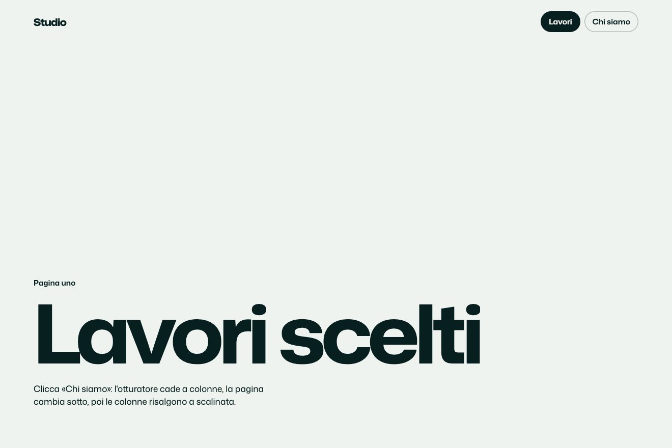
Column shutter
Transitions
A page transition inside a laptop and a phone, in the style of product components: a site builder shows three templates (a shop, a portfolio, a blog) and picking one makes the page on the screen shrink and slide away upwards like a closing window, the new one rises from below, the address changes letter by letter and the content comes in staggered, while both devices turn a few degrees and settle.
A folder that runs on its own: index.html, style.css, script.js and the libraries from a CDN. The React and Vue tabs hold the same demo as a ready component, which switches its animations off when it leaves the page.
<!doctype html>
<!--
  "Into the laptop" from Animorio · https://animorio.com
  License: free on your own sites and your clients’ sites, paid work included.
  Not for resale, redistribution, templates or code collections · https://animorio.com/en/license/
-->
<html lang="en">
<head>
  <meta charset="utf-8">
  <meta name="viewport" content="width=device-width, initial-scale=1">
  <title>Pagewright templates</title>
  <link rel="stylesheet" href="https://cdn.jsdelivr.net/npm/@fontsource-variable/mona-sans@5.3.0/wdth.css">
  <link rel="stylesheet" href="style.css">
</head>
<body>
  <!-- an invented site builder shows its templates inside a laptop and a phone: pick one and the page in the screen
       closes upwards like a window while the new one rises from below, the address changes, the content comes in
       staggered and the devices turn a few degrees and settle -->
  <main class="palco">
    <header class="testa" data-testa>
      <p class="occhiello">Pagewright templates</p>
      <h1 class="titolo">One builder, <span class="grigio">every kind of site</span></h1>
    </header>

    <div class="scena-box" data-box>
      <div class="scena" data-scena>
        <div class="portatile" data-portatile>
          <div class="coperchio">
            <div class="schermo" data-schermo="grande">
              <div class="barra">
                <span class="frecce" aria-hidden="true">
                  <svg viewBox="0 0 16 16"><path d="M10 3.5 5.5 8l4.5 4.5" /></svg>
                  <svg viewBox="0 0 16 16"><path d="M6 3.5 10.5 8 6 12.5" /></svg>
                </span>
                <span class="indirizzo"><svg viewBox="0 0 16 16" aria-hidden="true"><rect x="4" y="7" width="8" height="6" rx="1.5" /><path d="M5.8 7V5.4a2.2 2.2 0 0 1 4.4 0V7" /></svg><span class="url" data-url></span></span>
                <span class="barra-vuoto"></span>
              </div>
              <div class="pagine" data-pagine></div>
              <div class="riflesso" aria-hidden="true"></div>
            </div>
          </div>
          <div class="base" aria-hidden="true"><span class="incavo"></span></div>
          <div class="ombra" aria-hidden="true"></div>
        </div>

        <div class="telefono" data-telefono>
          <div class="schermo schermo--tel" data-schermo="piccolo">
            <div class="isola" aria-hidden="true"></div>
            <div class="pagine" data-pagine></div>
            <div class="riflesso" aria-hidden="true"></div>
          </div>
          <div class="ombra ombra--tel" aria-hidden="true"></div>
        </div>
      </div>
    </div>

    <nav class="schede" data-schede aria-label="Templates">
      <span class="indicatore" data-indicatore aria-hidden="true"></span>
      <button type="button" class="scheda" data-scheda="0" aria-pressed="true">Online store</button>
      <button type="button" class="scheda" data-scheda="1" aria-pressed="false">Portfolio</button>
      <button type="button" class="scheda" data-scheda="2" aria-pressed="false">Blog</button>
    </nav>

    <svg class="puntatore" data-puntatore viewBox="0 0 24 24" aria-hidden="true">
      <path d="M4 3l14 7.2-6.1 1.6L9.2 18z" />
    </svg>
  </main>

  <script src="https://cdn.jsdelivr.net/npm/gsap@3.15.0/dist/gsap.min.js"></script>
  <script src="script.js"></script>
</body>
</html>Change values, colours and text with the controls and watch the animation respond live. Or write in the code yourself. Then download the folder with your changes.
28 values to change
With the Animorio connector, Claude Code, ChatGPT, Cursor or VS Code take it from here, guide included, and fit it into your project. Paste this request:
Take “Into the laptop” from Animorio and fit it into my siteThe laptop and phone sit in a scene drawn at 660 by 420 pixels, with perspective on the container. The script scales it to fit the free space between the headline and the tabs and recomputes it on resize: on a phone it is whole, just smaller.
Each screen keeps its current page. On change the new page is added below, the old one moves up by yPercent -38 while shrinking and fading on power3.in, the new one comes from yPercent 100 on expo.out and starts when the old one is halfway. Then the old one is removed.
Every piece of the site has data-entra: navigation, headline, text, button, picture, cards. They come up 14 pixels, SFALSA seconds apart, shortly after the page starts rising.
The address is a row of spans, one per letter: the old ones leave upwards one after another, then the script writes the new ones and lifts them from below 12 milliseconds apart.
The laptop and phone have their transforms owned by GSAP (rotationY -14, rotationX 5). On change they turn by GIRO degrees and rise 6 pixels, then come back on elastic.out(1, 0.55); the phone starts RITARDO_TEL seconds later.
| Name | File | Default | What it changes |
|---|---|---|---|
CHIUDE | script.js | 0.5 | How long the old page takes to close upwards, in seconds. |
ENTRA | script.js | 0.85 | How long the new page takes to rise from below, in seconds. |
SFALSA | script.js | 0.05 | The delay between one piece and the next of the incoming content, in seconds. |
GIRO | script.js | 7 | How many degrees the devices turn during the change. |
RITARDO_TEL | script.js | 0.12 | How much later the phone starts, in seconds. |
SOSTA | script.js | 2.4 | How long each site stays in the automatic tour, in seconds. |
For the templates page of a site builder, an agency or a studio showing its work: the tabs pick the project and the screen shows it as a client would see it, on the computer and the phone together.
The same transition: the scene with the laptop and phone shrinks to fit whole in the box, while the headline and tabs stay large and readable. A tap picks the template like a click.
The devices stay still and nothing slides: the old page fades out and the new one fades in already in place, and the address changes at once.
GSAP 3.15.0, Mona Sans (font variabile) 5.3.0.
Compressed with gzip, the three demo files weigh 8.5 KB; the libraries: GSAP 28 KB.
Tested on 25 October 2026
Use it in your own projects and in your clients’ projects. Do not resell it or redistribute it as is. GSAP stays under its own Standard license. Full license.
Support Animorio
Animorio stays free thanks to the people who support it. If you like, buy us a coffee: it helps us make the next animations.
You asked for
We made it for you: it’s in the library, with the preview, the Playground and the code to copy.
An animation you can’t find, or a site to take apart in the journal: tell us which. We pick the next ones from here.
With your account’s email and password.
or with your email
You’re signed in as .
With your account, you can download the zip of every animation and every pack, for free.