The layered button
Buttons, Hover, Physics
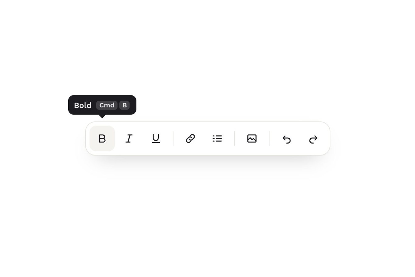
The formatting toolbar of a writing app, dark on black, with a single tooltip of smoked glass: over a button it tells the name of the action and the shortcut drawn as raised keys, Cmd and K, that press themselves one after the other, going down a pixel while their shadow gets shorter, as if to show how it is done. Moving to the next button the tooltip glides on a spring with its tail already pointing at where it goes and the letters of the name rolling; pressing the shortcut for real on the keyboard the keys in the tooltip go down with your fingers, light up warm and the button flashes.
A folder that runs on its own: index.html, style.css, script.js and the libraries from a CDN. The React and Vue tabs hold the same demo as a ready component, which switches its animations off when it leaves the page.
<!doctype html>
<!--
  "Shortcut tooltip" from Animorio · https://animorio.com
  License: free on your own sites and your clients’ sites, paid work included.
  Not for resale, redistribution, templates or code collections · https://animorio.com/en/license/
-->
<html lang="en">
<head>
  <meta charset="utf-8">
  <meta name="viewport" content="width=device-width, initial-scale=1">
  <title>The shortcut tooltip whose keys press down</title>
  <link rel="stylesheet" href="https://cdn.jsdelivr.net/npm/@fontsource-variable/mona-sans@5.3.0/wdth.css">
  <link rel="stylesheet" href="style.css">
</head>
<body>
  <main class="stage">
    <!-- the formatting toolbar of a writing app, with one glass tooltip over it. The tooltip tells the name of the
         action and its shortcut, drawn as raised keys that press down one after the other, as if to show how it is
         done; it glides to the next button on a spring and its letters roll. Pressing the shortcut for real on the
         keyboard presses the same keys in the tooltip and makes the button flash -->
    <div class="kit" data-kit data-autoclic>
      <span class="kit__halo" data-halo aria-hidden="true"></span>
      <div class="tip" data-tip aria-hidden="true">
        <div class="tip__in" data-tip-in>
          <div class="tip__body" data-tip-body></div>
          <svg class="tip__tail" data-tip-tail viewBox="0 0 16 8" aria-hidden="true">
            <path class="tip__tail-fill" d="M0 0h16L9.4 6.6a2 2 0 0 1-2.8 0z"/>
            <path class="tip__tail-edge" d="M0.5 0.5L6.6 6.6a2 2 0 0 0 2.8 0L15.5 0.5"/>
          </svg>
        </div>
      </div>
      <div class="bar" role="toolbar" aria-label="Formatting" data-tools>
        <span class="bar__clip" aria-hidden="true"><span class="bar__edge" data-edge></span></span>
      </div>
    </div>
    <p class="sr" aria-live="polite" data-live></p>
  </main>

  <script src="https://cdn.jsdelivr.net/npm/gsap@3.15.0/dist/gsap.min.js"></script>
  <script src="script.js"></script>
</body>
</html>Change values, colours and text with the controls and watch the animation respond live. Or write in the code yourself. Then download the folder with your changes.
18 values to change
With the Animorio connector, Claude Code, ChatGPT, Cursor or VS Code take it from here, guide included, and fit it into your project. Paste this request:
Take “Shortcut tooltip” from Animorio and fit it into my siteEach key is an element with two CSS variables, --p (pressed) and --lit (lit by a real press). The CSS does all of it: translateY of --p × 1.4 pixels, the hard shadow of its side going from 2.4 to 1 pixel, the soft one from 4 to 1.8 pixels away, the highlight on top fading and the face getting 14 % darker. GSAP only animates the two variables; coming back up it uses back.out(OVERSHOOT), so --p goes under zero and the key rises a pixel past its place before it stops.
One timeline per line: the keys go down KEY_GAP seconds apart, stay down KEY_HOLD, come back up from the last to the first; as the last one lands the button lights to 22 %. Once done, a delayedCall of KEY_PAUSE plays it again while the tooltip stays on the same button; it stops as soon as a real key is held.
A single element for all the buttons: its x follows the middle of the button on a spring (SPRING) worked out on GSAP's ticker in steps of 4 milliseconds, with the step capped at 1/30 of a second, and it stays inside the toolbar's box. The tail sits on the button it is going to, and the warm light behind the glass and the lit line on the toolbar's edge follow the same spring.
The name is one span per letter in a line with hidden overflow: the old ones go up to yPercent −115 and fade, the new ones come from +115 in ROLL seconds, 16 milliseconds apart in the way the tooltip goes. When only the name changes (Bold on) the keys move with a FLIP: where they were is measured, the new name goes in and GSAP carries them from the old place to the new one while the glass changes its width.
keydown and keyup on the window read metaKey or ctrlKey, shiftKey, altKey and the letter from e.code (KeyB, so Option does not change it): the keys in the tooltip follow the ones held down. When the combination is whole and matches a button, preventDefault, the tooltip goes there and the button flashes; leaving the window (blur) every key comes back up. Each button has aria-keyshortcuts, the tooltip is aria-hidden and the result is read in an aria-live region.
| Name | File | Default | What it changes |
|---|---|---|---|
DELAY | script.js | 0.4 | The seconds the pointer rests on a button before the first tooltip. |
SPRING | script.js | [300, 0.74] | The tooltip's spring as it glides: how stiff it is and how much it is held back. |
KEY_GAP | script.js | 0.17 | The seconds between one key going down and the next. |
KEY_HOLD | script.js | 0.34 | How long the keys stay down before they come back up. |
KEY_PAUSE | script.js | 1.5 | The seconds between one showing of the shortcut and the next. |
OVERSHOOT | script.js | 4 | How far the keys go past their place as they come back up. |
ROLL | script.js | 0.38 | The seconds the letters of the name take to roll in. |
HALO | script.js | 1 | How bright the warm light behind the glass is. |
For the toolbars of an editor, a notes app or a dashboard, for the controls of a design app: anywhere a button made of an icon only also has a shortcut to teach, and it helps if whoever passes learns it by watching it done.
Without hover a tap presses the button and shows the tooltip at once with the keys going down together, then it goes away by itself after a little over two seconds, or at once with a tap outside the toolbar; the toolbar is 260 pixels wide and the tooltip always stays inside its box.
The tooltip jumps from one button to another without the spring and shows and hides with a fade; the letters change with a fade, the keys do not move and tell they are pressed only with their shadow and a darker face; the button's flash is only a light fading out.
GSAP 3.15.0, Mona Sans (font variabile) 5.3.0.
Compressed with gzip, the three demo files weigh 10.0 KB; the libraries: GSAP 28 KB.
Tested on 7 November 2026
Use it in your own projects and in your clients’ projects. Do not resell it or redistribute it as is. GSAP stays under its own Standard license. Full license.
Support Animorio
Animorio stays free thanks to the people who support it. If you like, buy us a coffee: it helps us make the next animations.
You asked for
We made it for you: it’s in the library, with the preview, the Playground and the code to copy.
An animation you can’t find, or a site to take apart in the journal: tell us which. We pick the next ones from here.
With your account’s email and password.
or with your email
You’re signed in as .
With your account, you can download the zip of every animation and every pack, for free.