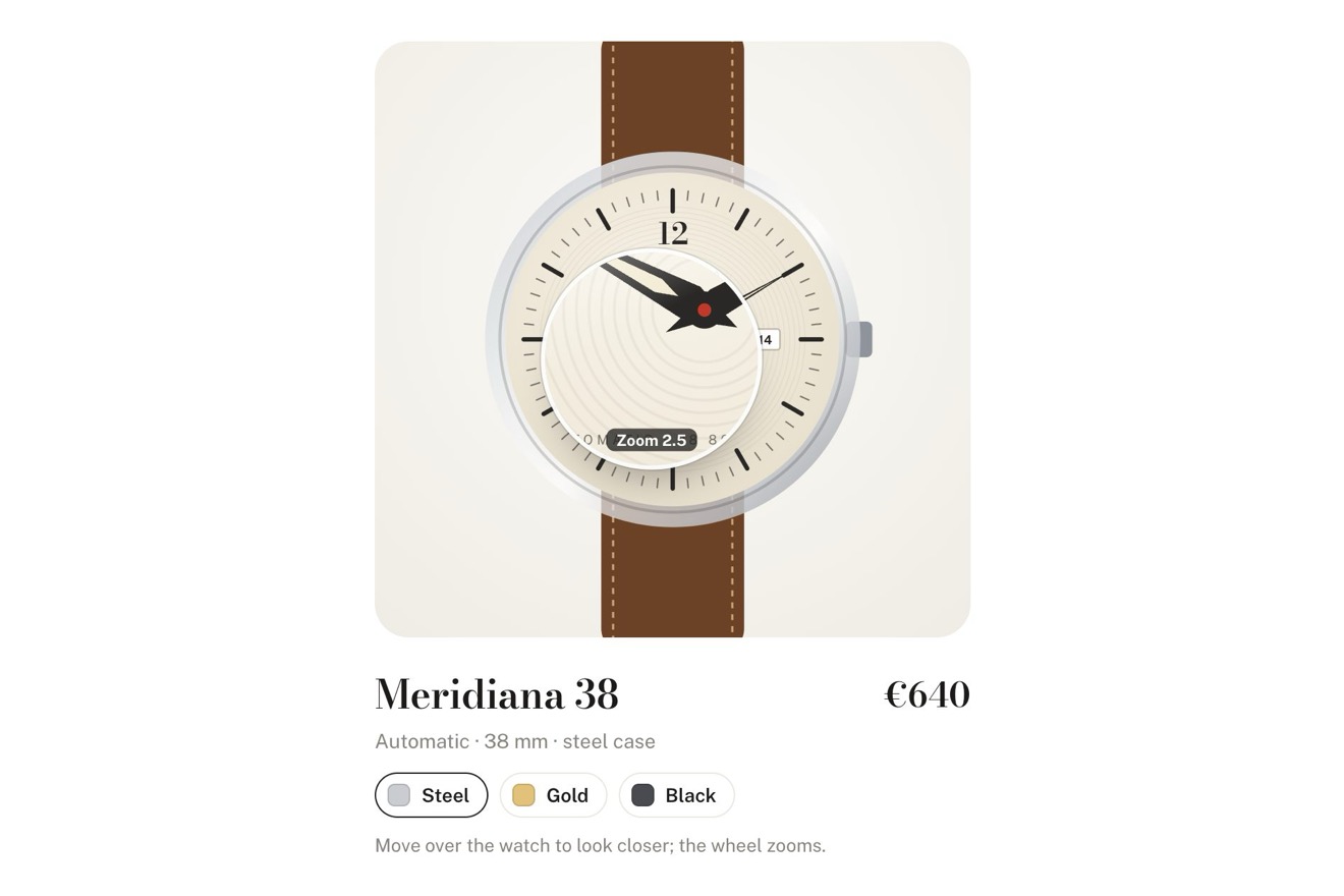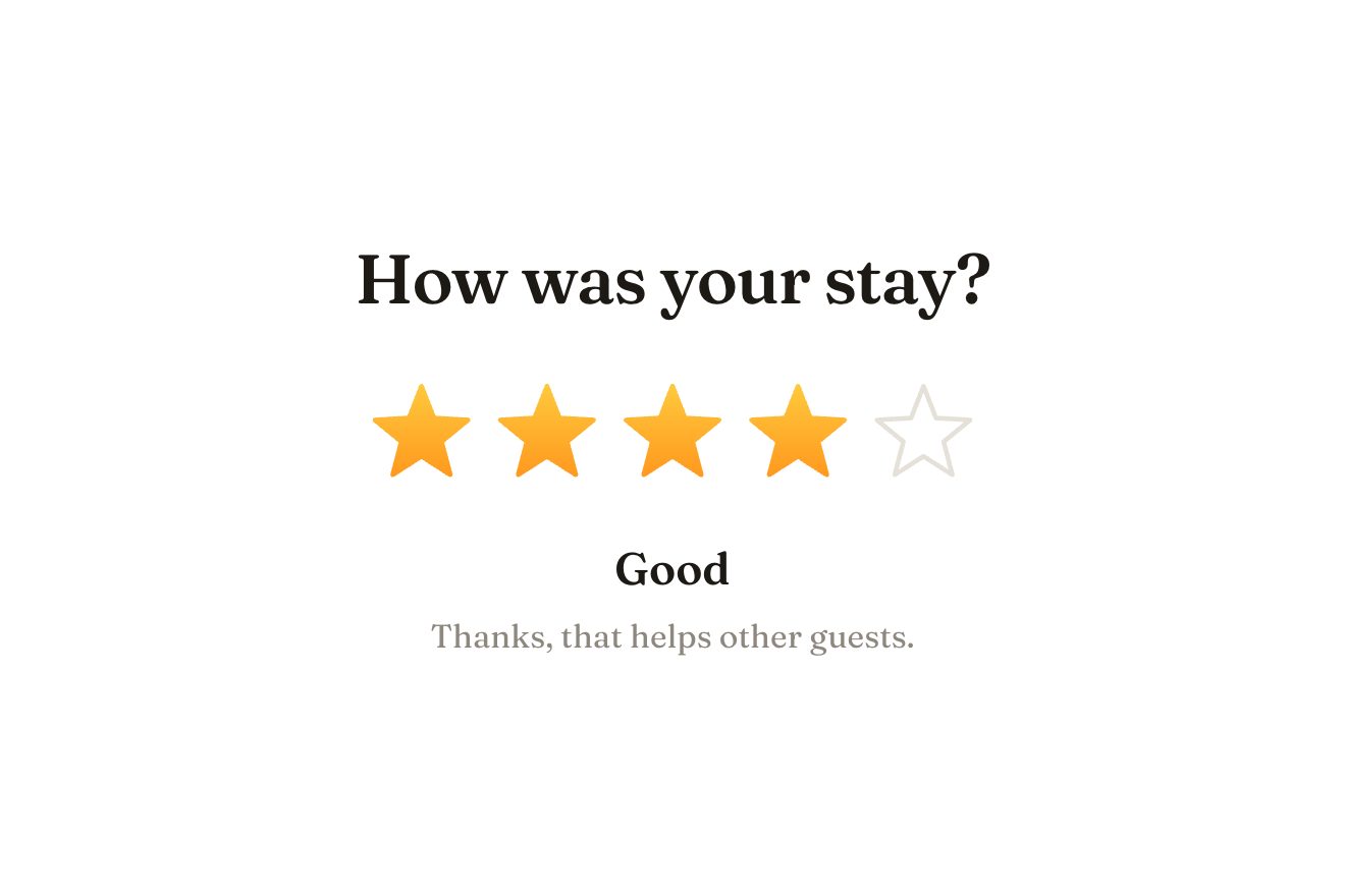
The star rating
Ratings, SVG, Hover
A light pill button on black for an app’s sign-in page: pressed, the key in its round seat turns a quarter like in a lock while a violet ring closes round it (the device is checking). When the ring is whole it leaves as a ripple, the avatar springs into the seat, a sheen crosses the pill, the label says ‘Welcome back, Maya’ and a small tick opens on the right.
A folder that runs on its own: index.html, style.css, script.js and the libraries from a CDN. The React and Vue tabs hold the same demo as a ready component, which switches its animations off when it leaves the page.
<!doctype html>
<!--
  "Passkey sign-in button" from Animorio · https://animorio.com
  License: free on your own sites and your clients’ sites, paid work included.
  Not for resale, redistribution, templates or code collections · https://animorio.com/en/license/
-->
<html lang="en">
<head>
  <meta charset="utf-8">
  <meta name="viewport" content="width=device-width, initial-scale=1">
  <title>Sign in with a passkey button with the key that turns and the avatar that comes in</title>
  <link rel="stylesheet" href="https://cdn.jsdelivr.net/npm/@fontsource-variable/mona-sans@5.3.0/wdth.css">
  <link rel="stylesheet" href="style.css">
</head>
<body>
  <main class="stage">
    <!-- a sign-in button for passkeys: pressed, the key in its round seat turns a quarter like in a lock while a ring
         closes round the seat (the device is checking); when the ring is whole it leaves as a ripple, the avatar
         springs into the seat, a sheen crosses the pill, the label says welcome back and a small tick opens on the
         right; after a moment it is ready again -->
    <button class="key" type="button" data-key>
      <span class="key__glow" aria-hidden="true"></span>
      <span class="key__body" aria-hidden="true">
        <span class="key__tint" data-tint></span>
        <span class="key__sheen" data-sheen></span>
        <span class="key__light"></span>
      </span>
      <span class="key__edge" aria-hidden="true"></span>

      <span class="seat" data-seat aria-hidden="true">
        <svg class="seat__ring" viewBox="0 0 54 54">
          <circle class="seat__track" cx="27" cy="27" r="25"></circle>
          <circle class="seat__arc" data-ring cx="27" cy="27" r="25" pathLength="1"></circle>
        </svg>
        <svg class="seat__ripple" data-ripple viewBox="0 0 54 54"><circle cx="27" cy="27" r="25"></circle></svg>
        <span class="seat__disc">
          <svg class="seat__glyph" viewBox="0 0 24 24">
            <g data-glyph>
              <circle cx="8.3" cy="12" r="4"></circle>
              <circle class="seat__hole" cx="7.4" cy="12" r="0.9"></circle>
              <path d="M12.3 12H20.4"></path>
              <path d="M16.6 12v2.7"></path>
              <path d="M19.8 12v2.1"></path>
            </g>
          </svg>
          <span class="avatar" data-avatar><span data-initials>MR</span></span>
        </span>
      </span>

      <span class="label"><span class="label__word" data-word>Sign in with a passkey</span></span>

      <span class="done" data-done aria-hidden="true">
        <svg viewBox="0 0 24 24"><path data-tick pathLength="1" d="M6.6 12.5 10.5 16.4 17.6 8.2"></path></svg>
      </span>
    </button>
    <p class="sr" data-live aria-live="polite"></p>

    <svg class="ghost" data-ghost viewBox="0 0 24 24" aria-hidden="true"><path d="M5 3.2 19.2 11l-6.3 1.6-3.3 5.9Z"></path></svg>
  </main>

  <script src="https://cdn.jsdelivr.net/npm/gsap@3.15.0/dist/gsap.min.js"></script>
  <script src="script.js"></script>
</body>
</html>Change values, colours and text with the controls and watch the animation respond live. Or write in the code yourself. Then download the folder with your changes.
17 values to change
With the Animorio connector, Claude Code, ChatGPT, Cursor or VS Code take it from here, guide included, and fit it into your project. Paste this request:
Take “Passkey sign-in button” from Animorio and fit it into my siteThe key is an SVG group that rotates round the centre of the drawing (svgOrigin 12 12): first a small step back, 14% of TURN, then the turn up to TURN with back.out, which gives the click at the end. Near the end of the check it trembles by three degrees, back and forth.
Round the seat sits an SVG circle with pathLength 1, rotated by minus 90 degrees so it starts at the top: stroke-dashoffset goes from 1 to 0 in VERIFY seconds. Under it, a very light grey track that shows only while checking.
When the ring is whole it is hidden and an identical copy scales from 1 to 1.42 and fades: it looks like the same ring leaving. The avatar, a disc with a gradient of the accent colour, scales from 0 to 1 with elastic.out inside the seat, which clips it.
Inside the pill’s body a slanted band of light slides from minus 110% to 110% of the width; a veil of the accent colour stays on the avatar’s side. On the right a disc opens from 0 to 30 pixels on a spring and the tick draws itself with stroke-dashoffset.
After HOLD seconds the button goes back to its first state by itself, because it is a demo; on a real site, instead of going back, you move to the page after sign-in. A click while the ring is turning does nothing.
| Name | File | Default | What it changes |
|---|---|---|---|
NAME | script.js | Maya | Who signs in: read in the welcome. |
INITIALS | script.js | MR | The initials inside the avatar. |
CHECKING | script.js | Verifying with Touch ID | The label while the device is checking. |
ACCENT | script.js | #6d5cff | The colour of the ring, the avatar and the tick. |
VERIFY | script.js | 1.3 | How many seconds the ring takes to close. |
TURN | script.js | 90 | By how many degrees the key turns. |
SPRING | script.js | 0.8 | How long the spring of the avatar coming in lasts, in seconds. |
HOLD | script.js | 2.6 | How many seconds the welcome stays before the button is ready again. |
LOOP | script.js | true | Left alone, a pointer tries it by itself. |
For the sign-in page of an app, a dashboard or an online shop that offers passkeys: the button that shows the device check and then who came in. Also good for ‘Continue with Face ID’ or for confirming a sensitive action.
The same button: the pill takes at most the screen width minus the margins and the long label is cut with an ellipsis. On touch there is no shade following the pointer; everything else is the same.
No turn, no ripple and no springs: the label changes with a fade, the ring appears already closed, the avatar and the tick fade in.
GSAP 3.15.0, Mona Sans (font variabile) 5.3.0.
Compressed with gzip, the three demo files weigh 6.0 KB; the libraries: GSAP 28 KB.
Tested on 14 November 2026
Use it in your own projects and in your clients’ projects. Do not resell it or redistribute it as is. GSAP stays under its own Standard license. Full license.
Support Animorio
Animorio stays free thanks to the people who support it. If you like, buy us a coffee: it helps us make the next animations.
You asked for
We made it for you: it’s in the library, with the preview, the Playground and the code to copy.
An animation you can’t find, or a site to take apart in the journal: tell us which. We pick the next ones from here.
With your account’s email and password.
or with your email
You’re signed in as .
With your account, you can download the zip of every animation and every pack, for free.