The star rating
Ratings, SVG, Hover
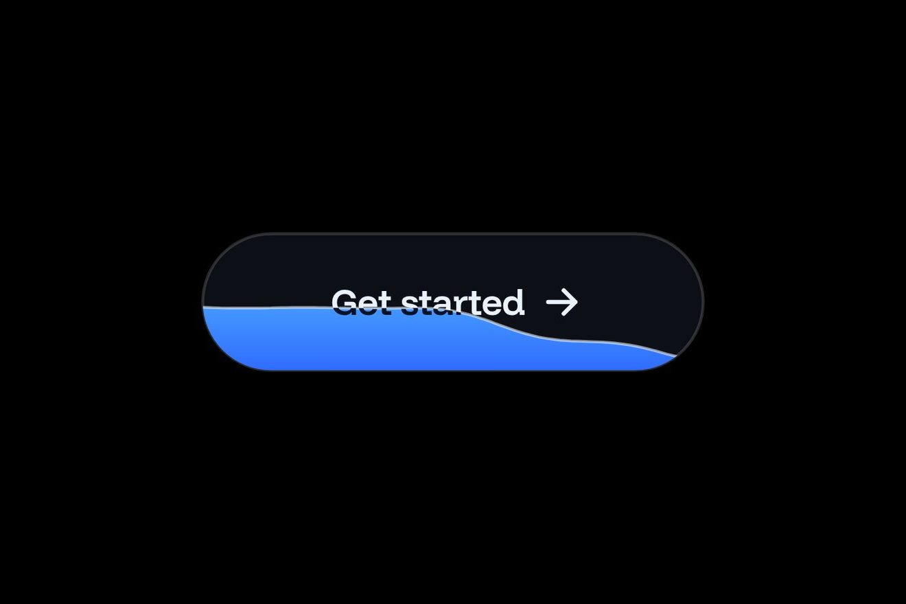
The Watch the demo button of a SaaS product’s landing page, a pill of frosted glass over two slow lights, violet and cyan, like a Dribbble shot. On the left a tiny screen of the product with a glass play button over its chart. Pressed, the play turns into a spinner while the demo loads, the percentage counts in the chip and a hairline of light fills under the glass; then a check says it is ready, a reflection crosses the glass and the preview starts: the chart bars move, the play becomes a pause and the time runs in the chip.
A folder that runs on its own: index.html, style.css, script.js and the libraries from a CDN. The React and Vue tabs hold the same demo as a ready component, which switches its animations off when it leaves the page.
<!doctype html>
<!--
  "Glass watch demo button" from Animorio · https://animorio.com
  License: free on your own sites and your clients’ sites, paid work included.
  Not for resale, redistribution, templates or code collections · https://animorio.com/en/license/
-->
<html lang="en">
<head>
  <meta charset="utf-8">
  <meta name="viewport" content="width=device-width, initial-scale=1">
  <title>The watch the demo glass button with the preview that plays</title>
  <link rel="stylesheet" href="https://cdn.jsdelivr.net/npm/@fontsource-variable/mona-sans@5.3.0/wdth.css">
  <link rel="stylesheet" href="style.css">
</head>
<body>
  <main class="stage">
    <!-- the Watch the demo button of a SaaS landing page, a pill of frosted glass over a slow violet and cyan light.
         On the left a tiny screen of the product with a glass play button over it. Pressed, the play turns into a
         spinner while the demo buffers (the percentage in the chip, a hairline filling under the glass), then a check
         says it is ready and the preview starts playing: the bars of the tiny chart move, the play becomes a pause and
         the timecode runs in the chip. Pressed while it plays, the demo pauses and the button goes back to rest -->
    <div class="wd" data-wrap>
      <span class="wd__aura" aria-hidden="true">
        <span class="wd__blob wd__blob--a" data-blob></span>
        <span class="wd__blob wd__blob--b" data-blob></span>
      </span>
      <button class="wd__btn" type="button" data-btn aria-label="Watch the Plotline demo, 2:14 long">
        <span class="wd__body" data-body>
          <span class="wd__glass" aria-hidden="true"></span>
          <span class="wd__shine" data-shine aria-hidden="true"></span>
          <span class="wd__sweep" aria-hidden="true"><span class="wd__sweep-band" data-sweep></span></span>
          <span class="wd__track" aria-hidden="true"><span class="wd__bar" data-bar></span></span>
          <span class="wd__edge" data-edge aria-hidden="true"></span>
          <span class="wd__row">
            <span class="wd__thumb" aria-hidden="true">
              <svg class="wd__ui" viewBox="0 0 62 44" preserveAspectRatio="none">
                <defs>
                  <linearGradient id="wd-bar" x1="0" y1="1" x2="0" y2="0">
                    <stop offset="0" stop-color="var(--violet)"/>
                    <stop offset="1" stop-color="var(--cyan)"/>
                  </linearGradient>
                </defs>
                <path class="wd__ui-line" d="M9 8h44"/>
                <path class="wd__ui-side" d="M9 15h7M9 20h5M9 25h6"/>
                <path class="wd__ui-line" d="M21 37h33"/>
                <g data-ui>
                  <rect class="wd__ui-bar" x="23" y="23" width="3.6" height="14" rx="1.2"/>
                  <rect class="wd__ui-bar" x="29" y="18" width="3.6" height="19" rx="1.2"/>
                  <rect class="wd__ui-bar" x="35" y="26" width="3.6" height="11" rx="1.2"/>
                  <rect class="wd__ui-bar" x="41" y="15" width="3.6" height="22" rx="1.2"/>
                  <rect class="wd__ui-bar" x="47" y="21" width="3.6" height="16" rx="1.2"/>
                </g>
              </svg>
              <span class="wd__thumb-glare"></span>
              <span class="wd__playhead" data-playhead></span>
              <span class="wd__play" data-play>
                <span class="wd__play-plate" data-plate></span>
                <svg class="wd__icon" viewBox="0 0 24 24">
                  <circle class="wd__spin-track" data-spin-track cx="12" cy="12" r="6.6"/>
                  <circle class="wd__spin" data-spin cx="12" cy="12" r="6.6" pathLength="1"/>
                  <path class="wd__tri" data-tri d="M9.6 7.6v8.8l7-4.4z"/>
                  <g data-pause><path class="wd__pause" d="M9.9 8.4v7.2M14.1 8.4v7.2"/></g>
                  <path class="wd__check" data-check pathLength="1" d="M8 12.3l2.7 2.7 5.4-5.6"/>
                </svg>
              </span>
            </span>
            <span class="wd__text" aria-hidden="true">
              <span class="wd__state" data-state>
                <span class="wd__title" data-t>Watch the demo</span>
                <span class="wd__sub" data-s>Plotline in 2 min · no sign-up</span>
              </span>
              <span class="wd__state" data-state>
                <span class="wd__title wd__title--busy">Loading the demo</span>
                <span class="wd__sub">Buffering in HD</span>
              </span>
              <span class="wd__state" data-state>
                <span class="wd__title">Ready</span>
                <span class="wd__sub">Starting from the top</span>
              </span>
              <span class="wd__state" data-state>
                <span class="wd__title">Now playing</span>
                <span class="wd__sub" data-s>Plan a sprint in one view</span>
              </span>
              <span class="wd__state" data-state>
                <span class="wd__title">Demo paused</span>
                <span class="wd__sub">Pick up where you left off</span>
              </span>
            </span>
            <span class="wd__chip" aria-hidden="true">
              <span class="wd__chip-face" data-chip>2:14</span>
              <span class="wd__chip-face" data-chip><span data-roll>0%</span><span data-roll></span></span>
            </span>
          </span>
        </span>
      </button>
    </div>
    <p class="sr" aria-live="polite" data-live></p>
  </main>
  <script src="https://cdn.jsdelivr.net/npm/gsap@3.15.0/dist/gsap.min.js"></script>
  <script src="script.js"></script>
</body>
</html>Change values, colours and text with the controls and watch the animation respond live. Or write in the code yourself. Then download the folder with your changes.
26 values to change
With the Animorio connector, Claude Code, ChatGPT, Cursor or VS Code take it from here, guide included, and fit it into your project. Paste this request:
Take “Glass watch demo button” from Animorio and fit it into my siteBehind the button two blurred radial blots, violet and cyan, drift slowly with two yoyo tweens of different lengths. The glass is a layer with backdrop-filter blur(18px) saturate(170%) and an almost transparent white gradient: the lights come through blurred and more saturated, as behind real glass.
The one pixel edge is a layer with padding: 1px and an exclude mask that keeps only the frame; its background is a vertical gradient brighter at the top plus a radial gradient on the --mx and --my variables, moved by gsap.quickTo with the pointer: the edge lights up where the finger passes.
The screen is an SVG with five rectangles: one object per bar with its height, moved by GSAP and written back into height and y by a function that keeps the base still. The play is a second glass with backdrop-filter inside the first: it blurs the bars passing behind it.
A simple state machine, rest, loading, ready, playing, paused: each state is a function that swaps the words (five lines stacked in the same grid cell), the icons inside one SVG (triangle, spinner, pause, check) and the chip. Loading is a value from 0 to 1 that moves the hairline under the glass with scaleX and the percentage.
In the chip two spans take turns: every second the old one rises out, the new one comes from below with a back.out. While the demo plays each chart bar has its own looping timeline with different heights and lengths, so they never move together.
| Name | File | Default | What it changes |
|---|---|---|---|
PRODUCT | script.js | Plotline | The product’s name in the small line. |
LENGTH | script.js | 2:14 | How long the demo is, in the chip at rest. |
CHAPTER | script.js | Plan a sprint in one view | The chapter shown while the demo plays. |
LOAD | script.js | 1.6 | How many seconds the loading lasts. |
PLAY | script.js | 3.2 | How many seconds the demo plays before pausing by itself. |
SPRING | script.js | 1 | How springy the moves are: 0.4 calm, 2 very bouncy. |
GLOW | script.js | 1 | How strong the two lights behind the glass are. |
AUTO | script.js | true | The button goes round by itself until someone touches it. |
For the hero of a SaaS product, app or startup landing page, next to the main button: watch the demo, take the tour, see how it works. It also fits a studio portfolio for the showreel. It says at once that it is a video and how long it is, and gives a live sign while it loads.
On the phone the button is at most 86% of the screen wide and long words end with an ellipsis; there is no hover, so the light under the finger turns on at the touch and the rest is the same.
Nothing moves: the lights behind the glass stay still, icons, words and chip swap with a fade, the loading hairline fills, the seconds change in place and the chart bars stay at their height.
GSAP 3.15.0, Mona Sans (font variabile) 5.3.0.
Compressed with gzip, the three demo files weigh 9.3 KB; the libraries: GSAP 28 KB.
Tested on 3 November 2026
Use it in your own projects and in your clients’ projects. Do not resell it or redistribute it as is. GSAP stays under its own Standard license. Full license.
Support Animorio
Animorio stays free thanks to the people who support it. If you like, buy us a coffee: it helps us make the next animations.
You asked for
We made it for you: it’s in the library, with the preview, the Playground and the code to copy.
An animation you can’t find, or a site to take apart in the journal: tell us which. We pick the next ones from here.
With your account’s email and password.
or with your email
You’re signed in as .
With your account, you can download the zip of every animation and every pack, for free.