Guide
Accessible animation: prefers-reduced-motion and beyond
For some people movement on screen brings on nausea, dizziness or headaches; for others it is a distraction that makes reading impossible. How to respect the system setting, what to remove and what to keep, how to avoid hiding content behind an animation, and how to make it all work with a keyboard and a screen reader.
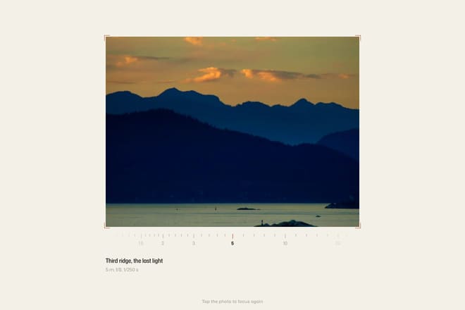
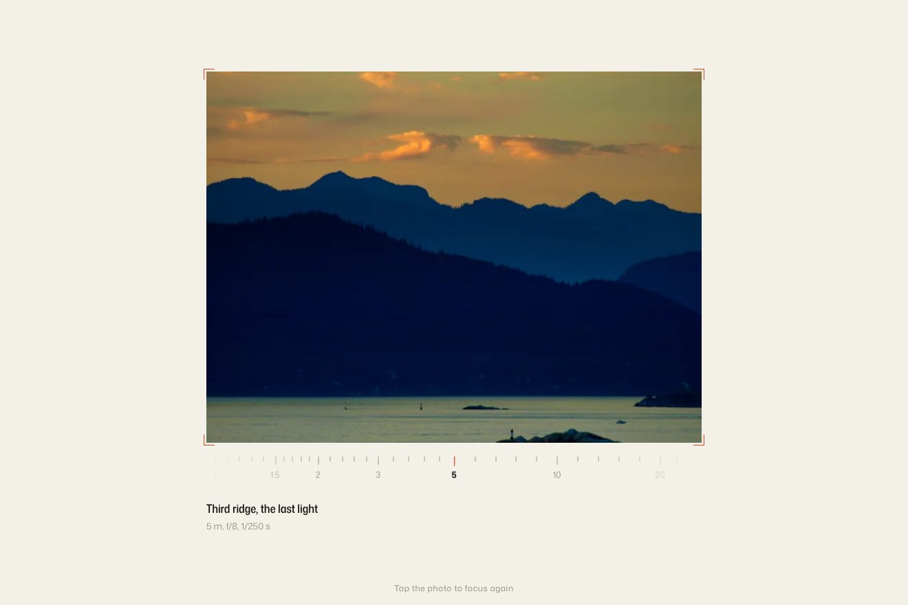 Focus pull photo
For most people, animation makes a site clearer and more pleasant to use. For a sizeable minority it does the opposite. People with vestibular disorders can feel sick or dizzy when backgrounds move at different speeds or when a section zooms across the whole screen. People with attention difficulties struggle to read while something moves beside the text. Screen reader users never see the animation at all, and need the same information some other way. Accessible animation does not mean giving up motion. It means designing it so nobody gets left out.
The system setting: prefers-reduced-motion
Every modern operating system has a setting to reduce motion. On iPhone and Mac it is called Reduce Motion, on Windows “Show animations”, on Android “Remove animations”. Browsers expose it to websites through the prefers-reduced-motion media query, and respecting it is the foundation for everything else.
In CSS the simplest approach is a block that switches animation off when the setting is on.
@media (prefers-reduced-motion: reduce) {
  *, *::before, *::after {
    animation-duration: 0.01ms !important;
    animation-iteration-count: 1 !important;
    transition-duration: 0.01ms !important;
    scroll-behavior: auto !important;
  }
}
The near-zero duration, rather than animation: none, is on purpose: animation end events still fire, so code that waits for them does not hang. But this block is a safety net, not a solution. It strips everything blindly, including the movement that helps, and it does nothing to animations driven by JavaScript.
In JavaScript you read the setting with matchMedia, and it is worth listening for changes too, because people can switch it on while the page is open.
const reduced = window.matchMedia('(prefers-reduced-motion: reduce)');

function setUpAnimations() {
  if (reduced.matches) {
    gsap.set('.reveal', { opacity: 1, y: 0 });
    return;
  }
  gsap.from('.reveal', { opacity: 0, y: 40, stagger: 0.08 });
}

setUpAnimations();
reduced.addEventListener('change', () => location.reload());
GSAP offers a tidier route: gsap.matchMedia only creates animations while a condition is true and tears them down by itself when it stops being true, with no reload.
What to remove and what to keep
Reducing motion does not mean removing everything. Accessibility guidelines talk about motion that is not essential, and the practical split we use looks like this.
Always remove. Large movement: elements crossing the screen, sections sliding sideways as you scroll down, depth effects with layers moving at different speeds, zooms that fill the page, rotation, anything that moves on its own and keeps moving. These are the movements that make people ill.
Replace. Entrances and transitions between states. A heading that rises from below can simply appear with a short fade; a panel that slides in from the right can just be there. A fade does not trigger symptoms and keeps the sense that something changed.
Keep. State changes that carry information: a button that changes colour when pressed, a tick that appears, a field that turns red on an error. Here the change is the content, and removing it would remove the information. Keep it, perhaps without the movement part.
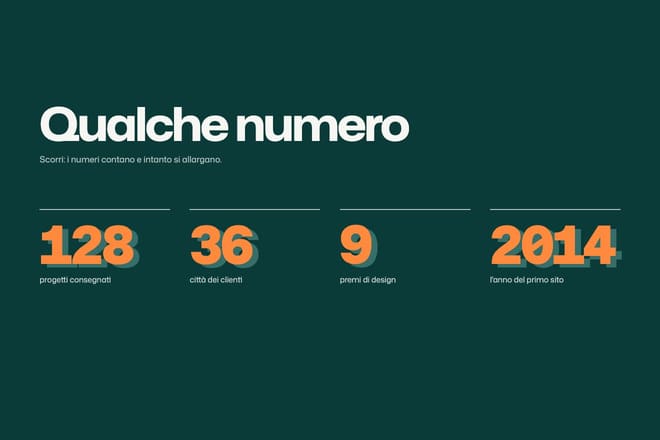
An example from the library: in the photo that comes into focus on scroll the picture arrives soft and slightly too big, then settles as you scroll. With reduced motion the photo is already sharp and in place and simply fades in, so the page says the same thing without any zooming. In numbers that count up and widen the counting becomes the final figure, written straight away.
Content must not depend on motion
The worst mistake is not an annoying animation. It is content you cannot see without one. It happens in three ways.
The starting state hidden in CSS. If the stylesheet says opacity: 0 and a script is meant to bring it to 1, all it takes is for the script not to run, because of an error, a network block or a browser extension, and the page stays blank. Let the script itself apply the hidden state just before animating. With gsap.from that happens automatically: GSAP starts from the final state written in your CSS and only moves the element to the starting value once it is ready.
Text that only appears on scroll. A section that can only be read by scrolling slowly, one word at a time, is unreadable for people who scroll fast, for keyboard users, and for screen readers that read the document without scrolling it. The text has to be in the document, complete, from the start; the animation only decides how it shows up.
Information carried by movement. If the only way to tell an action worked is to watch an icon transform, anyone who cannot see it will never know. Every outcome should also be written down, as visible text or as a message for assistive technology.
<p class="outcome" role="status" aria-live="polite"></p>function announce(text) {
document.querySelector('.outcome').textContent = text;
}
announce('Added to your cart');An element with role="status" is read out by screen readers as soon as its text changes, without moving focus. It is the right way to say “done” to someone who cannot see the tick.
Motion that starts by itself
The international web accessibility guidelines are specific here: any movement that starts automatically, lasts more than five seconds and sits alongside other content must be possible to pause, stop or hide. That covers rotating carousels, endlessly scrolling logo strips, animated backgrounds and reviews that change by themselves.
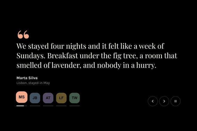
The fixes are simple. Motion stops when the pointer is over it and when something inside it receives focus; there is a visible pause button; and with reduced motion it never starts. In the reviews that roll each review stays put for a few seconds with a bar showing the time, and the pointer, keyboard focus or the pause button all stop the bar.
Avoid entirely anything that flashes more than three times a second. Above that threshold it can cause seizures in people with photosensitive epilepsy, and no system setting protects them from it.
Keyboard and focus
Animations often change what is on the page, and keyboard users need to be able to follow those changes. Three rules cover almost every case.
Focus must be visible. Never outline: none without an alternative. You can draw a nicer outline with :focus-visible, but it has to be there. During an animation the outline should follow the element: if you animate an inner child, the outline stays on the container and does not jump.
Focus goes where the content goes. When a panel, menu or dialog opens, focus moves inside it; when it closes, focus returns to the button that opened it. A menu that slides in beautifully but leaves focus behind on the covered page is unusable with a keyboard.
Do not animate something about to receive focus in a way that hides it. A field that fades in over a second while focus is already inside it means typing blind. Interactive elements must be visible and usable at once, even if the animation around them carries on.
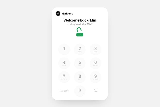
The passcode keypad that unlocks the app is a good example of motion that does not get in the way: the keys press down with a light ripple, but entry works at any speed, including from a physical keyboard, and a wrong code is announced as well as shown.
Waiting and errors
Two moments need particular care: waiting, and things going wrong.
While loading, a skeleton with a moving glint is a good solution, but switch the glint off under reduced motion and leave the grey shape still. The loading skeleton does exactly that, and when the data arrives the content takes the place of the bones without pushing the rest of the page around. For screen readers, add aria-busy="true" to the container and remove it once the content is ready.
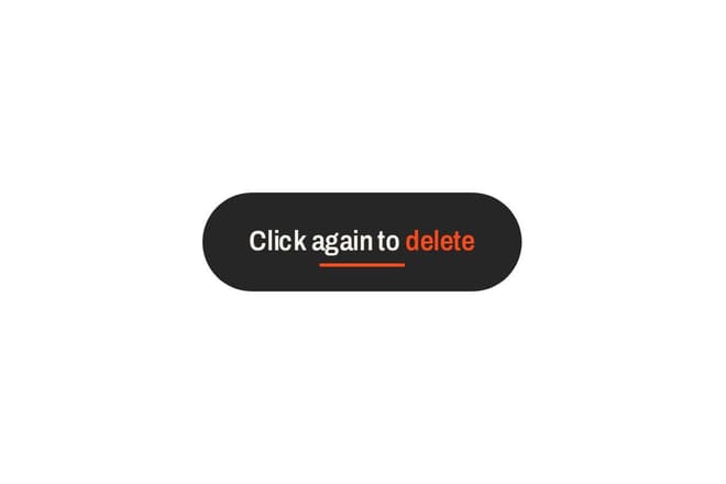
For errors, the classic shake of a wrong field works well for sighted users but is an abrupt movement. Under reduced motion, swap it for a colour change and a thicker border, and in every case write the error message next to the field and link it with aria-describedby. The button that asks twice does not rely on the stretching pill alone to warn people: the label changes too, and screen readers read it.
Sound and haptics count as motion too
Reducing motion is mostly about what moves on screen, but the same people are often bothered by other sudden effects. A sound that plays on every click, or a vibration on every tap, should follow the same logic: off by default or easy to switch off, and never the only way an outcome is communicated. On phones the Vibration API is a nice touch for confirming a payment or a long press, but it has to go hand in hand with something visible and something written.
Checking your own work
The checks are simple and worth doing for every new animation. Turn on Reduce Motion in your system settings and go through the page: everything should be readable, with nothing sliding or zooming. Navigate with the keyboard only, from the first element to the last: focus should always be visible and never end up behind anything. Load the page with scripts disabled: all the content should be there. And at least once, listen to the page with a screen reader, VoiceOver on Mac and iPhone or NVDA on Windows: every action should have a response you can hear, not just one you can see. Every piece in the Animorio library respects reduced motion: switch it on in your system, open a demo, and you will see the version without movement.
Try them in the library
The pieces this guide mentions, with the live demo, the knobs and the code.