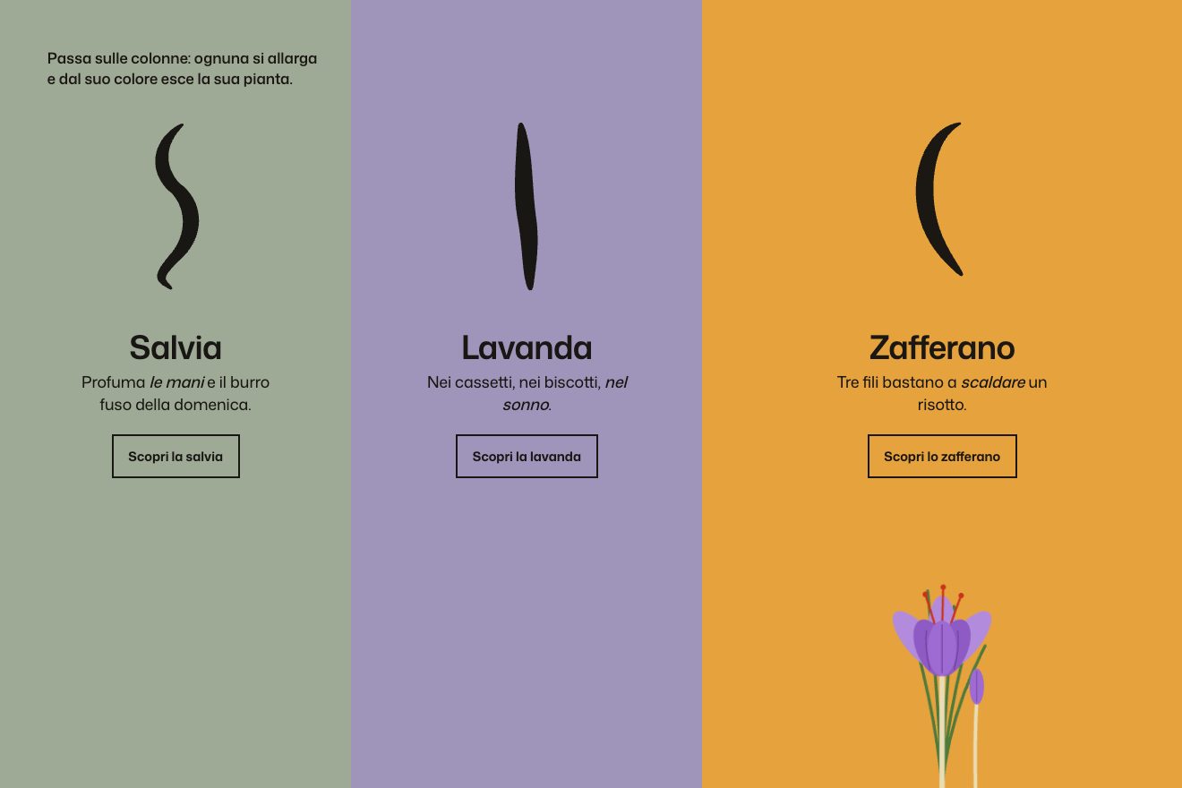
The colour columns
Hover, SVG
The activity card of a dashboard, dark and product grade: six months of days light up in a diagonal wave while the total of contributions counts up. Under the pointer the cells grow like the icons of a dock, a white outline jumps from day to day on a spring and a glass label follows it with the number and the date. Touching ‘Longest streak’ the longest run lights up one day after the other.
A folder that runs on its own: index.html, style.css, script.js and the libraries from a CDN. The React and Vue tabs hold the same demo as a ready component, which switches its animations off when it leaves the page.
<!doctype html>
<!--
  "Activity heatmap" from Animorio · https://animorio.com
  License: free on your own sites and your clients’ sites, paid work included.
  Not for resale, redistribution, templates or code collections · https://animorio.com/en/license/
-->
<html lang="en">
<head>
  <meta charset="utf-8">
  <meta name="viewport" content="width=device-width, initial-scale=1">
  <title>The dashboard activity heatmap with cells that rise under the pointer</title>
  <link rel="stylesheet" href="https://cdn.jsdelivr.net/npm/@fontsource-variable/mona-sans@5.3.0/wdth.css">
  <link rel="stylesheet" href="style.css">
</head>
<body>
  <main class="stage">
    <!-- the activity card of a team dashboard: the days light up in a diagonal wave while the total counts up; under
         the pointer the cells rise like the icons of a dock, an outline jumps from day to day on a spring and a glass
         label follows with the day and its number; the longest streak can be traced one day after the other -->
    <article class="card" data-card aria-label="Team activity, last six months">
      <span class="card__sheen" aria-hidden="true"></span>
      <header class="head">
        <span class="brand">
          <svg class="brand__mark" viewBox="0 0 20 20" aria-hidden="true"><path d="M4 3h5v6h7v8h-5v-6H4Z"></path></svg>
          Kelvo
        </span>
        <span class="head__range">Last 6 months</span>
      </header>

      <div class="total">
        <span class="total__n" data-total>0</span>
        <span class="total__label">contributions by the team</span>
        <span class="total__delta">
          <svg viewBox="0 0 12 12" aria-hidden="true"><path d="M2.5 9.5 9.5 2.5M4.4 2.5h5.1v5.1"></path></svg>
          18%
        </span>
      </div>

      <div class="map" data-map>
        <svg class="map__svg" data-svg role="img" aria-label="Heatmap of daily contributions">
          <g data-months class="map__months"></g>
          <g data-days class="map__days"></g>
          <g data-cells></g>
          <rect class="map__cursor" data-cursor></rect>
        </svg>
        <div class="tip" data-tip aria-hidden="true">
          <b data-tip-n>9 contributions</b>
          <span data-tip-d>Tue, 14 Oct</span>
        </div>
      </div>

      <footer class="foot">
        <button class="streak" type="button" data-streak>
          <svg viewBox="0 0 14 14" aria-hidden="true"><path d="M7.6 1.2 3 7.8h3.4L5.9 12.8 11 6h-3.6Z"></path></svg>
          Longest streak <b data-streak-n>0 days</b>
        </button>
        <span class="legend" aria-hidden="true">
          Less
          <i></i><i></i><i></i><i></i><i></i>
          More
        </span>
      </footer>
    </article>
  </main>

  <script src="https://cdn.jsdelivr.net/npm/gsap@3.15.0/dist/gsap.min.js"></script>
  <script src="script.js"></script>
</body>
</html>Change values, colours and text with the controls and watch the animation respond live. Or write in the code yourself. Then download the folder with your changes.
26 values to change
With the Animorio connector, Claude Code, ChatGPT, Cursor or VS Code take it from here, guide included, and fit it into your project. Paste this request:
Take “Activity heatmap” from Animorio and fit it into my siteEach day is an object with its SVG cell and three numbers: show (how far it has popped up), h (how close the pointer is) and s (whether it is part of the lit streak). Every frame the cell’s scale is show times (1 + MAGNIFY times h), written into its transform only if it changed.
A GSAP timeline takes show from 0 to 1 with back.out for each cell, delayed by column plus row times 0.7, multiplied by WAVE: the wave travels diagonally. The same time counts the total up, which is the real sum of the days drawn.
For each cell the distance from the pointer is measured in cells; inside RADIUS the wanted value is (1 minus distance over RADIUS) squared, and h chases it with a step proportional to time. The cells are centred on the origin, so they grow from their middle and the SVG lets them spill past its edge.
The day under the pointer is found by dividing the position by the grid pitch. The white outline and the glass label chase it on a spring integrated by hand (stiffness 210, damping 19, two steps a frame); the label stays inside the map’s sides and goes below when there is no room above.
The streak is the longest run of days with at least one contribution, found in the data. A timeline takes s to 1 one day after the other every 45 milliseconds, with a small scale kick and the white edge, and after a second and a half takes it back to zero in the same order.
The grid pitch is the smaller of the width divided by the weeks and the height left divided by seven; under 14 pixels the weeks drop to twenty and then sixteen. On resize the map is built again from scratch.
| Name | File | Default | What it changes |
|---|---|---|---|
ACCENT | script.js | #7a6bff | The colour of the busy days. |
MAGNIFY | script.js | 0.55 | How much the cell under the pointer grows: 0.55 = one and a half times. |
RADIUS | script.js | 2.8 | How many cells away the magnification reaches. |
WAVE | script.js | 0.03 | How many seconds between one diagonal and the next, when the days light up. |
STIFFNESS | script.js | 210 | The spring of the outline and the label: higher is quicker. |
DAMPING | script.js | 19 | Lower lets the outline pass the mark and come back. |
SEED | script.js | 7 | Changes the invented data of the days. |
LOOP | script.js | true | Left alone, it starts the round again. |
For the dashboard of a developer app, a work tool or a habit app: the card that sums up months of activity day by day, also good on the product page as a showpiece.
The same animation with adapted sizes: sixteen or twenty weeks instead of twenty six, without the weekdays on the left, and the pitch also follows the height. With a finger the cells rise where it touches and drags.
The map fades in with the total already written; the cells do not grow, the outline and the label go from day to day without a spring and the streak lights up all at once.
GSAP 3.15.0, Mona Sans (font variabile) 5.3.0.
Compressed with gzip, the three demo files weigh 8.1 KB; the libraries: GSAP 28 KB.
Tested on 13 November 2026
Use it in your own projects and in your clients’ projects. Do not resell it or redistribute it as is. GSAP stays under its own Standard license. Full license.
Support Animorio
Animorio stays free thanks to the people who support it. If you like, buy us a coffee: it helps us make the next animations.
You asked for
We made it for you: it’s in the library, with the preview, the Playground and the code to copy.
An animation you can’t find, or a site to take apart in the journal: tell us which. We pick the next ones from here.
With your account’s email and password.
or with your email
You’re signed in as .
With your account, you can download the zip of every animation and every pack, for free.