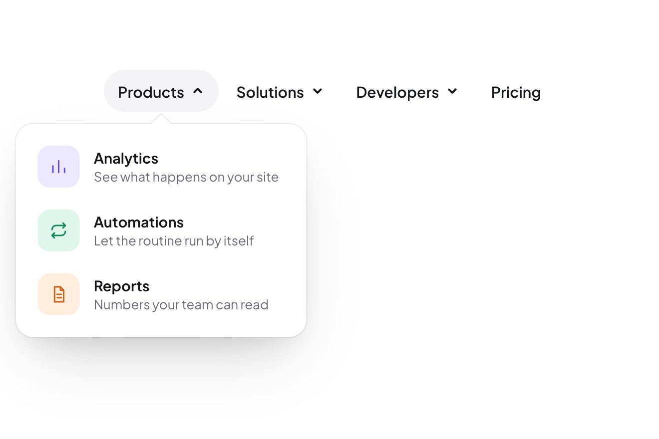
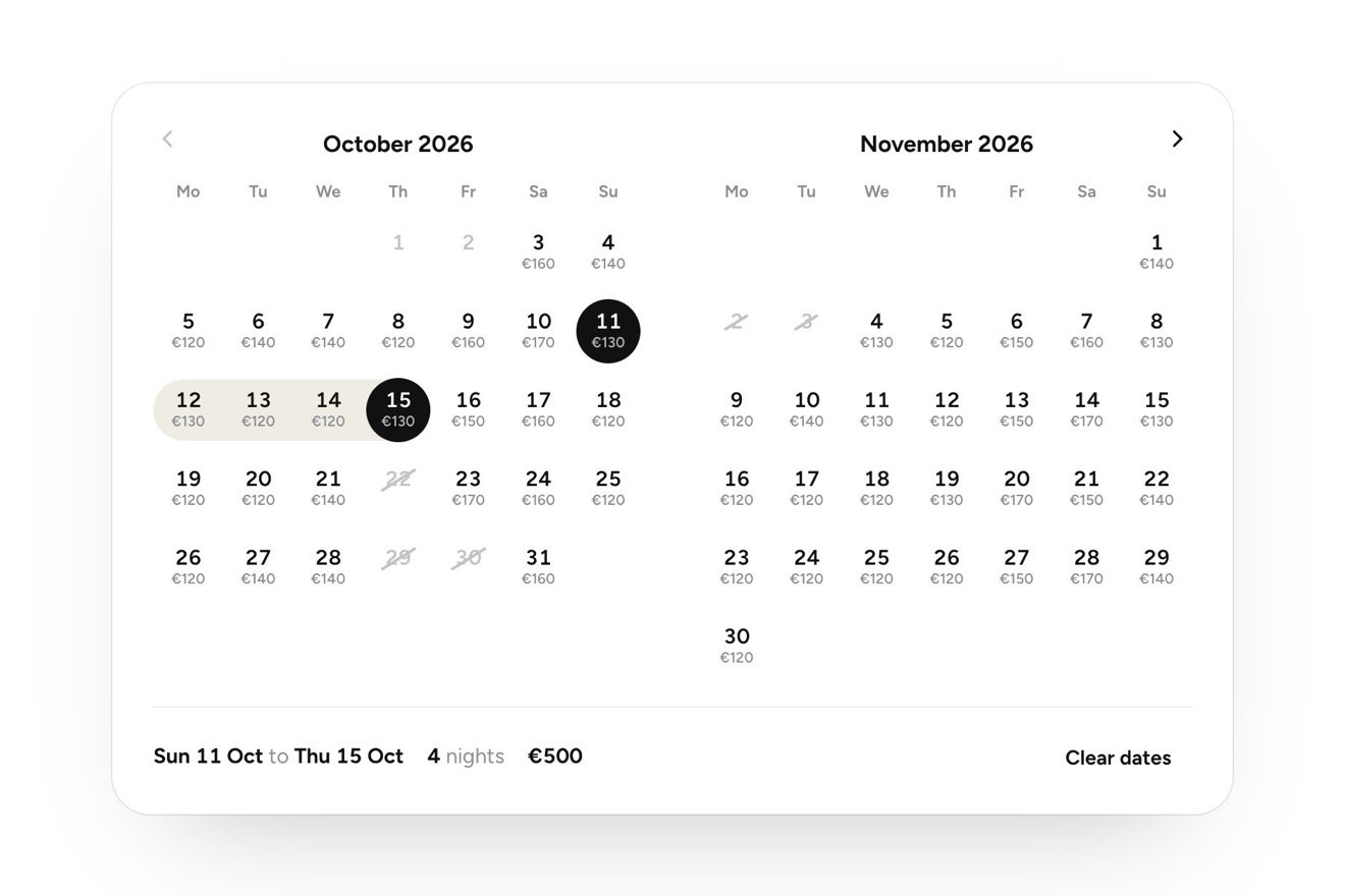
The inchworm menu
Menus, Hover, Transitions
The «Preview» button of a site editor, under a small frame with the page being built: pressed, the dark pill squashes and stretches on a spring into three devices, desktop, tablet and phone, with a cream mark sliding under the one you point at. Pick a device and the pill closes around «Previewing Phone» while the frame above takes that device's size and every block of the page flies to its new place: three cards become two and then one, the links fold into a menu icon, the headline wraps longer. Hover the button and it offers «Exit preview».
A folder that runs on its own: index.html, style.css, script.js and the libraries from a CDN. The React and Vue tabs hold the same demo as a ready component, which switches its animations off when it leaves the page.
<!doctype html>
<!--
  "Device preview button" from Animorio · https://animorio.com
  License: free on your own sites and your clients’ sites, paid work included.
  Not for resale, redistribution, templates or code collections · https://animorio.com/en/license/
-->
<html lang="en">
<head>
  <meta charset="utf-8">
  <meta name="viewport" content="width=device-width, initial-scale=1">
  <title>The preview button that reflows the page for each device</title>
  <link rel="stylesheet" href="https://cdn.jsdelivr.net/npm/@fontsource-variable/mona-sans@5.3.0/wdth.css">
  <link rel="stylesheet" href="style.css">
</head>
<body>
  <main class="stage" data-stage>
    <!-- the preview button of a site editor: it opens into three devices, and the page above resizes and reflows for
         the one you pick (three cards become two, then one; the links fold into a menu icon) -->
    <div class="kit" data-kit>
      <div class="size" data-size aria-live="polite"><span data-sizetext>Desktop · 1280 px</span></div>

      <div class="frame is-desktop" data-frame aria-hidden="true">
        <div class="frame__bar">
          <span class="frame__dot"></span><span class="frame__dot"></span><span class="frame__dot"></span>
          <span class="frame__url"></span>
        </div>
        <div class="page" data-page>
          <div class="nav">
            <span class="nav__logo f"></span>
            <span class="nav__links"><span class="nav__link f"></span><span class="nav__link f"></span><span class="nav__link f"></span></span>
            <span class="nav__burger f"><i></i><i></i><i></i></span>
          </div>
          <div class="hero">
            <span class="hero__line hero__line--a f"></span>
            <span class="hero__line hero__line--b f"></span>
            <span class="hero__sub f"></span>
            <span class="hero__cta f"></span>
          </div>
          <div class="cards">
            <span class="card f"><span class="card__img c1"></span><span class="card__t"></span><span class="card__t card__t--s"></span></span>
            <span class="card f"><span class="card__img c2"></span><span class="card__t"></span><span class="card__t card__t--s"></span></span>
            <span class="card f"><span class="card__img c3"></span><span class="card__t"></span><span class="card__t card__t--s"></span></span>
          </div>
        </div>
        <span class="frame__sheen" data-sheen></span>
      </div>

      <div class="pv" data-pv>
        <span class="pv__shine" data-shine aria-hidden="true"></span>
        <button class="pv__layer pv__idle" type="button" data-idle aria-haspopup="true" aria-expanded="false">
          <svg class="pv__ico" viewBox="0 0 20 20" aria-hidden="true"><path d="M1.8 10S5 4.5 10 4.5 18.2 10 18.2 10 15 15.5 10 15.5 1.8 10 1.8 10z"/><circle cx="10" cy="10" r="2.6"/></svg>
          <span>Preview</span>
        </button>
        <div class="pv__layer pv__choices" data-choices role="radiogroup" aria-label="Preview on">
          <span class="pv__mark" data-mark aria-hidden="true"></span>
          <button class="pv__chip" type="button" role="radio" aria-checked="false" data-dev="desktop" aria-label="Desktop">
            <svg viewBox="0 0 20 20" aria-hidden="true"><rect x="2" y="3.5" width="16" height="10.5" rx="1.6"/><path d="M7 17h6M10 14v3"/></svg>
          </button>
          <button class="pv__chip" type="button" role="radio" aria-checked="false" data-dev="tablet" aria-label="Tablet">
            <svg viewBox="0 0 20 20" aria-hidden="true"><rect x="4" y="2" width="12" height="16" rx="1.8"/><path d="M9 15.5h2"/></svg>
          </button>
          <button class="pv__chip" type="button" role="radio" aria-checked="false" data-dev="phone" aria-label="Phone">
            <svg viewBox="0 0 20 20" aria-hidden="true"><rect x="6" y="2" width="8" height="16" rx="1.8"/><path d="M9.2 4.3h1.6"/></svg>
          </button>
          <span class="pv__sep" aria-hidden="true"></span>
          <button class="pv__close" type="button" data-close aria-label="Close">
            <svg viewBox="0 0 16 16" aria-hidden="true"><path d="M4.5 4.5l7 7M11.5 4.5l-7 7"/></svg>
          </button>
        </div>
        <button class="pv__layer pv__set" type="button" data-set>
          <span class="pv__set-in" data-setin>
            <svg class="pv__ico" data-setico viewBox="0 0 20 20" aria-hidden="true"><rect x="6" y="2" width="8" height="16" rx="1.8"/><path d="M9.2 4.3h1.6"/></svg>
            <span class="pv__set-word">Previewing</span> <span class="pv__set-dev" data-setdev>Phone</span>
          </span>
          <span class="pv__set-out" data-setout aria-hidden="true">
            <svg class="pv__ico" viewBox="0 0 20 20" aria-hidden="true"><path d="M8 5.5L3.5 10 8 14.5M4 10h12.5"/></svg>
            Exit preview
          </span>
        </button>
      </div>
    </div>
    <svg class="pointer" data-pointer viewBox="0 0 24 24" aria-hidden="true"><path d="M5 3.5 18.5 12 12.4 13.6 9.4 19.6z"/></svg>
  </main>

  <script src="https://cdn.jsdelivr.net/npm/gsap@3.15.0/dist/gsap.min.js"></script>
  <script src="https://cdn.jsdelivr.net/npm/gsap@3.15.0/dist/Flip.min.js"></script>
  <script src="script.js"></script>
</body>
</html>Change values, colours and text with the controls and watch the animation respond live. Or write in the code yourself. Then download the folder with your changes.
27 values to change
With the Animorio connector, Claude Code, ChatGPT, Cursor or VS Code take it from here, guide included, and fit it into your project. Paste this request:
Take “Device preview button” from Animorio and fit it into my siteThe pill is a single element with three layers stacked: Preview, the row of devices and the chosen device. GSAP changes its width by measuring the incoming layer with width max-content and getBoundingClientRect, on a back.out curve with the overshoot of OVERSHOOT.
Under the icons sits an absolute cream mark that takes the position of the icon you point at through offsetLeft and offsetTop, in 0.42 seconds on the same spring; the icon above turns dark with a class.
The frame and every block of the page get their state saved with Flip.getState; then the frame changes class (is-desktop, is-tablet, is-phone) and width, and Flip.from carries everything from the old place to the new one with nested true and a stagger of STAGGER. The card grid goes from three columns to two and to one in CSS only.
The links and the menu icon don't move: Flip sees them appear and disappear (display none) and hands them to onEnter and onLeave, which grow or shrink them with a fade.
The frame height is the smallest of 330 pixels, half the window height and what is left above the button; the widths of the three devices follow from it (1.6, 0.8 and 0.5 times) and are measured again on resize. Inside, every size is a multiple of --u, a hundredth of the height.
A GSAP timeline moves a drawn pointer: it opens, passes over the tablet, picks the phone, exits the preview, then picks the tablet; at the first real movement, touch or key it stops.
| Name | File | Default | What it changes |
|---|---|---|---|
OPEN | script.js | 0.6 | Seconds for the pill to open into the three devices. |
CLOSE | script.js | 0.5 | Seconds for the pill to close around the chosen device. |
REFLOW | script.js | 0.9 | Seconds for the frame to resize and the page blocks to reach their new place. |
OVERSHOOT | script.js | 1.3 | How far the pill and the blocks pass their mark before settling (0 none). |
STAGGER | script.js | 0.03 | Seconds between one page block and the next as they reflow. |
PRESS | script.js | 0.96 | How much the pill squashes under the finger (1 never). |
SHEEN | script.js | 0.9 | How bright the light crossing the frame and the pill is (0 none). |
SPEED | script.js | 1 | 2 = the pilot twice as fast, 0.5 = half. |
LOOP | script.js | true | The pilot plays the story again and again. |
--accent | style.css | #5b5cf0 | The violet of the button inside the previewed page. |
--pill | style.css | #121216 | The black of the pill. |
In a site editor, a CMS, a landing page or newsletter builder: whoever builds the page checks with a single gesture how it looks on desktop, tablet and phone, and sees right away what changes.
The same animation with adapted sizes: the frame is sized on the window height and the desktop version narrows to nine tenths of the width; the icons are a little smaller. Without hover, the first tap on the chosen device shows Exit preview and the second exits.
Nothing moves: the pill changes width at once, the layers swap with a fade and the frame fades out and back already at its new size; the pilot has no pointer and shows the states one after another.
GSAP 3.15.0, Flip (GSAP) 3.15.0, Mona Sans (font variabile) 5.3.0.
Compressed with gzip, the three demo files weigh 7.5 KB; the libraries: GSAP + Flip 37 KB.
Tested on 8 November 2026
Use it in your own projects and in your clients’ projects. Do not resell it or redistribute it as is. GSAP stays under its own Standard license. Full license.
Support Animorio
Animorio stays free thanks to the people who support it. If you like, buy us a coffee: it helps us make the next animations.
You asked for
We made it for you: it’s in the library, with the preview, the Playground and the code to copy.
An animation you can’t find, or a site to take apart in the journal: tell us which. We pick the next ones from here.
With your account’s email and password.
or with your email
You’re signed in as .
With your account, you can download the zip of every animation and every pack, for free.