Guide
Animated type: words, letters and variable fonts
A headline that arrives word by word, letters that jump as the pointer passes, a menu whose weight shifts where the hand goes: how to split text without breaking it, how to use the weight and width axes of a variable font, and the rules that keep everything readable, screen readers included.
 Tumbling letters headline
Text is the part of a website people actually read, so animating it is a small gamble: every movement risks getting between the words and the reader. Done well, though, animated type is one of the most elegant effects on the web. A headline arriving one word at a time sets the rhythm of the sentence, a letter that reacts to the pointer makes the page feel alive, a weight that shifts under the hand shows off what a typeface can do. This guide starts with the basic technique, splitting text into pieces, and works up to variable fonts, with the rules we follow in the Animorio library so readability is never lost.
Splitting text: lines, words, letters
To animate one word at a time, each word has to be its own element. The browser sees a heading as a single block of text, so the first step is always to split it into span elements. You can do it by hand, but GSAP’s SplitText handles the hard cases: lines that change when the window resizes, spaces, combined characters, accented letters.
import { SplitText } from 'gsap/SplitText';
gsap.registerPlugin(SplitText);

const heading = document.querySelector('.heading');
const split = SplitText.create(heading, { type: 'lines, words', mask: 'lines' });

gsap.from(split.words, {
  yPercent: 110,
  duration: 0.9,
  ease: 'expo.out',
  stagger: 0.06,
});
The mask: 'lines' option wraps every line in a container that clips whatever sticks out, so words rise from below the line’s edge instead of appearing out of thin air. That clipping is what gives the most polished entrances their typographic feel. The delay between words, the stagger, is the rhythm of the sentence: between 0.04 and 0.08 seconds the sentence reads as it arrives; above 0.12 people start waiting.
Lines, words or letters: which to choose
The unit you animate changes the result a lot, and it is not only a matter of taste.
By line suits paragraphs and subheadings. It is the calmest entrance, and the text stays readable while it arrives.
By word suits headlines. Each word arrives whole, so the sentence can be read in real time, and you can feel its rhythm.
By letter suits short, important words: a name, a figure, a two-word title. On longer sentences letters turn into a shower of marks that can only be read at the end.
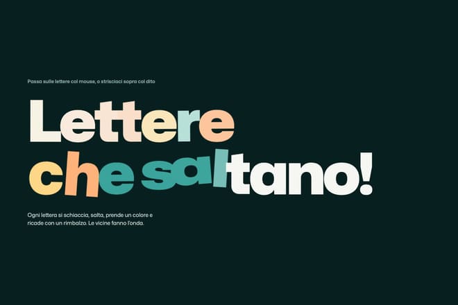
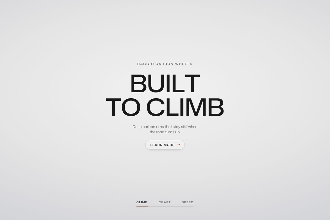
In the headline with tumbling letters each letter tumbles in from above, turned a quarter over, with a shadow that shortens as it lands. It works because the brand is a single word. In chapters whose letters light up at random the title’s letters switch on in scattered order, but the body text below rises line by line, more calmly: single letters are kept for what can be read at a glance.
Letters that react to the pointer
Type can also respond to whoever is looking at it. The basic idea is to measure the distance between the pointer and each letter, and use it to decide how far the letter moves.
const letters = SplitText.create('.word', { type: 'chars' }).chars;
const lift = letters.map((l) => gsap.quickTo(l, 'y', { duration: 0.5, ease: 'elastic.out(1, 0.35)' }));

document.querySelector('.word').addEventListener('pointermove', (e) => {
  letters.forEach((l, i) => {
    const r = l.getBoundingClientRect();
    const d = Math.abs(e.clientX - (r.left + r.width / 2));
    lift[i](d < 60 ? -(60 - d) * 0.3 : 0);
  });
});
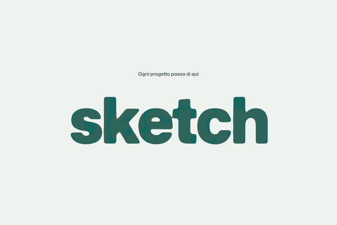
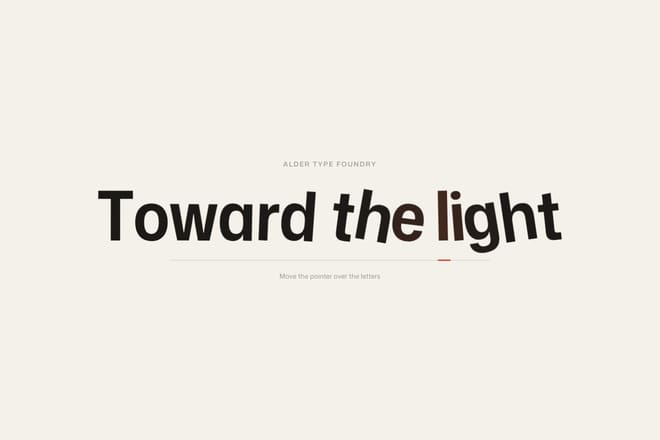
Every letter gets its own quickTo function, its own spring, and neighbours move a little less than the letter under the pointer, so a wave appears. That is the principle behind jumping letters, where each letter squashes, rises and drops back with a bounce, and the headline whose letters lean toward the pointer, where letters tilt from their foot like stems toward the light.
One caution: keep these reactions to headlines and isolated words, never body text. A paragraph that moves under the pointer is a paragraph nobody can read.
Variable fonts: weight and width as animatable properties
A variable font is a single file holding a whole range of shapes. Instead of one file for regular, one for bold and one for condensed, it has axes: weight (wght), width (wdth), sometimes slant or optical size. Each axis is a continuous number, and a continuous number can be animated.
Animorio uses Mona Sans, a variable font with a weight axis from 200 to 900 and a width axis from 75 to 125. In CSS the axes are set like this:
.heading {
  font-family: 'Mona Sans Variable', sans-serif;
  font-variation-settings: 'wght' 420, 'wdth' 100;
  transition: font-variation-settings 0.4s cubic-bezier(0.22, 1, 0.36, 1);
}
@media (hover: hover) and (pointer: fine) {
  .heading:hover {
    font-variation-settings: 'wght' 760, 'wdth' 118;
  }
}
For the two most common axes there are also the standard properties font-weight and font-stretch, which the browser maps to wght and wdth. They have one advantage: they do not overwrite each other, whereas font-variation-settings always has to list every axis together, because each declaration replaces the previous one entirely.
With GSAP the most practical approach is one custom CSS property per axis, read by the stylesheet.
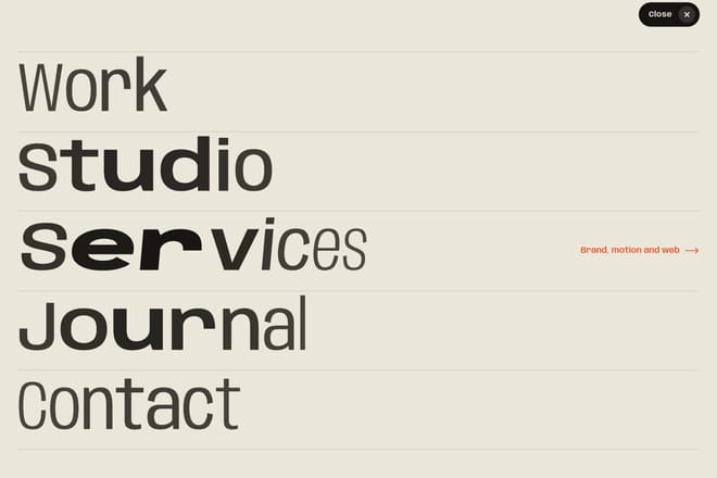
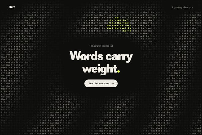
.letter { font-variation-settings: 'wght' var(--weight, 400), 'wdth' var(--width, 100); }gsap.to('.letter', { '--weight': 800, '--width': 120, stagger: 0.03, duration: 0.6 });In the variable weight menu each letter takes its weight and width from its distance to the pointer, so a wave of black, wide letters follows the hand through the words. In the background of letters gaining weight the weight axis becomes a texture: bands of solid black drifting slowly across a halftone of thin letters.
Changing width moves the text
There is a consequence that surprises everyone the first time: when a letter gets wider or heavier it takes up more room, and the letters after it shift. In a centred heading the whole line grows on both sides; in a paragraph the text may wrap at a different point and make the page jump.
There are three ways to deal with it. The first is to accept it and use it: in words that melt into each other the font width slides from one word to the next as you scroll, and the change in size is part of the effect. The second is to reserve the space: give the container the width of the widest version, so the text changes shape inside a box that stays put. The third is to compensate: as weight goes up, narrow the width slightly, and the word stays the same size while it gets darker. That compensation is exactly why variable fonts with two axes suit animation so well.
Numbers that count
Figures are a case of their own: prices, statistics, counters. A number climbing from zero to its value draws the eye and makes the figure feel bigger, but it has two traps. The first is jittering width: in most typefaces a 1 is narrower than an 8, so a number changing digits shakes from side to side. The fix is tabular figures, all the same width, which well made fonts already contain.
.counter { font-variant-numeric: tabular-nums; }The second is duration. The count should finish within a second and a half at most, slowing towards the end with a curve such as power2.out so the last digits can be read. And write the final value into the HTML from the start: the script only resets it to zero once it is ready, so anyone who never sees the animation still reads the right number.
Readability first
Run every text effect past a few simple questions.
Can you read it while it moves? A headline that arrives word by word can be read during the entrance. One that arrives letter by letter, shuffled, can only be read at the end: fine for two words, not for a sentence.
How long does it take? A headline should be complete in a little over a second. Any longer and visitors start reading something else.
Does it repeat? A headline that animates every time it comes back on screen becomes irritating by the third time. Entrances happen once; pointer reactions can repeat, because the reader is driving them.
Does the contrast hold? Letters that go from thin to heavy, or that fade, have to stay legible at every moment of their animation, not just at the end. Weight 200 in light grey on white, even for half a second, is unreadable for many people.
Split text and screen readers
Splitting a heading into dozens of span elements has a side effect: some screen readers read each piece as a separate word, or worse, letter by letter. SplitText prevents this on its own by putting the full text in an aria-label on the element and hiding the pieces with aria-hidden. If you split text by hand, do the same.
<h1 aria-label="Every word in its place">
  <span aria-hidden="true">Every</span>
  <span aria-hidden="true">word</span>
  <span aria-hidden="true">in its place</span>
</h1>
Under reduced motion the text should simply be there, complete and still: no word-by-word entrance, no jumping letters. Pointer reactions can stay if they only change weight without moving anything, because a change of weight is not movement through space.
Where to start
The best way in is a headline split by words with a mask on the lines: it is the simplest technique and the one that improves a page the most. Then try a variable font on something small, a button or a menu item, and play with weight and width. Every text piece in the library has a Playground with knobs for timing, delays and weights, many of them for the word itself, so you can copy the code once the rhythm feels right.
Try them in the library
The pieces this guide mentions, with the live demo, the knobs and the code.