Guide
Animations for an online shop: which ones matter and where
In an online shop motion has one job: making clear what just happened and what comes next. The add to cart button, the product photo, the sale price, the move to checkout and the loading states, with the right timings, the code to build them and the animations you are better off leaving out.
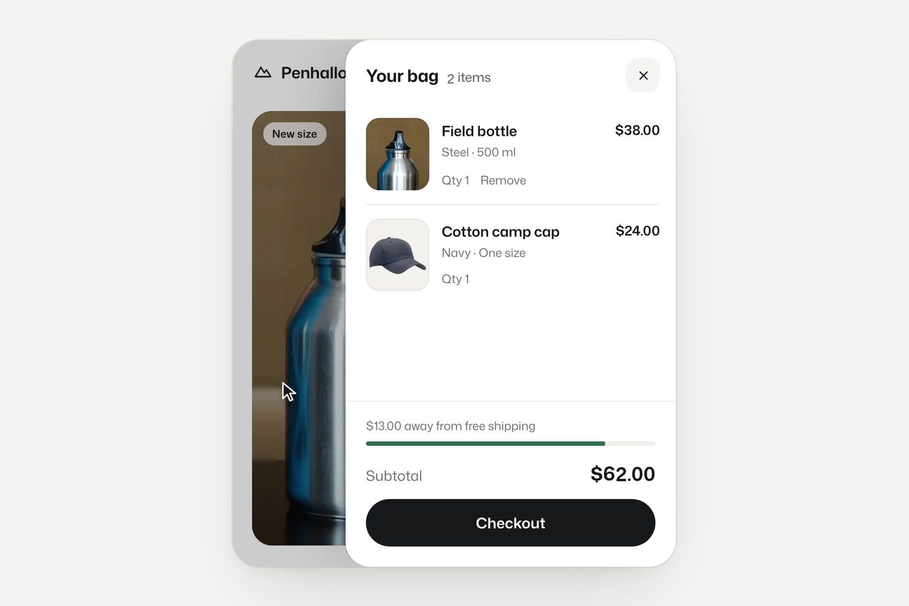 Fly-to-cart photo
Animation in an online shop is not there to impress. It is there to answer three questions shoppers ask all the time, usually without noticing: did that work? where did it go? what happens now? A button that does not react to a tap gets tapped twice, and two taps on add to cart put two items in the basket. A cart that updates quietly in a corner makes people think nothing happened. An abrupt jump from the product page to payment feels like landing on a different site. Each of these moments is fixed by a small, precise movement, and almost everything else can go.
The add to cart button: the answer has to come at once
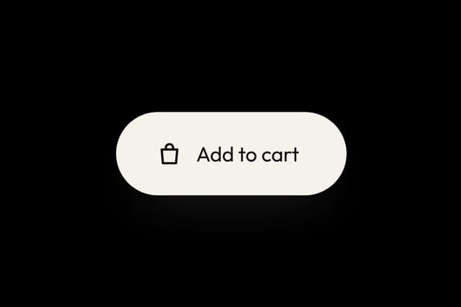
The tap on “Add to cart” is the most important moment on the page, and there is one rule: the reaction must start within a tenth of a second, even if the request to the server has not come back yet. The button dips slightly under the finger, then changes state in a way you can read: an icon that turns into a tick, a label that becomes “Added”, a counter that appears.
const button = document.querySelector('.add');

button.addEventListener('click', async () => {
  button.disabled = true;
  gsap.timeline()
    .to(button, { scale: 0.96, duration: 0.08 })
    .to(button, { scale: 1, duration: 0.4, ease: 'back.out(3)' });
  button.dataset.state = 'busy';

  const response = await fetch('/cart', { method: 'POST' });
  button.dataset.state = response.ok ? 'done' : 'error';
  button.disabled = false;
});
Disabling the button while the request runs prevents double orders, and keeping the state in data-state leaves the icon and label swap to CSS, so it still works when animation is turned off. The library’s add to cart button takes the idea a step further: the bag hops and flies off, and the pill closes up into a counter with minus and plus, so a second tap becomes a clear choice instead of a mistake.
Showing where the product went
When the cart lives in a side panel or an icon in the header, shoppers need to see the link between the product and the cart. The classic technique is to fly a copy of the photo from where they tapped to the cart. You do it with a fixed-position clone, working out both positions with getBoundingClientRect.
function flyToCart(photo, target) {
  const from = photo.getBoundingClientRect();
  const to = target.getBoundingClientRect();
  const copy = photo.cloneNode();
  Object.assign(copy.style, {
    position: 'fixed', left: from.left + 'px', top: from.top + 'px',
    width: from.width + 'px', margin: 0, zIndex: 50, pointerEvents: 'none',
  });
  document.body.append(copy);

  gsap.timeline({ onComplete: () => copy.remove() })
    .to(copy, { x: to.left - from.left, duration: 0.7, ease: 'power2.inOut' }, 0)
    .to(copy, { y: to.top - from.top, duration: 0.7, ease: 'back.in(1.4)' }, 0)
    .to(copy, { scale: 0.15, opacity: 0.4, duration: 0.7, ease: 'power1.in' }, 0);
}
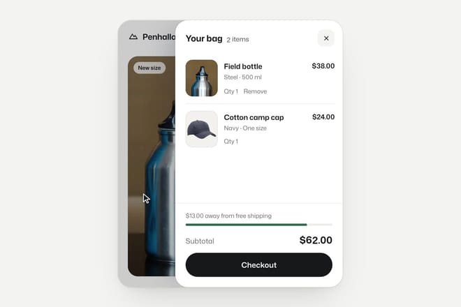
Using two different eases for the horizontal and vertical movement draws an arc instead of a straight line, and it is the arc that reads as the item going “into” something. In the product photo that flies into the side cart the cart slides in from the right on a spring while the photo is still in the air, and the photo lands in the first row: the shopper sees the product arrive exactly where they will find it again.
Keep the flight under a second. Any longer and someone adding two products in a row waits for the first flight to end before tapping the second, and the whole shop feels slow.
The product page: looking closely
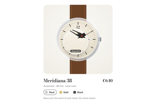
On the product page the most useful animation is not decorative: it is the one that lets people see better. A lens that follows the pointer and magnifies the photo answers “what is it really like?”, the question a physical shop answers by letting you pick the thing up. The product lens follows the pointer on a soft spring so it does not shake with the hand, and shows the watch sharp down to the smallest print on the dial.
Two rules apply to every zoom. First, the magnified image must be a bigger file, not the same photo scaled up, or the lens only shows pixels. Second, on phones replace the lens with pinch to zoom, which people already know. A lens that follows the finger covers exactly the part they want to look at.
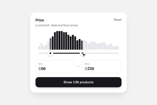
Filters deserve the same care. A price slider that shows straight away how many products are left in the range saves people from an empty results page. The two-handle price range slider does it with a thin histogram: as you drag, the bars inside the range light up and the ones outside fade.
When the price changes
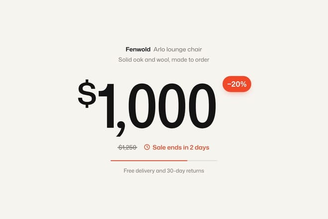
When a price changes, for a sale, a different size or a discount code, the change has to be visible. A number that silently swaps itself goes unnoticed, and an unnoticed discount is a wasted one. It takes very little: the old figure struck through and moving away, the new one rising into its place.
function changePrice(el, next) {
  gsap.timeline()
    .to(el, { yPercent: -60, opacity: 0, duration: 0.18, ease: 'power2.in' })
    .add(() => { el.textContent = next; })
    .fromTo(el, { yPercent: 60, opacity: 0 },
      { yPercent: 0, opacity: 1, duration: 0.35, ease: 'power3.out' });
}
The price that drops, the old figure falling away is the full version: a line strikes the full price, its digits come loose one at a time and the new price arrives digit by digit. For screen reader users the new price must be announced too: a container with aria-live="polite" reads out the updated value without relying on the animation at all.
From cart to checkout
The steps between cart, shipping details and payment are where most orders are lost. Animation here is about continuity: showing people they are still in the same place and moving forward, not starting over. The most effective technique is to turn an element of the previous screen into an element of the next one. With GSAP’s Flip plugin you record the starting layout, change it, and animate the difference.
import { Flip } from 'gsap/Flip';
gsap.registerPlugin(Flip);

const state = Flip.getState('.cart-row, .total');
document.querySelector('.cart').classList.add('summary');
Flip.from(state, { duration: 0.6, ease: 'power3.inOut', stagger: 0.03, absolute: true });
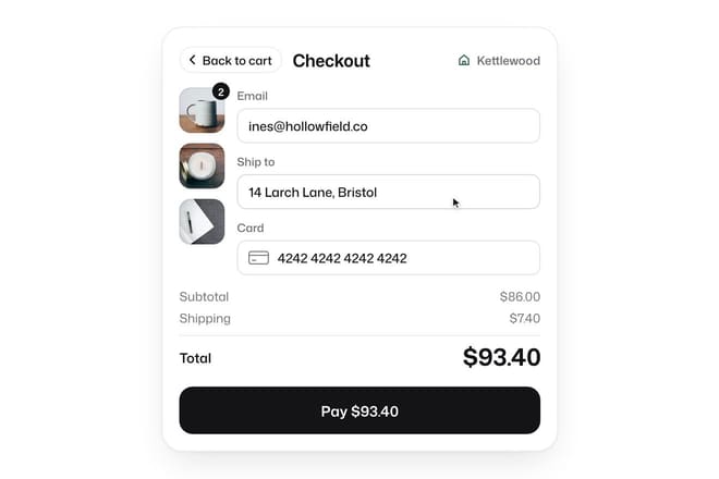
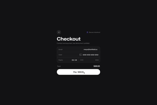
That is how the cart that turns into the order summary works: pressing Checkout shrinks the product rows into thumbnails on the side and the same panel becomes the summary. In the page transition from the Checkout button to the payment page the button itself widens until it becomes the new page, keeping its colour, so the tap and the page that follows are one and the same.
A warning: page transitions should stay under 600 milliseconds and must never block data entry. If the card field appears after a second and a half of animation, people in a hurry start typing into nothing.
Loading states: making the wait feel short
Every shop has moments where it waits for the server: search results, shipping costs, payment confirmation. A spinner only says “wait”. A skeleton, the grey outline of the page that is about to arrive, also says “here is what is coming”, and waits feel shorter because the eye starts reading the structure straight away.
.bone {
  background: linear-gradient(90deg, #e6ebe8 25%, #f2f5f3 50%, #e6ebe8 75%);
  background-size: 200% 100%;
  animation: shimmer 1.4s linear infinite;
}
@keyframes shimmer {
  to { background-position: -200% 0; }
}
@media (prefers-reduced-motion: reduce) {
  .bone { animation: none; }
}
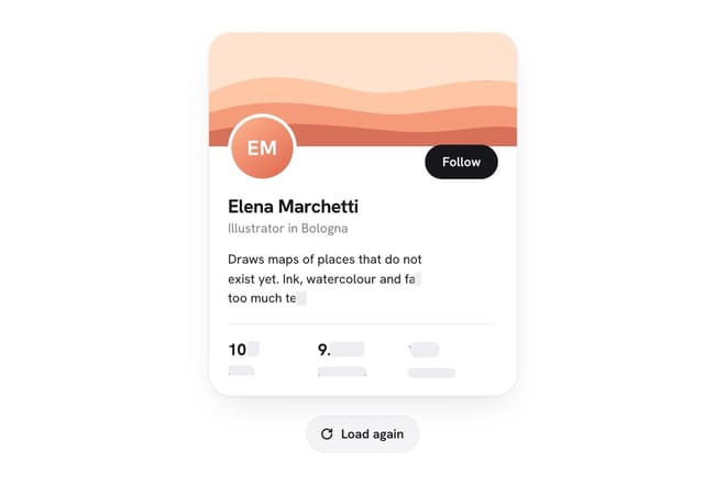
In the loading skeleton a single glint crosses all the bones together rather than one per element, and when the data arrives each bone turns into its piece from the top down. It is a small detail, but one glint is calmer and keeps the page from looking agitated. For payment confirmation a skeleton is not enough: that moment needs written words, “Confirming your payment, please do not close this page”, because the fear of paying twice is stronger than any animation.
What to leave out
Some animations that are everywhere in online shops do more harm than good.
Popups that slide in after a few seconds. They cover the product just as someone is looking at it, and the movement makes them even more intrusive. If you need one, use a still bar at the bottom.
Galleries that change photos on their own. Whoever is studying a detail has it taken away. Photos change when the shopper decides.
Scroll-in effects on every card of a grid. On a category page with a hundred products, making every card rise slows reading and slows phones. A quick fade on the first rows is plenty; the rest should simply be there.
Flashing “only 2 left” badges. The flash grabs attention once, then turns into noise and makes the shop look less trustworthy.
Animations that delay the buy button. If the button enters after the title, the photo and the description, people who had already made up their minds have to wait.
Measuring whether they work
In a shop an animation is judged by numbers, not taste. After it goes live, ask concrete questions: how many double taps land on add to cart? How many people drop out between cart and payment? How long from a tap to the first sign of a response? If an animation does not improve at least one of these, or makes one worse, take it out, however good it looks. Every animation in this guide is in the library with its code and a Playground, so you can try it with your shop’s colours and timings before copying it.
Try them in the library
The pieces this guide mentions, with the live demo, the knobs and the code.