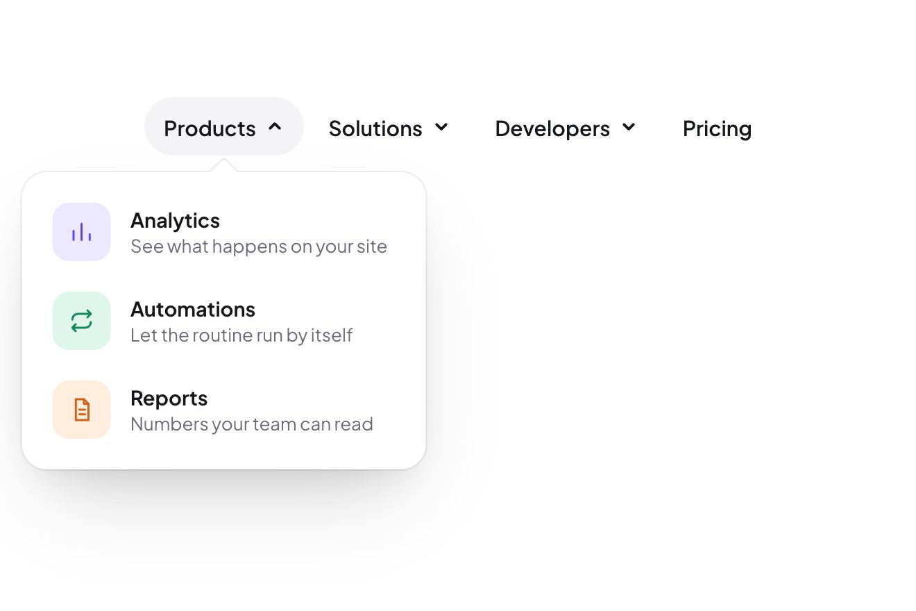
The inchworm menu
Menus, Hover, Transitions
The button to add a made-up concert, Low Tide Sessions, to your calendar, on black: a graphite pill with the calendar icon on the left and, on the right, a little paper page with the month in red and the day, 26. Pressed, the page peels off, folds in half along a crease that darkens, flies in an arc over the label and slides into the icon, which opens its page and closes it back over it with a bounce, now with the date printed on. The button becomes Added with a check drawing itself and the line with day and time; a second click plays the same gesture backwards.
A folder that runs on its own: index.html, style.css, script.js and the libraries from a CDN. The React and Vue tabs hold the same demo as a ready component, which switches its animations off when it leaves the page.
<!doctype html>
<!--
  "Add to calendar button" from Animorio · https://animorio.com
  License: free on your own sites and your clients’ sites, paid work included.
  Not for resale, redistribution, templates or code collections · https://animorio.com/en/license/
-->
<html lang="en">
<head>
  <meta charset="utf-8">
  <meta name="viewport" content="width=device-width, initial-scale=1">
  <title>The Add to calendar button with the date page that folds into the icon</title>
  <link rel="stylesheet" href="https://cdn.jsdelivr.net/npm/@fontsource-variable/mona-sans@5.3.0/wdth.css">
  <link rel="stylesheet" href="style.css">
</head>
<body>
  <main class="stage" data-stage>
    <!-- an event page's Add to calendar button: the little date page peels off the pill,
         folds in half and slides into the calendar icon, whose page closes over it -->
    <button class="btn" type="button" data-btn data-autoclic aria-pressed="false"
      aria-label="Add Low Tide Sessions, Thursday November 26 at 8:30 PM, to your calendar">
      <span class="btn__light" aria-hidden="true"></span>

      <span class="cal" aria-hidden="true">
        <span class="cal__body" data-body>
          <span class="cal__pocket"></span>
        </span>
        <span class="cal__ring cal__ring--a"></span>
        <span class="cal__ring cal__ring--b"></span>
        <span class="cal__lid" data-lid>
          <span class="face face--grid" data-face-grid>
            <span class="face__band"></span>
            <span class="face__rows"></span>
          </span>
          <span class="face face--date" data-face-date>
            <span class="face__band face__band--on" data-mon-small>NOV</span>
            <span class="face__day" data-day-small>26</span>
            <span class="face__shine" data-shine></span>
          </span>
          <span class="face face--back"></span>
        </span>
      </span>

      <span class="btn__words">
        <span class="btn__row" data-idle>
          <span class="btn__label">Add to calendar</span>
          <span class="btn__sub" data-where>Low Tide Sessions · Halden Hall</span>
        </span>
        <span class="btn__row" data-done aria-hidden="true">
          <span class="btn__label">Added</span>
          <span class="btn__sub" data-when>Thu, Nov 26 · 8:30 PM</span>
        </span>
      </span>

      <span class="btn__side" aria-hidden="true">
        <span class="chip__shadow" data-chip-shadow></span>
        <span class="chip" data-chip>
          <span class="chip__half chip__half--bottom" data-bottom>
            <span class="chip__sheet">
              <span class="chip__band" data-mon>NOV</span>
              <span class="chip__day" data-day>26</span>
            </span>
            <span class="chip__crease" data-crease></span>
          </span>
          <span class="chip__half chip__half--top" data-flap>
            <span class="chip__front">
              <span class="chip__sheet">
                <span class="chip__band" data-mon>NOV</span>
                <span class="chip__day" data-day>26</span>
              </span>
              <span class="chip__gloss" data-gloss></span>
            </span>
            <span class="chip__back"></span>
          </span>
        </span>
        <svg class="tick" viewBox="0 0 24 24" data-tick>
          <path class="tick__ring" d="M12 3.4a8.6 8.6 0 1 1 0 17.2a8.6 8.6 0 1 1 0-17.2" data-tick-ring/>
          <path class="tick__mark" d="M7.6 12.4l2.9 2.9l5.9-6.2" data-tick-mark/>
        </svg>
      </span>
    </button>
    <p class="sr" data-live aria-live="polite"></p>

    <svg class="ghost" data-ghost viewBox="0 0 24 24" aria-hidden="true"><path d="M5 3.2 19.2 11l-6.3 1.6-3.3 5.9Z"></path></svg>
  </main>

  <script src="https://cdn.jsdelivr.net/npm/gsap@3.15.0/dist/gsap.min.js"></script>
  <script src="script.js"></script>
</body>
</html>Change values, colours and text with the controls and watch the animation respond live. Or write in the code yourself. Then download the folder with your changes.
24 values to change
With the Animorio connector, Claude Code, ChatGPT, Cursor or VS Code take it from here, guide included, and fit it into your project. Paste this request:
Take “Add to calendar button” from Animorio and fit it into my siteThe little page is made of two 18 pixel halves holding the same whole page, shifted: the bottom one shows the lower half of the 26, the top one has a front and a back with backface-visibility hidden. Turning the top half by -180 degrees on the x axis, pivoting on its bottom edge, folds the page in half and shows its ruled back, as in the digits of a split-flap clock.
The icon’s page is hinged on top and turns in 3D with its own perspective: at 126 degrees it is open towards the viewer and its back shows. Right as the page arrives, while the front face is turned away, the grid page gives way to the one with the date: closing again it shows NOV and 26 with no visible swap.
The icon’s body, the little page and the icon’s page are siblings in the same stack with z-index 1, 2 and 3, and the icon itself is never transformed (it would make its own layer): so the page flies over the label, goes in front of the bottom of the pocket and stays under the page that closes.
The landing point is measured with getBoundingClientRect between the centre of the little page and the pocket; the flight is two half runs per axis, x first slow then braking, y first up then down, so the arc comes by itself. On resize, at rest, the timeline is rebuilt with the new measures and resumes where it was.
The whole gesture is one paused timeline: the first click plays it, the second plays it backwards with timeScale 1.18, so the way back really is the same gesture in reverse, even if interrupted halfway. aria-pressed tells the state and an aria-live line announces the add or the removal.
| Name | File | Default | What it changes |
|---|---|---|---|
FOLD | script.js | 0.46 | Seconds for the date page to fold in half. |
FLIGHT | script.js | 0.62 | Seconds of the folded page’s flight to the icon. |
LID_BOUNCE | script.js | 1.6 | How much the icon’s page bounces as it closes (0 crisp). |
ARC | script.js | 15 | How high the flight’s arc rises, in pixels. |
HOLD | script.js | 3.2 | Seconds the autopilot leaves «Added» before removing it. |
PRESS_SCALE | script.js | 0.972 | How far the pressed button sinks. |
ACCENT | script.js | #ff5a43 | The accent colour: the month band, the check and the rim. |
On the page of a concert, a conference, a class or a booking: the button that puts the event in the visitor’s calendar. Changing month and day on the little page, it suits any reminder with a date.
The same animation: the pill is at most the screen width minus 32 pixels, the icon and the little page keep their size and the flight is measured again on the real width. A tap is hover and click together.
Nothing moves or folds: the little page fades away, the date fades in on the icon, «Added» and the check arrive already drawn; the second click plays the same fades backwards. The pilot’s pointer is hidden.
GSAP 3.15.0, Mona Sans (font variabile) 5.3.0.
Compressed with gzip, the three demo files weigh 7.3 KB; the libraries: GSAP 28 KB.
Tested on 11 November 2026
Use it in your own projects and in your clients’ projects. Do not resell it or redistribute it as is. GSAP stays under its own Standard license. Full license.
Support Animorio
Animorio stays free thanks to the people who support it. If you like, buy us a coffee: it helps us make the next animations.
You asked for
We made it for you: it’s in the library, with the preview, the Playground and the code to copy.
An animation you can’t find, or a site to take apart in the journal: tell us which. We pick the next ones from here.
With your account’s email and password.
or with your email
You’re signed in as .
With your account, you can download the zip of every animation and every pack, for free.